| |||||||||||||||||||||
|
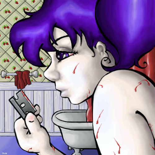
Strawberry Gashes
Childlike_Vampire
(Dec 17, 2003)
"Hex me told herI dreamt of a devil that knew her Pale white skin with strawberry gashes all over all over Watch me fault her You're living like a disaster She said kill me faster With strawberry gashes all over" -Jack Off Jill, Strawberry Gashes Safety Save
SomethingRotten (Dec 24, 2003)
I love this and that song. The blood looks really good and I think it really goes with the song.
Trey (Jan 9, 2004)
This picture is absolutely awesome. It hit me kind of hard at first, because I have a friend who cuts herself for some reason... I have no formal learning in composition or whatever, but I guess I'll just say what I can, since I want to give a real comment. ;) I like the contrast of the red and purple with the white of her skin. Especially with the blood. I also like how the bathroom in the background is all in reds and whites, while her hair and eyes are that blue-ish purple. There's a metaphor there somewhere...Don't know if you intended it, but it's itching right at the back of my brain and aching to come out. Anyhow, awesome picture. I really like it.
marcello (Jan 9, 2004)
"blueberries and strawberries taste better with blood"?
fleeting_memory (Feb 12, 2004)
this is so sad because I know someone like this. The expression on her face is VERY well done-amazing |
| ||||||||||||||||||||
|
DeadlyBlondeArcher
(Feb 3, 2004)
Just started...
staci (Feb 5, 2004)
prettiful. ive seen a few too (in Arkansas), although they've only looked like big moths cos they are so wee.
Look (Feb 6, 2004)
It's coming out great! I'm still trying to figure out your style. I mean I can tell it's your work right away, but I can't point out what's making it so different from other drawings. Maybe the way you use greyish colors. Hum..
DeadlyBlondeArcher (Feb 6, 2004)
It's probably recognizable because I do it here exactly as I would if I were working on a real canvas, maybe? I build up from a base and I blend alot, and then try not to "spit and rub" the brush strokes at the end, leave them visible. Maybe that's it...
Knockoff (Feb 10, 2004)
Why haven't I commented on this.?I love the buetiful coloring in this piece. The wings are amazing, great job! |
| ||||||||||||||||||||
|
DeadlyBlondeArcher
(Feb 2, 2004)
Think I am finally getting the "hang" of some of the tools on this applet. :D
leola (Feb 3, 2004)
I like it alot!
EverDream (Feb 5, 2004)
Reminds me alot of a chalk pastel painting. Exquisit work if that's the look you were shooting for. If not then I still like it none the less. ;) Keep it up!
DeadlyBlondeArcher (Feb 5, 2004)
Pastels are the other medium I use when I'm too lazy to get out my paints or when I travel. Thanks EverDream.
picassogirl (Feb 9, 2004)
I love this archer! i can almost feel putting on those line fresh clother, the jeans are a little stiff and the shirt smells great! nice, reminds me of being a kid in summer |

| ||||||||||||||||||||
|
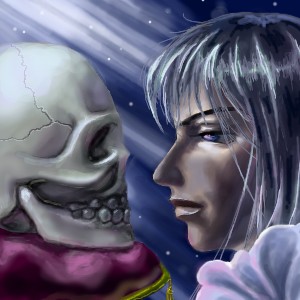
Look
(Feb 1, 2004)
Plan to do a series of drawing on zodiacs. this is gemini"There can be only one that's truely special. Brother, that is why you had to die and I stay alive. There should be nothing that is idenitical, for they will not be unique anymore. You shall rest in the moonlight, the cold moonlight."
Sotalean (Feb 3, 2004)
Do you use a tablet? 'cause this is really well done. The lines and coloring are amazing. *thumbs up* I kind of wish that this site had a favorites use. This would definitely be added to it. ^^Done!!! No more revise for this one. In case you are wondering what's changed. well.. nose smaller, slightly change on the eye, tried to add more texture to the skull (not successfull)... that's about it... ack, just realize the lighting on the hair isnt so good. oh well. :P
DeadlyBlondeArcher (Feb 4, 2004)
Did a great job on this one. What kind of galactic shampoo does she use? I want my hair that shiny! :) Her hair is my fav thing, btw.
Look (Feb 4, 2004)
It's a he... well, for the shampoo, same brand as InuYasha uses (inuyasha: a character from an anime called inu Yasha). reason: quote from cartoon network: "a full head of hair and not a single split end? that's his true strength if you gotta ask me!" heh |
| ||||||||||||||||||||
|
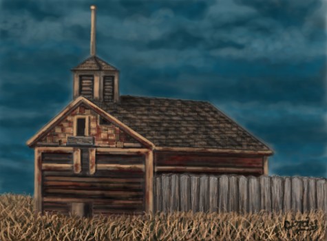
DeadlyBlondeArcher
(Jan 31, 2004)
From a photograph of an old abandoned schoolhouse on a Montana backroad.
dixielandcutie (Feb 2, 2004)
i love the sky and the colors of the wood! nice one dba!
thug (Feb 2, 2004)
you have such an awesome style! Looks like a painting, and your skys are superb. Keep on painting.
staci (Feb 2, 2004)
yes you have a very oil painted style. what i would look forward to from you is other colors. maybe more green and reds.
Look (Feb 3, 2004)
Beautiful color! I really like your style. I knew it's yours at first glance. Arent you special! |
| ||||||||||||||||||||
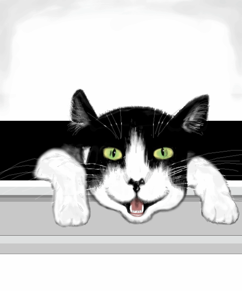
|
Toan
(Jan 22, 2004)
My mother has a daily cat picture calender and this was the image for Tuesday Jan. 20, '04. It was cute and couldn't resist trying to draw it.
Toan (Jan 22, 2004)
Well...the reason the head shape looks freaky is because it's stretching it out a window so it's not as round as it would be if it was just sitting normally. And the black outline is the way it is in the calander picture...to me it makes the legs very real looking. It just doesn't really work well under the chin and I've tried a few times to correct that.
angelbate (Jan 22, 2004)
it's good, imho. it seems to have a bit of a folk art style to it, and its cute. i esp like the eyes and mouth. the only thing i would have suggested is more work on the part of the window above it, but otherwise it's very nicely done :)
Pkingsora (Jan 28, 2004)
^^ thisis very cool..it looks like my old cat..she died - . -..but this picture XD reminds meh of her..thisis great picture!
Deformed (Feb 2, 2004)
it looks like its going to eat me! get it away!! get it away!!!!! |
| ||||||||||||||||||||
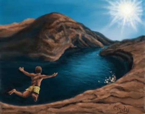
|
DeadlyBlondeArcher
(Jan 28, 2004)
Jump!
DeadlyBlondeArcher (edited Jan 29, 2004)
No, Marcello, the shadow is behind him, on the inside ledge of the cliff that you cant see. Consistent with all the other shadows. (That is, if he is casting one yet. He just now jumped :) He would have to still be standing on the ledge for there to be a shadow there.
Look (Jan 29, 2004)
lol @ that jump onto the ground comment. If you move him furthur up, it might help to clear it up. I like the sensation in the drawing, probably because of the free and open pose of the chracter. Feels like flying.
DeadlyBlondeArcher (Jan 29, 2004)
Yeah, I do see what he means... I probably wasn't successful in portraying how it actually looked - We are (supposed to be) viewing it from a rock a little higher up on the cliff looking downward at him and he was right on the edge. But if i gotta explain it, it means it sucks! lol
dixielandcutie (Jan 29, 2004)
i see it. and i think its great! |
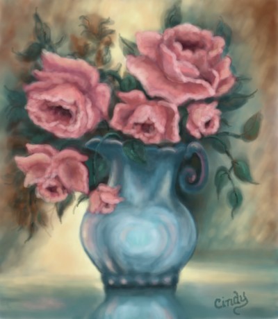
| ||||||||||||||||||||
|
DeadlyBlondeArcher
(Jan 25, 2004)
I originally did a work similar to this with oil on canvas about 10 years ago. I believe it was while I was studying a book called "How to Paint Roses".
Look (Jan 26, 2004)
aww, what can I say, it's so beautiful! I like the soft color, and the way the flowers are, it's almost as if they have expressions
dixielandcutie (Jan 26, 2004)
thats gorgeous!
Alicia (Jan 28, 2004)
I love roses , My garden is always filled with them. .:) Where are the yellow roses of Texas ?
DeadlyBlondeArcher (Jan 28, 2004)
I have some in my yard, Alicia! Next time I do roses I'll do yellow ones for you. :) |
| ||||||||||||||||||||
|
mikhail
(Dec 23, 2003)
well im done with it but i need to have 2 hours total so i can submit it on this board, so ill try to sharpen it up later...
xvolcomx (Jan 10, 2004)
Awesome pic.....the glow of the light source is really cool. And those trees...amazingly thin lines. Awesome.
honeywhiska (Jan 11, 2004)
how did you do this??? it looks so realistic, like a photo!!
EverDream (Jan 16, 2004)
I like this...I like this alot...perhaps it's because it looks just like a watercolor painting? *shrugs* This still is beautiful work though. Great job!
DeadlyBlondeArcher (Jan 27, 2004)
This is absolutely spectacular. Such a great job in drawing focus to the little birds in the nest. |

| ||||||||||||||||||||
|
EverDream
(Sep 15, 2003)
odd drawings tend to pop out when someone has a lot of things on their minds has anyone else noticed such? Anyway, that's my case and this is what the outcome was. Enjoy.
marcello (Dec 14, 2003)
that's a good question, considering they're books with no pictures in them.
Childlike_Vampire (Dec 14, 2003)
But...there are pictures in the Harry Potter books...at the beginning of every chapter...and on very nearly every cover...
marcello (Dec 14, 2003)
she didn't draw them
h0micidal-pupp3t (Jan 18, 2004)
You know what? This make me think of Sirius Black (;____;). Not Snape in the least.Anyway. I'm odd. Now on to the groveling! This is so amazing. It a-l-most has a sepia tone to it. I love the expression, and the scan lines as well. The color around the edges draws attention to the person. *nods* |

| ||||||||||||||||||||
| |||||||||||||||||||||
| 2draw.net © 2002-2026 2draw.net team/Cellosoft - copyright details - 2.24sec (sql: 31q/2.13sec) |