| |||||||||||||||||||||||
| Public Boards/Beginner | |||||||||||||||||||||||
|
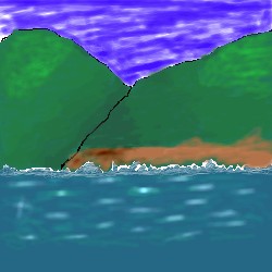
The Mountains of "I NEED PEACE"
Korean_Pride
(Sep 3, 2003)
I was just remembering a mountain scene I saw in the Muskokas (Canada). I needed a break from school work. COmments would be helpful on how I can improve.
mkkmypet (Sep 4, 2003)
The water looks very good, but the splashes seem too much like a sudden change to the water, there should be a little bit more of rughness before the actual wave. Also the lineart on the mountains needs some more work. Shii-painter or lauscaux sketch may be a little easier to use until you get better. But besides that, It's a lovely drawing!! |
| ||||||||||||||||||||||
|
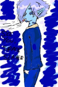
taori
(Sep 3, 2003)
I can't even begin to tell you how long I spent in front of a mirror trying to get that position right...and it still looks all wrong. *Growls*I think I'll call him Zel Spiegel! Yeah! ...And now I'm going to bed before I do something else strange and frightening like this.
mkkmypet (Sep 4, 2003)
Mmmmm... Blooo...
mazi (Sep 4, 2003)
ameraq - more critique stuff. makes people better ne?and the bg could use some work (shi painter has 3 layers good for line, color, then bg) heh go zel
Harmanye (Sep 4, 2003)
Actually, Shi-painter has (near?) unlimited layers, just copy a blank layer, the most I've used is twelve.Blue, blue is always good, blue hair, blue clothes, blue blue blue, he does look a little slouchy though; too much curve in the shoulder, methinks, but whatever. He is blue. ^_^
dragon_girl (edited Sep 4, 2003)
i dislike cigarets. |
| ||||||||||||||||||||||
|
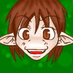
Hakkai
(Sep 3, 2003)
Raah~! Beware.. I bite. >_o;
dragon_girl (edited Sep 4, 2003)
i love this drawing.
Merulotte (Sep 4, 2003)
Youkai... I've heard that somewhere before... Well, at least I have a clue as to what it could ever be.It's small, but detailed. The background's simplicity doesn't attract away from the subject, so... (Eck. I've said that three times in a week or so...) It's nice, of course. The biting is a bit of something to be wary of, I'd say...
Maiko (Sep 6, 2003)
aww ~~ *glomps it and gets bitten* ow OOYoukai means : ghost, demon, devil etc etc... very cute hakkai ~~ ^__^ -Kitsunebi |
| ||||||||||||||||||||||
|
xvolcomx
(Sep 3, 2003)
User Icon |

| ||||||||||||||||||||||
|
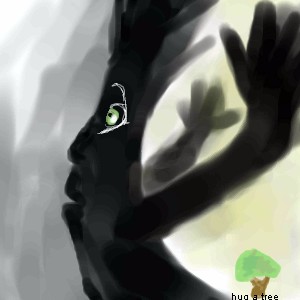
amuy
(Sep 3, 2003)
Its our old rotten tree in my backyard...we had some bad winds and 'woosh' he fell down...(thats kinda what the pic is)go hug a tree...it wont hug back..but thats ok.
mkkmypet (Sep 4, 2003)
Haha! This is great! I love how the tree shows so much motion!
dragon_girl (edited Sep 4, 2003)
Poor tree, I feel sorry for it because I adore trees.
Merulotte (Sep 4, 2003)
Oh, poor rotting compost tree... It looks quite shocked right now. That happy, pretty tree in the background... I think I can hear it mocking the falling one. o_o
strangeoid (Sep 4, 2003)
It reminds me of...umm.... what's that one movie? You know, with all the fairies? It was about a forest.... umm.... With that blonde guy and his tape player, when he gets shrunk... OH! FERN GULLY! |
| ||||||||||||||||||||||
|
Ameraq
(Sep 3, 2003)
The God (or godess?) Mauw. Is mauw a she? is mauw a he? is mauw both? and...why is one eye, bigger than the other? Alas, 0ur questions will never be answered.
mkkmypet (Sep 4, 2003)
I don't care if one eye is bigger than the other, this is great! <^-^>
Gothic_Otaku (Sep 4, 2003)
I agree! ^_^ |

| ||||||||||||||||||||||
|
cat14133
(Sep 3, 2003)
she's off of sonic adventure 2 battle
Harmanye (Sep 4, 2003)
No Dragon_girl... Rouge the -bat-... this makes her a bat 'gal'...Anyway,it looks great :) I like the face especially, rather surly, just like her.
raenboe (Sep 4, 2003)
Porportions are a little off, but this is actually pretty acurate otherwise! Rouge rocks.
method3 (Sep 4, 2003)
ok, so my question is how can the proportions be off if it's some kind of bat furry thing? and about the picture itself, it'd be nice to see a background on this other than a few scribbles and filles and stuff.
raenboe (Sep 5, 2003)
Well, since I own the game (awesome game, BTW ;P) I know what she looks like. There aren't many off proportions either. The boots are kinda short and chubby, and her face looks a tiny bit strange, although I can't grasp what it is. Good job, otherwise! :) |

| ||||||||||||||||||||||
| Specialty Boards/Collaborations | |||||||||||||||||||||||
|
Bow to Marcello; he made the wolf deliciously evil and fixed the snout I had messed up on. >_o
11 comments
– latest 4:
Knockoff (Aug 25, 2003)
Thats amazing. Great job on the colors cello.brought up highlights
mkkmypet (Sep 3, 2003)
<^-^>Lurvely.
wolfpup902 (Mar 31, 2008)
amazing wolf i love it. |

| ||||||||||||||||||||||
| Public Boards/Beginner | |||||||||||||||||||||||
|
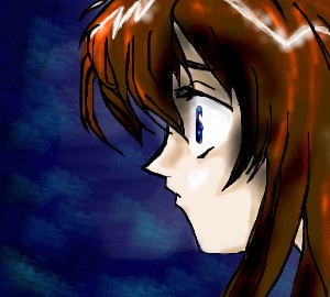
Ameraq
(Sep 3, 2003)
hmmm, did the outline and such from:http://www.angelfire.com/anime4/fruitsbasket1/images/Toru3/shockedtoru.jpg but i was on my own for coloring...darn the black and white printer....
mkkmypet (Sep 3, 2003)
Very nice drawing(as usual), Ameraq!
amuy (Sep 3, 2003)
Should this really be on beginner..come on now, give yourself some credit! its really good..LIKE BUTTA!
Knockoff (Sep 4, 2003)
Yes very nice, Great hair. The eye does look a little big. nu? Nice nice.
elvish_warior (Sep 5, 2003)
wow thats really nice |
| ||||||||||||||||||||||
|
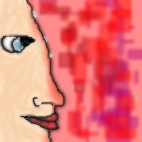
porridgebird2002
(Sep 3, 2003)
I do nottt know. My first drawing, thank you very much. Lol....
Knockoff (Sep 3, 2003)
Hmmm Not bad for a first.! The ey is very purdy. Id say to put some shading on (or is the red the shading. Well Welcome again.
mkkmypet (Sep 3, 2003)
I think that the red is like a glow from the background. Shading would be good, but it's only the first drawing. -_- The lips are x-ellent.
dragon_girl (Sep 3, 2003)
its not that good you defenetly need to improve
Merulotte (Sep 3, 2003)
Dragon_Girl, it's his first try, and it's not like anyone should tell someone else to just improve. It's far more superior to tell them their mistakes, so they can fix them next time...As for those... Shading, as mentioned, could be useful. In front of the eye, the head indents slightly, and then convexes outward subtly, just as it passes the eye to form the forehead. The nose seems good for a slightly more realistic work. The lips are fairly good, as well. The eye is normally an almondy shape or a slightly ovular almondy shape. The almond's tip ends on the side not facing the brow (forehead-rest of head spot, mentioned earlier) but it's a bit less sharp. The only other thing I see that could be added is hair. ^_^ Unless the person is bald, of course. And maybe an eyebrow (or eyebrows). You're off to a good start, and with practice, your potential can be revealed. |
| ||||||||||||||||||||||
| |||||||||||||||||||||||
| 2draw.net © 2002-2025 2draw.net team/Cellosoft - copyright details - 0.70sec (sql: 37q/0.23sec) |