| |||||||||||||||||||||||
| Public Boards/Beginner | |||||||||||||||||||||||
|
ShadowKitten
(Sep 16, 2003)
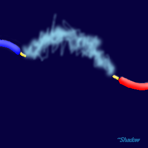
An electric arc. Just |
| ||||||||||||||||||||||
| Public Boards/Advanced | |||||||||||||||||||||||
|
furyofroy
(Sep 13, 2003)
Finished. See the caption for entry two to see what I think of this. >_<
concannon (Sep 18, 2003)
*massages forehead in annoyance*Look. In no way was I bashing Roy, insulting his work, etc, etc. I agree, he's fantastic for his age, and per usual, most of his drawb by hand works are better than his oekaki. However, it IS possible to attain smoother lines in Shi-Painter, and I was just pointing it out. The point is, he's trying to work his way up to Ian's level, and he's well on his way there. However, if he gains no constructive criticism....what's he going to base his improvement on? Also. I know what it's like to compare yourself to people who are ridiculously skilled; I, myself, stupidly compare myself to people such as Cara Jane Mitten, Aido Rakaen, Ursula Vernon, Jessica Hickman, Roux (Hilary See Penna), Lurid, Holly Ramirez, Amelia Stoner, and so forth. And because of constant viewing of their work, improvement can be achieved. I've drawn both a piece in Amelia Stoner's style, and one in Cara Mitten's. And for the last note: If you don't like being attacked for what you say, say what you originally planned to say more politely the next time. Then something like this *waves hand around* may be avoided.
TheLIVR (Sep 18, 2003)
I know what I did was definately not constructive criticism, and maybe not the most polite as it did. However, it is needed. Grounding statements like those can really help people refocus, so they don't delude themselves into a constant "oh my god, I suck, why can't I draw as well as amazingly-godly-artist-guy?" One of the things I hate the most of my artist friends is there constant self-loathing. I've found that they need perspective. Not the drawn type, the mental one. To keep a level head, they need to keep their eyes on the reality of things. If Roy happened to actually be able to create a work that matched one of Ian McConville's weekly cartoons, you know what it would mean? That Roy is a better artist than Ian McConville, and was able to produce top quality merchandise with inappropriate tools.
nyao (Sep 30, 2003)
wow... that's so cool... i luv this style, and the cute furries. ^^
rogue__wolf (Jan 15, 2004)
awww cute fuzzies!!!! |

| ||||||||||||||||||||||
| Specialty Boards/Collaborations | |||||||||||||||||||||||
|
"Yeah, it's kind of overdoing it to nuke a whole village for food and candy, but hey, i'm too cheap to pay for that kind of stuff... cookie?"
27 comments
– latest 4:done. (pinches boy)
ShadowKitten (Aug 4, 2004)
i really love the way you did the fire in the background and the highlights on the hair excellent job you guys
Mipunai (Aug 12, 2004)
Wow, I love the colors and the backround a lot n_n It's very pretty
yuohoo (Jan 4, 2005)
THAT LOOKS! so AWSOME!!!!!!!!!!!!!!!!!!!!!!!! I like it all! even the bloody sword! I like! the background looks shiney...ohh....*u*
Namori (Aug 5, 2005)
*squeals* so good!!! i love the background, it's so pretty! And i like his clothing too! XDDD |

| ||||||||||||||||||||||
| Public Boards/Beginner | |||||||||||||||||||||||
|
Gothic_Otaku
(Sep 14, 2003)
Hey, it's a self portrait of my heart! Kinda....
dragon_girl (Sep 14, 2003)
*dragon giggles* peoiple lol lol haha "peoiple"
Gothic_Otaku (edited Sep 14, 2003)
It's just to be a cold heart, and I tought, "hey, how about steel?" beause I have winamp3 skin called heart of steel.....and it fits perfectly! =3 but sometimes my heart is warm, hot, melted, etc. so it fits even better! ^_^dragon_girl: don't make fun of others, it's just a typo mistake....
mazi (Sep 14, 2003)
dragon girl, you have no room to laugh at other peoples typos/spelling errors.. |

| ||||||||||||||||||||||
|
digital-nut
(Sep 14, 2003)
The wings are supposed to be gold, but I aren't that good at drawing metal, any tips on how to make it look better?
Gothic_Otaku (Sep 14, 2003)
I can't wait for it to be finished! :D *waits patiently*
mazi (Sep 14, 2003)
ok go to a search engine, such as google, and in the image search type 'gold' or 'metal' and look at the pics there.almost done now, this would be sooooooooo much easier if my finger was fully cured
ShadowKitten (Oct 7, 2003)
I think that it would have looked better without the tatoo |

| ||||||||||||||||||||||
|
Marienkind
(Sep 14, 2003)
'cause it's fun.
marcello (Sep 15, 2003)
Actually, don't memo a mod, just post it on the message board.
panda_panda (Sep 15, 2003)
ooooooooooooo O_o riiiiight....
method3 (Sep 16, 2003)
Memo a mod and die. No really. It's like the ring... only worse.About the picture, I'm just saying it looks like a hole in the mouth, simply because the coloring around that area doesn't imply that the mouth is complete. In other words, seems like Marienkind went over with the skin tone and put a dot over the black line... and didn't add pink in the mouth back over to make the edge continuous and smooth. Not that it looks wrong, but at first glance that's what i thought.
nyao (Sep 29, 2003)
prettie.. i luv her smile and the bubblie background. ^_^ |

| ||||||||||||||||||||||
| Public Boards/Intermediate | |||||||||||||||||||||||
|
Kazukie
(Sep 14, 2003)
Hellooo.. I haven't drawn in a little.. I left the drawing up, that's why the timer's 21 hours.. It took me 2-3 probably.. This would be .. Kazukie.. (Not me just a character) I'm hoping to draw more of her.. maybe.. C&C welcome and appreciated. :)I'm practicing so I can work up to the showcase. *waves fingers around* I'm reallllyyy trying to improve.. =3
dragon_girl (Sep 14, 2003)
wow that is so so so so so so so so so so so so wow so good
Gothic_Otaku (Sep 14, 2003)
Boy does this bring back memories XD
dragon_girl (Sep 14, 2003)
Gothic" what do you mean
Childlike_Vampire (Sep 14, 2003)
Personally I'm adoring the spiderwebs...o so delicate! |

| ||||||||||||||||||||||
| Public Boards/Beginner | |||||||||||||||||||||||
|
taori
(Sep 13, 2003)
Finally done. Not supposed to be stoned, but she sure looks like it...edit- just so you know, the timer lies. this took far longer than 45 minutes, i can assure you. Whew, finally finished. I worked pretty damn hard on this...don't know if it came out that well though...I wish i could do hair.
Kazukie (Sep 14, 2003)
If you ask me, she's just sleepy. =]
marcello (Sep 14, 2003)
Mazi posted a link to pretty good tutorial on hair. might want to check it out.
mazi (Sep 14, 2003)
http://div.dyndns.org/EK/tutorial/ its on there. |

| ||||||||||||||||||||||
| Public Boards/Intermediate | |||||||||||||||||||||||
|
coffeejelly
(Sep 14, 2003)
whoot!i finally got my computer to work again! X'D
mazi (Sep 14, 2003)
well now that youve perfected drawing front on girls with long hair you should try something new..?
Kazukie (Sep 14, 2003)
I'd love to see some more full body drawings. ;D I love the soft, fuzzy-ness of the drawing. ;D And I like her eye color a lot. =]
nyao (Sep 14, 2003)
ooo.... it's so purtie! me luv the light colourz. ^^
Renmazuo (Sep 29, 2003)
The coloring is so soft^______^Somehow it reminds me of the drawings of an online manga i really like! |

| ||||||||||||||||||||||
| Public Boards/Beginner | |||||||||||||||||||||||
|
Noremac
(Sep 13, 2003)
this is my image of a Naz'Gul (Ringwraith) and his fancyful sword. (there is a signature stick figure guy in there try and find it) |

| ||||||||||||||||||||||
| |||||||||||||||||||||||
| 2draw.net © 2002-2026 2draw.net team/Cellosoft - copyright details - 1.31sec (sql: 40q/0.74sec) |
On another note, there's too much space under the arc. The arc is cool, but there's just too much empty space. Perhaps you could have tried drawing a background? Abstract electric arcs? Something.
btw Nerdboy is my 11 year old brother...
Edit: Uhm is there ne way to override the 100kb space limit so that i can edit my image.