| |||||||||||||||||||||||
| Public Boards/Intermediate | |||||||||||||||||||||||
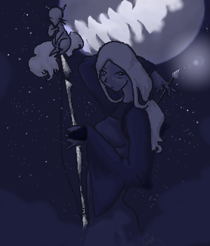
|
Ink
(Sep 25, 2003)
my eyes hurt... *_*'' |
| ||||||||||||||||||||||
| Public Boards/Beginner | |||||||||||||||||||||||
|
Isu
(Sep 25, 2003)
It's my friend Heather's character, Teka. I love him, so I drew a little thing of him being stupid. Yaaay. I've never been very good with the Paint applet... yay for tones!
nanashixsilencer (Sep 26, 2003)
wow kawaii!! ///_n!! it looks sooooo neat!! i love the expression on the face. ^_~
mazi (Sep 26, 2003)
nice. really nice. the anatomy on the neck is kickassed though it could use some more overall shading. too much midtone for my liking =) |

| ||||||||||||||||||||||
| Public Boards/Intermediate | |||||||||||||||||||||||
|
furyofroy
(Sep 24, 2003)
Maybe...
cherikit-chan (Oct 1, 2003)
Another great pic again! cherikit-chan goes to your site all the time... more comics!more comics! I like Garrett and how he's on his coffee rampage. Garrett is the coolest!
kamidake26 (Oct 2, 2003)
haha, thats great. gotta love crossovers :D I have to ask the significance of the poster in the background though, any at all? or was it just a last minute addition to fill in space? ^^
furyofroy (Oct 2, 2003)
He's sorta scoffing at the poster, but It's real significance was to, yes, fill-in space. ~~;; I was gonna draw another person, but I was tired of working, and so I made Mr. Bowels. :D
CrystalineWings (Dec 23, 2003)
OMG, it's a Furry Vash! *squee* I love you Fury! XD You're my hero. XD Ahem. Calming down now. ^_^ |

| ||||||||||||||||||||||
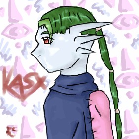
|
Jiah
(Sep 26, 2003)
A character I've had for a while, Kasx. Origionally a huge demon who was sealed to a mostly humanoid form by these glove-like things on his hands. they come off, spell goes away, rawr. The symbol in the background is the symbol on his gloves. |
| ||||||||||||||||||||||
| Public Boards/Beginner | |||||||||||||||||||||||
|
Ameraq
(Sep 26, 2003)
moo. nothing else to say but, moo.
taori (Sep 26, 2003)
Wings, ears, shiny marks on arms, bandages, hair. Taori wants to marry this picture too.
mazi (Sep 26, 2003)
very good though the wings could use some shading
Shuichi-chan (Oct 10, 2003)
WOW! I luvit! She is rockin! Your wings are purfect. You could fix............................................NOTHING! *hits self over and over again with a frozen fish* |

| ||||||||||||||||||||||
|
ShadowKitten
(Sep 6, 2003)
Just testing my shading abilities, i have come to the conclusion that I suck at shading and i would appreciate sum help. ^_^
Ameraq (Sep 6, 2003)
mmm, i'm probably not the best person to give advice...but here goes:first of all, the shadinag on the eye looks pretty good, though you might want some white around the iris. It might help some on overall shading if you look at other pictures (not just ones on 2draw, but just...random pictures anywhere) there probably should be darker skin shading under her/his hair and around the nose.... looking in a mirror might also help so you can see where the light falls and such... yeah...so...there my unprofetional opinion....
Merulotte (Sep 26, 2003)
Eeeeeee! It's always best to put the effort of many into one... About the eye, I like it. It could use whites, but anyhow...
ShadowKitten (Sep 26, 2003)
O sorry about that i couldnt post anymore pictures so i thought i would finish some of my unfinished peices
mazi (Sep 26, 2003)
yeah please dont spam the boards |
| ||||||||||||||||||||||
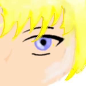
| Public Boards/Intermediate | |||||||||||||||||||||||
|
feena95
(Sep 26, 2003)
o.o ... n-c...
mazi (Sep 26, 2003)
nice, could use some more contrast though
Eliafin (Sep 26, 2003)
Cute! I like the colors you used and the way you've shaded it. ^^
JAM-BAD (Sep 26, 2003)
i agree great colors, there nice and soft. :)
Hotaru-chan (Sep 27, 2003)
aaawww, he's soo cute!!! I like his eye, it's the perfect shape/size!!=3 |

| ||||||||||||||||||||||
| Public Boards/Beginner | |||||||||||||||||||||||
|
nanashixsilencer
(Sep 25, 2003)
ok...its ugly. yeesh!!>_< i can so not draw with a mouse!!
Gothic_Otaku (Sep 25, 2003)
I like it....It's got that whole cute thing going on. Would make a good icon if it wasn't so big. A peice of advice....Avoid lascaux. The oekaki shi-painter has this nifty thing called the pen tool, and to wortk the controls click on them several times to change the settings. To change the colors you move the colored brs around. (don't worry, this will make sense once you use the applet) You can make wonderful music--I mean art with the shi painter. P.S. The head is too big and pointy. Don't worry, the rest is good.
marcello (Sep 25, 2003)
here's a better piece of advice, ignore everything gothic otaku says.Ahem...so i didnt like the other tacky background i put and i couldnt think of anything to put...so i put the clouds...///_-;;
mazi (Sep 26, 2003)
ahaha gothic otaku, lascaux has antialias, which can be just as good as the pen tool when you know how to use it. dont tell people to avoid an applet because you dont like it -_-; |

| ||||||||||||||||||||||
| Public Boards/Intermediate | |||||||||||||||||||||||
|
coffeejelly
(Sep 26, 2003)
why did i spend so much time on this? ;n;why do i always spot mistakes only after the image is submitted *bang wall*
Sixelab (Sep 27, 2003)
i think its because the hair is less detailed than the rest of the drawing, sort of looks seperate. But wow, what a nice face. She's beautiful, i love it, her eyes are very sweet.
Renmazuo (Sep 29, 2003)
U_U i can't do realism at all.........or semirealism........I realy love her expression!And her lips^W^
nyao (Oct 2, 2003)
prettie... and so real! ^^ me luv the softness of it!
Carlucci (Nov 27, 2003)
Wow. That is really good! i like her eyes and the shading. |

| ||||||||||||||||||||||
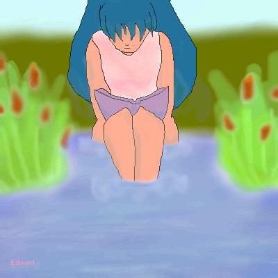
|
Edward
(Sep 21, 2003)
Unfinished
mazi (Sep 26, 2003)
try adding some highlights/shadows to the water to make it look like ripples and kinda put her in the water with some shadows.water not very good ><
strangeoid (Sep 26, 2003)
YAY! Let's hear it for reading!
Edward (Sep 26, 2003)
CHA! |
| ||||||||||||||||||||||
| |||||||||||||||||||||||
| 2draw.net © 2002-2026 2draw.net team/Cellosoft - copyright details - 1.25sec (sql: 38q/0.75sec) |
^_^