| |||||||||||||||||||||||
| Public Boards/Beginner | |||||||||||||||||||||||
|
sincerest form of flattery..
staci
(Feb 12, 2006)
or someone failing miserably at ripping you off ^_^
TaCO (Feb 12, 2006)
This looks cool!! Draw another pic like this one but better, I command thee.
Zack (Feb 12, 2006)
I like the shapes and designs in the skin as it fades out.
davincipoppalag (Feb 12, 2006)
The no-eyes eyes and those patterns are cool.
Punky (Feb 13, 2006)
The little swirls in the skin and writing in the eys are fab. Nicw work, I like the loose feel to it, it reminds me of a poster I have in my room. |

| ||||||||||||||||||||||
| Public Boards/Intermediate | |||||||||||||||||||||||
|
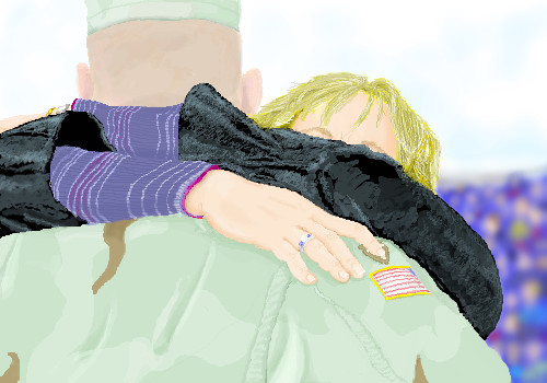
JoeNobody
(Jan 12, 2006)
Welcome Home. Saving here before I lose it like the first time I tried
SYTHE (Jan 15, 2006)
He should have a combat patch on his right shoulder were the flag is and the flag under that, then it would be perfect. Wearing the patch in this manner signifies that he was deployed to a combat zone. Great peice.SYTHE, Thanks for the heads-up on the meaning of the patch above the flag. This is of the return of a friend and his wife. He proudly served in Iraq and arrived home safe on Thanksgiving night.
emmamommalag (Jan 21, 2006)
This is a lovely tribute to your friend. I'm glad he arrived home safe and sound and I'm grateful to him for his service to our country.
Qwerty_Wittle_Fawah (Feb 13, 2006)
omg I didnt see this. This is so sweet. I love it! |
| ||||||||||||||||||||||
| Main Forums/The Post Board | |||||||||||||||||||||||
 |
SneakyWalter (Oct 6, 2005)
Post a link to what you think is your best piece On 2draw.
58 comments
|
||||||||||||||||||||||
| Public Boards/Intermediate | |||||||||||||||||||||||
|
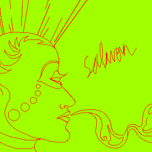
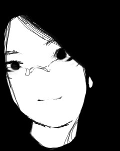
Estecca
(Nov 9, 2005)
Just a doodle right now. :) Maybe I'll colour later.No, I'm not implying that salmon is a Bohemian snackfood. XD I just like random names sometimes. CRITIQUE. I CAN'T DRAW REALISM. The forehead looks like it needs help. D;
mybettastorm (Nov 11, 2005)
You shouldnt be critasizing so much, simplt tell the person what they need to work on. I dont think that is so hard, Im trying to do that more often myself! :) XP
Minty_hippo (edited Nov 12, 2005)
I disagree with you, this is not up to the standard of intermidiate level, and besides the more critacism (sp?) the more that person can improve on. Critasism (sp?) is nothing to get affended of and nor is it personal. Hideyourface may not have included why he thinks its beginner, but you should know by looking at this anyone can draw that, theres no colour just a plain background and no heart gone into this drawing. Just because its over 30mins and supposidly has effort doesn't mean its intermidiate, anyone can do that, if thats the case then everybody would be drawing on intermidiate. I suggest you work on your pictures more and stick to the beginners board for doodles like this, otherwise carry on what you do best ^___^ like to see more pictures from you and see your full potential!!By this I mean, go for something you've never thought of drawing before, something that will blow everyones mind and think ' WOAAAAA THIS KICKS BUTT!!! ' Sorry if I seemed that I was getting at you but I couldn't resist >___<
marcello (Nov 12, 2005)
*criticism (It's spelled like critic)*offended *it's (its is possessive) *supposedly *intermediate (it's freaking written on this page) You asked for critique, however, so I am not surprised people gave such comments. You can't draw realism, but that's does not seem to apply here since you did not even attempt to do so. I would say, yes, this is beginner level. While the lines are fairly clean, they still lack thought and seem rather arbitrary. Random text does not a make a picture better or more abstract, and in this case, I would say it detracts from the overall piece. I imagine you added it because you felt the picture was missing something, it still is. This is all very fine and well for a quick sketch, but it's hard to imagine it took you 30 minutes.
George_Goat (Feb 12, 2006)
*le-gasp* Here's an actual tip on realism. =O The eyes are generally a bit further back on the head, that's probably why the forehead looks 'funny' to you. ^^;; Though I think this picture really looks cool in a designy sort of way, it does kind of look like she has just one eye in the middle of her forehead. The shape of the head/chin bugs me just a little, too, but it's not too far off, there, and I'm sure not all people have perfectly round heads anyways. I hope I helped! |
| ||||||||||||||||||||||
| Public Boards/Beginner | |||||||||||||||||||||||
|
Robinman
(Feb 11, 2006)
can't scare anybody so I'll make theese things up when I'm BORDED!!!!!!!!!!!!!!!tell me if I can improve! ok. let us take a moment of silence. I'm dumb.
Robinman (Feb 11, 2006)
please can you help me improve it as of better than what it is right now?
komugimaro (Feb 11, 2006)
u want some tutorials\
marcello (Feb 11, 2006)
this is really good.
SYTHE (Feb 11, 2006)
You should switch to decaf. If you get a chance, check out 'Dynamic Anatomy' it will give you a good understanding of the human body. Even people who draw cartoons need a good anatomical understanding. :) |
| ||||||||||||||||||||||
| Public Boards/Intermediate | |||||||||||||||||||||||
|
17 comments
– latest 4:
HunterKiller_ (Feb 8, 2006)
Awesome subject. Love the painterly style. Your 'bots are too awesome Zack. ^.^
Ceido (Feb 8, 2006)
Maybe he's holding some kinda of binocular pinpointing device. The bloke can pinpoint and then the tank fires automatically! :OLove the angles in this piece. Great draw! :)
marcello (Feb 9, 2006)
actually terracotta, that's a new 2draw feature I'm testing out on random accounts. it deduces the content of the picture and generates appropriate sound effects/ambient music when possible
DarkCloak (Feb 10, 2006)
Very nice piece! |

| ||||||||||||||||||||||
| Main Forums/2draw.net | |||||||||||||||||||||||
 |
Axil62 (Jan 24, 2006)
You know how some people like to comment on everything just to be commenting? Well how about this. The points you accumulate would be deducted for each letter you type...one letter, one point. If you run out of points you have to draw enough to get enough points back to be a useless blabber mouth again.
37 comments
|
||||||||||||||||||||||
| Public Boards/Beginner | |||||||||||||||||||||||
|
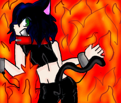
ItsMyLife
(Feb 5, 2006)
Fire! it sucks
ItsMyLife (Feb 7, 2006)
OK i will ^-^
marcello (Feb 7, 2006)
looks more like fur than fire. you might want to go check what fire looks like.
Natsuna (Feb 7, 2006)
Is there a chain linking there cuffs together? Sort of like its torture?o.o;
ItsMyLife (Feb 8, 2006)
Marcello, Yeah it my F-ing art So i can make it the way i want, No ask u you. if u do not like to Do not comment |
| ||||||||||||||||||||||
|
woah_pockster
(Feb 6, 2006)
guess who :D
TaCO (Feb 6, 2006)
Mickle Jackson???
Shoebox (Feb 6, 2006)
ooh, cute. I love the uber high contrastyness. great glasses!Looks like a young Amy Lee o.O
woah_pockster (Feb 6, 2006)
YEAH IT'S JESUS me. roflthnx for the comments babes <333
Noremac (Feb 6, 2006)
wow, not bad. :D |
| ||||||||||||||||||||||
| Main Forums/2draw.net | |||||||||||||||||||||||
 |
marcello (edited Nov 27, 2005)
So, who would be interested in a 2draw-con? It'd probably be here in New Mexico, maybe sometime in the Spring. If there is interest of course. Probably raffles, contests, and just general hanging out. Probably plenty of cool free and secret shit that you'd have to come to get. Who knows. 2draw merch maybe? Just throwing the idea out there, post your thoughts. p.s. probably the biggest issue is location and "getting there." feel free to post your thoughts on that, as well. p.p.s. ...
247 comments
|
||||||||||||||||||||||
| |||||||||||||||||||||||
| 2draw.net © 2002-2026 2draw.net team/Cellosoft - copyright details - 2.95sec (sql: 36q/2.57sec) |