| |||||||||||||||||||||||
| Public Boards/Beginner | |||||||||||||||||||||||
|
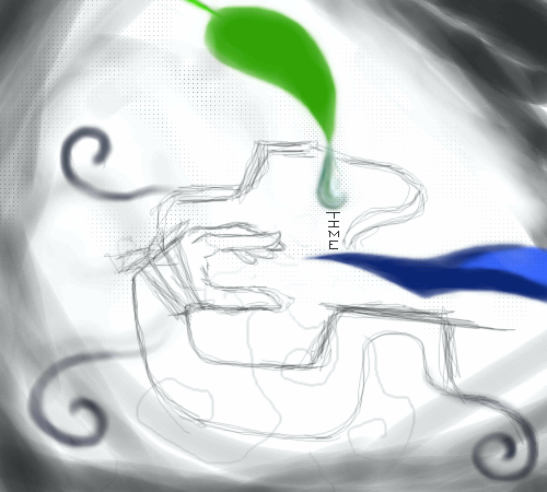
p3ndragon
(Jul 30, 2005)
It means nothing. It belongs on the beginner board. |
| ||||||||||||||||||||||
|
Rave
(Jul 30, 2005)
A very, very speedy doodle done by myself. =3 I was just testing out the other types of oekaki boards you could use. >W< This one I like more since I have the opacity option. =o |

| ||||||||||||||||||||||
| Public Boards/Intermediate | |||||||||||||||||||||||
|
pencilhero
(Jul 30, 2005)
ooopps 0_0 i switch to finished but why is in the new on the top ????? 0_0it's kinda one day old tsk i should have switch to finished yesterday but i forgot sorry for the flooding 0_0 didn't mean too can't believe it ....0_0 i gueess i learned my lesson sorry again...
pencilhero (Jul 30, 2005)
Thanks I use 40 -100 opacity and flow always at max also pen size also at max for the mist style effect offcourse i use the color picker(right click) all the time so i don't really need too soft.. anyway the mist need to be more textured it's kintda smoothy with hard edges to like someone did a median filter in paint shop pro XD i havwe to add more whites to the mist and textures... this basic layer XD i guess that was stupid off me not to make one layer for the mist - clouds XD *my english kinda suck right now cause i am sleepy XD* taa daaaaaaa! XD
still doesn't look good :/
DarkHorses (Jul 31, 2005)
I like this, i ran across it and couldnt stop looking at it, nice job!
Cordelia_Pink (Aug 1, 2005)
Colorful! The sky looks great, the blend is great, the hair is great, the face is great, and everything else is great!! You could maybe soften the lines for the strands on her hair though. |

| ||||||||||||||||||||||
| Public Boards/Beginner | |||||||||||||||||||||||
|
yukitora
(Jul 30, 2005)
^_^
fleeting_memory (Jul 30, 2005)
This is nice and you spent enough time working on it that it obviously took enough effort to stay right where it is. A background of a couple soft looking hearts to match the one on the left might be cute and make the picture look more finished if you really wanted to give something a shot. ^^
Shanghai (edited Jul 30, 2005)
I just feel that time/effort spent and actual quality achieved are two different things, and the boards are based on the quality not the time. If you look at the rest of her gallery, there's at least 7 things almost exactly like this originally posted here and then later moved to beginner. Personally I think it'd take a lot more to bring this up to intermediate level than just a couple hearts in the background. I'm not intending to be mean in any way with this, I'm just choosing to be honest and not sugar coat my opinions since, at this point, I would think she'd have gotten the idea that she needs to try a little harder and improve a little more before she gets to the next level.-and I'm more than willing to help too, since there's been many people I've given informal art lessons to over msn or aim.
yukitora (edited Jul 31, 2005)
actually the name yuki can be a girl or a guys name. In japanese "yuki" means "snow"@ redpanda: acutally i just needed more room to draw...lol ><
SanzoGirl (Aug 4, 2005)
I knew that it means snow, I just thought the name was only used for boys. |

| ||||||||||||||||||||||
| Main Forums/2draw.net | |||||||||||||||||||||||
|
EliteDrawer-TM (Jul 29, 2005)
A paintchat o 2draw would be a neat idea. (comes from one of the other forums <vamp2>) I think that if we had a paintchat on 2draw more people could get to know each other. Also people could paint together. |EliteDrawer|
9 comments
|
|||||||||||||||||||||||
| Public Boards/Beginner | |||||||||||||||||||||||
|
Maiko
(Jul 24, 2005)
I dunno >_>;;; It turned into this for some reason*shame shame*
darkshadow (Jul 28, 2005)
may be???................ runs away really fast
minikuineko (Aug 1, 2005)
could those possibly be fuzzy handcuffs????? lol
Maiko (Aug 1, 2005)
yes XDDDD BONDAGE YAOI LOVEEEEE
xaxsinglextearx (Aug 7, 2005)
kinky |

| ||||||||||||||||||||||
| Main Forums/The Post Board | |||||||||||||||||||||||
 |
vamp2 (Jul 25, 2005)
I just put in the new drawing pad and chatroom. I have moderators watching the the chatroom so if you do say or do something stupid you will be kicked off for a day/week.. Hope everyone checks it out... |Vamp2|
11 comments
|
||||||||||||||||||||||
| Public Boards/Beginner | |||||||||||||||||||||||
|
meh
(Jul 23, 2005)
Something random.
Shanghai (edited Jul 23, 2005)
It's a cute drawing, I like the cat character a lot, but don't you think it's a little too plain? Having a least a shade of some color in the background, probably something light, may make it stand out more. |

| ||||||||||||||||||||||
|
witch_girl
(Jul 22, 2005)
this is my first oekaki on this site and i feel i did well using a different type of oekaki board
Minty_hippo (Jul 22, 2005)
her neck and ehad seem a little to big for hair, hmmmm if you don't wanna ajust the breasts up to the hair then I suggest you make her torso a little bigger and her arms, then the perspective would seem correct ^^
hyschara (Jul 22, 2005)
I'm with minty hippo^^ And Lascaux is cool, right??hey~ is that chinese word or kanji? what does it say?^^ Or are they strategically placed scratch marks?^^
Split (Jul 24, 2005)
yeah make her boobs bigger and her hands too cuz the head is too big
Maiko (Jul 24, 2005)
Her neck is a bit large ^_^;it says "Kitsune" on her neck X3 it's the "ko" in Maiko for my name Mai ko = Dancing Fox hahahaha *shuts up* but yeh, welcome to teh 2draw the kitsune kanji is a bit weird o_o; |
| ||||||||||||||||||||||
| Public Boards/Intermediate | |||||||||||||||||||||||
|
sephiroth54321
(Jul 6, 2005)
it's just a rough right now, but it will look good when finished
SimplyX (Jul 23, 2005)
I would like to commend you on your effort put through this long process. At least you decided to put quality first rather than quantity and ignoring the 10 hours that state for the duration time. Or was it really 10 hours or a bit off? Seeing the number of revisions you've done, it is obvious that you were persistent in making the lines as crisp and arranged properly just as you've observed on the original picture (or I suppose the reference). A background would be nice too but I suppose making a duplicate of the original is satisfying enough then there is no need to make any more hassle with it. Not really what I call exceptional but acceptable enough for this board, if I say so myself.
sephiroth54321 (Jul 23, 2005)
thanks, I really didn't pay much attention to the ref though, and the timer isn't really off.....most of the extra time in between is just me thinking of what to do next.....
Minty_hippo (Aug 9, 2005)
wow thats really cool! Looks juts like the other one! Sep did add his own colour kinda!hey sep, if you get any more space add a shine to the blade! make it look like if you touch it ever so slightly you'll get cut! Nice one!! this is brill!!
sephiroth54321 (Aug 11, 2005)
Thanks....I really would like to take you up on your advice, but I put so much time into this I kinda just feel like leaving it as it is... |

| ||||||||||||||||||||||
| |||||||||||||||||||||||
| 2draw.net © 2002-2026 2draw.net team/Cellosoft - copyright details - 2.89sec (sql: 36q/1.98sec) |
I don't think any of that matters in this case though, because it seems kind of strange to be thinking of proper finger lengths when the arm is coming out of a swirl. =P
I actually didn't really try >_>
At least it's on beginner now :D
you should draw every day.