| |||||||||||||||||||||||
| Main Forums/2draw.net | |||||||||||||||||||||||
 |
DieChan (Jul 15, 2005)
We're having a bit of a problem. My brother just turned six on July 5 and he has a problem with food. You see, he eats way too much too often, and when we aren't watching him, he'll steal more from the kitchen. So, humble and fellow 2draw-ers, do you have any advice as to what we can do about this little eating disorder? Help and advice would be mucho appreciated.
35 comments
|
||||||||||||||||||||||
 |
Linwe_lover_1990 (Jul 17, 2005)
Hey All. is there a technique to draw so that the compression doesn't molest your colors? it is a little irritating. thanks to all who answer -Levi
11 comments
|
||||||||||||||||||||||
| Main Forums/Drawing Discussion | |||||||||||||||||||||||
 |
squee (Jul 18, 2005)
My tablet isn't working and I don't know why. I plug it in and when I go to draw the light on it turns green and the cursor doesn't move. Wtf is wrong with it?
10 comments
|
||||||||||||||||||||||
| Public Boards/Intermediate | |||||||||||||||||||||||
|
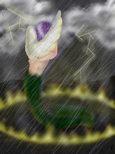
fleeting_memory
(Jul 13, 2005)
Alright I am afraid to add anymore to it. All I really wanted to fix way the skin to tail transition. Thank you to Maiko for the space! YAY you are awesome. If you guys feel that this should be moved then I can't stop youl, but I am proud of it. |
| ||||||||||||||||||||||
| Main Forums/Drawing Discussion | |||||||||||||||||||||||
 |
Inu-chan (Jul 16, 2005)
Anyone want to do an art trade with original charachters? (meaning I draw one of yours, you draw one of mine?)
20 comments
|
||||||||||||||||||||||
| Public Boards/Intermediate | |||||||||||||||||||||||
|
seaanemone
(Jul 14, 2005)
=Pkay all done
hideyourface (Jul 15, 2005)
I just think it's overrated for a lame anime reproduction :\STILL, the lineart and shading on this is very smooth and nice.
Xodiak (Jul 15, 2005)
I think the female characters are sexy! >:D|XOD|
Aikara (Jul 15, 2005)
People can like what they choose, whether obsessed or not, I find it sweet they can remain focused on something. Or inspiration source.++I like the simple shading on here. It looks especially good with the smooth texture. :) |
| ||||||||||||||||||||||
| Public Boards/Advanced | |||||||||||||||||||||||
|
Shanghai
(Jun 10, 2005)
This is one of many ideas I've been trying to come up with lately to make a tree-based community that includes large, tall trees, a sense of fantasy, and still gives them enough horizontal space to walk around on and doesn't put them so high up that the force of wind blowing them off the tree would be a risk. Also the higher up on a tree you are the more the tree will sway in the wind, and I don't want them to get motion sickness everytime the wind blows.
Rosemary (Jul 15, 2005)
beautiful picture i love the mist :)
15grifficorntears (Jul 15, 2005)
Reminds me of a book I read with a town in the trees. Love the misty aspect you took.
pandabarrie (Aug 25, 2005)
looks like a giant bonsai tree! |

| ||||||||||||||||||||||
| Main Forums/2draw.net | |||||||||||||||||||||||
|
quintessence (Jun 23, 2005)
I've noticed that a lot of people are using the maximum size (500x500) on the intermediate board lately, especially people who are sort of on the borderline of being able to draw there. Big canvases are great, but you have to fill up all that empty space unless there's obvious artistic merit in leaving it blank. Huge 500x500 drawings on the intermediate board with one little character stranded in the middle are going to get moved to beginner, okay? People who are just getting up to the inter...
4 comments
|
|||||||||||||||||||||||
 |
little_cheddar (Jun 23, 2005)
Um sorry if someone has already asked this but, ho do you delet a picture that is finished?
4 comments
|
||||||||||||||||||||||
 |
sarna (edited Jun 17, 2005)
Sorry to bother you all but I had a question...Is there any way that you can get more space to draw on the Begginer Board?
6 comments
|
||||||||||||||||||||||
| |||||||||||||||||||||||
| 2draw.net © 2002-2026 2draw.net team/Cellosoft - copyright details - 2.11sec (sql: 30q/1.34sec) |
I like the rain, but now the tail seems to blend into the background a bit. You could try lightening up one or the other to separate the two. I might also add some glow around the lightning too. I like seeing how hard you're trying here for sure :). Keep on going.