|
| |||||||||||||||||||||||
|
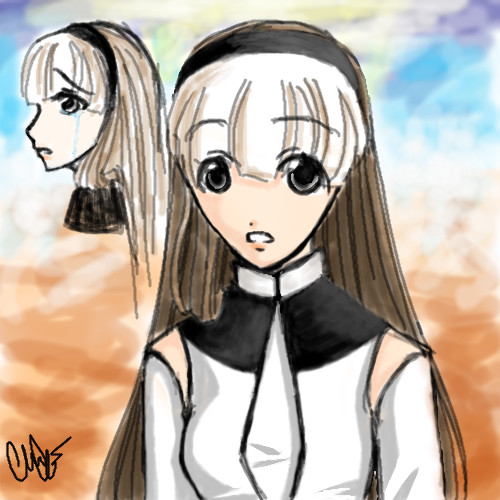
Namori
(Aug 15, 2005)
I'm entering a contest...so this is just a quick sketch of her..I'm sorry this one isn't as good as the other pieces I recently did, but my time was limited... |
| ||||||||||||||||||||||
|
Mal
(Aug 15, 2005)
goldfish swimming about in a bowl i lost a bubble lol
emmamommalag (Aug 15, 2005)
Very nice job, Mal.
davincipoppalag (Aug 15, 2005)
This is deceptively simple..yet very effective. I like this very much, particularly the shadow.
HunterKiller_ (Aug 16, 2005)
I like the water colour look with the nice line black outline. |

| ||||||||||||||||||||||
|
Tresspasses
(Aug 12, 2005)
This is taking a lot longer than I expected it to!Gotta run for now...
hideyourface (Aug 15, 2005)
it's not intermediate cause it's not good enough :)
Tresspasses (Aug 15, 2005)
Yes, but what could be improved without losing the feel of the piece. Saying it is not good enough is exactly the same as saying it is not of intermediate quality, an opinion with no helpful comments to back it up.A helpful comment would be something like "the shadows could use more depth" I know that there are some very good artists on these boards, and I would appreciate some constructive comments.
hideyourface (Aug 15, 2005)
I wrote something long, but I accidently went back a page while writing it.. Basically, the picture is small. Small pictures are good as long as they have detail. Allthe buildings/walls lack textures and detail. The fence/buildings would probably be just as dark as the person since the light is coming from behind. Maybe a street light by the person would make it look better.
Tresspasses (edited Aug 16, 2005)
Thanks for the comments hideyourface :)I was trying for a the world outside your windows type of thing, with the shadowy nature and fuzziness. The person is not supposed to be a person, but rather a shadow of the past... Obviously I was unable to portray this meaning with my drawing. I will give some though as to how to better get that point across. Too bad the long post was lost, I would have really enjoyed seeing it. Thanks again, and if anybody else has some comments I'd really like to hear them. |

| ||||||||||||||||||||||
|
EyeOfSauron
(Aug 15, 2005)
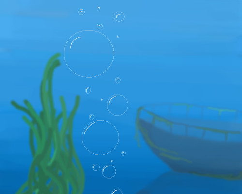
Practicing with transparency
davincipoppalag (Aug 15, 2005)
Ya..thats a tough one to draw... for sure.. I sent you the hair tutorial link, btw..in memos
hideyourface (Aug 15, 2005)
it lacks detail. And the bubbles should be smoother. It's a good idea to try drawing circles freehand. |
| ||||||||||||||||||||||
|
Namori
(Aug 14, 2005)
mermaid under the sunlight...
~unwritten_law_girl~ (Aug 15, 2005)
its pretty!
hideyourface (Aug 15, 2005)
i think the front of her should be shaded since the light is coming from behind. If not that, then it should at least have some more darker shading. Also, her hairline is a but too high up and her left arm is a bit too long. That's all I see wrong with it. It's still very pretty.
fleeting_memory (Aug 16, 2005)
I like the gold on the tail and around her arms
Namori (Aug 26, 2005)
hmm...yeah, it does look kind of awkward since the light is coming from behind her and her front is still very light...thanks for pointing it out to me, hideyourface! :D I'll try to make sure not to make that mistake again. |

| ||||||||||||||||||||||
|
fleeting_memory
(Aug 15, 2004)
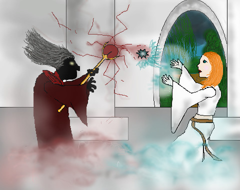
scene twoTo understand this for all of those who weren't here for the beginning go here: http://cellosoft.com/2draw/view/26686/ |
| ||||||||||||||||||||||
|
frenchtoast
(Aug 15, 2005)
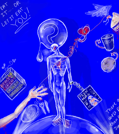
Decided to vent my frustration in a healthy way: through my art. Ugh, I hate societies standards on things these days and what horrible ingredients are in most foods... Anyways, not sure if this is intermediate level or not, but enjoy anyways? :D
fleeting_memory (Aug 15, 2005)
looks fine to me. I like the whole effect of being chained to gossip and the 'social' way of life. Cool glassy looking effect.
HunterKiller_ (Aug 15, 2005)
The blue and glass things go together well. Me likes.
Namori (Aug 15, 2005)
I like the drop because I can never color drops well...T__T
Xodiak (Aug 15, 2005)
Xod likes how you made everything look so glassy and pretty. Great drawing! >:D|XOD| |
| ||||||||||||||||||||||
|
fin
(Aug 15, 2005)
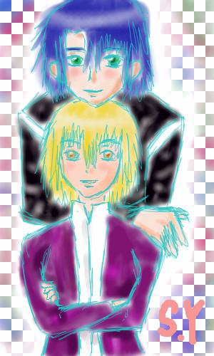
HI This is my first picture. my HomePage : http://www.angelfire.com/gundam/pythoness/index.htm
Namori (Aug 15, 2005)
Yay! I love Gundam Seed!! I love the background, so colorful!
hideyourface (Aug 15, 2005)
I think if you'rre going to colour with the airbrush, you need to focus on details. Also, I dont know about the colour of the lines.. and they're still pretty sketchy.
fleeting_memory (Aug 15, 2005)
very nice for a first picture, but you've got lots of room left-dont be afraid to tidy it up a bit :)
fin (edited Aug 15, 2005)
Thank you for the comments. I will try to draw better next time.^_^ |
| ||||||||||||||||||||||
|
Miss_DJ
(Aug 14, 2005)
night water
davincipoppalag (Aug 14, 2005)
well ya better get outta the way..cuz it looks like it's comin here! nice!!
Miss_DJ (edited Aug 16, 2005)
I have to admit poppa, you inspired me to try this after I saw your latest masterpiece! hopefully, with a little luck, the apple won't fall far from the tree! (ugh..sorry I gave up on this one..it was better before..)
davincipoppalag (Aug 15, 2005)
awwww.. lol I hope ya don't fall at all! |

| ||||||||||||||||||||||
|
TaCO
(Aug 12, 2005)
crap
hideyourface (Aug 13, 2005)
oo, I like all these colours together.
Deformed (Aug 14, 2005)
Bitching. Simply bitching.
hideyourface (Aug 15, 2005)
its bitchin' not bitching. duhhhh. gawd.
Namori (Aug 15, 2005)
the colors....it's so pretty.. |
| ||||||||||||||||||||||
| |||||||||||||||||||||||
| 2draw.net © 2002-2026 2draw.net team/Cellosoft - copyright details - 6.34sec (sql: 34q/6.22sec) |

I agree with KH44N