| |||||||||||||||||||||||
|
IDontLookTooGoodInPink
(Dec 2, 2003)
just the lineart.. :3 it took more like 20 min..but i was talking to people.. damn them! -hiss- he's so cute! XD |

| ||||||||||||||||||||||
|
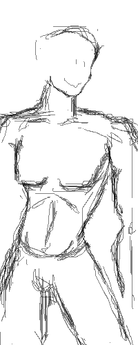
darkk_angel
(Dec 16, 2003)
Tee hee hee... Well, I have a tendency to save often.... Practicing male anatomy....
tappie_chan (Dec 16, 2003)
he does, indeed seem to be quite sexy...i eagerly await completion ^___^
Porcelain (Dec 16, 2003)
Hah, cute smiley face. :P
darkk_angel (Dec 17, 2003)
thanks, dudes!!! Im sorry for not being on here for so long! |
| ||||||||||||||||||||||
|
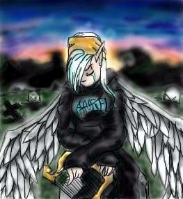
pyrobarbie
(Dec 16, 2003)
Never take what you have for granted...love the people you know now, you never know when you might loose some one unexpected. One minute they'll be there but you never know in the next. Some one you never realized you really remember could be gone in an instant...don't regret not remembering that someone, because you never know when they leave. The pain and thoughts are hard but the memories of that some one live on in your heart, the memory really makes you realize how much it actually hurts to loose someone you knew. Who was standing right there next to you, who you never thought to give a second look, who you didn't remember.This is for that someone...
Porcelain (Dec 16, 2003)
The wings are utterly beautiful. The shading (like mine) could use a bit of work -- particularly on the clothing. Maybe you just need to clean it up a bit? But the lineart is adoration-worthy.ok i tried to fix the shading but i'm not really good at it
|
| ||||||||||||||||||||||
|
Raindrop
(Dec 16, 2003)
Nothing special |

| ||||||||||||||||||||||
|
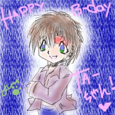
dothacker
(Dec 1, 2003)
THIS IS TATSUHA'S PRESENT!!! ^_^ finally done!!! >.< c() *Kumagoro BEAM! HAPPY BIRTHDAY TATSUHA!!! (December 21st)
Lark (Dec 3, 2003)
Oohh!!! Chibi!!!! Woooosh!! Pretty!!!
Maiko (Dec 14, 2003)
tee hee, very very cute ><Tatsuha is very lovable, but he's weird @.@ draw kumagoro XD
Lark (Dec 15, 2003)
Something something draw bunny something something along those lines.[Edited by a moderator because this user failed to read the rules. (Again.)] |
| ||||||||||||||||||||||
|
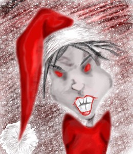
Krystiana
(Dec 14, 2003)
So I've figured out that any red loses a lot of quality as you work on the picture. It gets a lot of random pixels in it. That sucks. Oh, well. Yeah. This is how I feel right now. I like the whole "season of giving" thing, but I don't even have enough money to keep up with my own regular payments. Can't even buy christmas presents for anyone until I get my next paycheck. (Not to mention I'm completely broke right now. I've got about $1.03 in my checking account. I hate money. Stupid materialistic crap.)
strangeoid (Dec 14, 2003)
Very scary.... And yes, I believe the brighter colors are lost a bit in the transfer. Cool piccy, and the description does help explain a lot. ^^;; |
| ||||||||||||||||||||||
|
dothacker
(Nov 26, 2003)
umm.. haha. I haven't been on for a while sorry, ne? ^_^ yep another failed atricle. please commetn as you wish. *walks steadily away*
elana (Dec 10, 2003)
This is a good drawing as well, only it needs some shading and background! Hurry and finish, I wanna see the end result! : Dyahoo~! ^^ finished!! *cheers* okay, now I shall get back to my homework. one more thing.. forgot to say.. it's the wonderful and cute KAFEI~! ^.^ (I don't think I made it quite well... I was in a HUGE rush...
Maiko (Dec 14, 2003)
kyutsuu ><i love how you did Kafei, you should fix the side of the Keaton's body, it looks like the tail is connected to the shoulder, but it's a nice pic ^^ hehehe... thanks a bunch for the correction. ^^ hope this one's better! *bows* domo arrigatou!
|
| ||||||||||||||||||||||
|
Vinegar
(Dec 10, 2003)
Andy Kaufman wasnt the only man on the moon :)
Parelis (Dec 11, 2003)
Great subject! Can't wait to see that spacesuit rendered as well as the moon surface is.
Childlike_Vampire (Dec 11, 2003)
I'm loving the reflection on the visor. saweet!im not feeling to well so i quit early.. finish l8ter
MC.Cracka (Dec 14, 2003)
nice shading and reflection. |

| ||||||||||||||||||||||
|
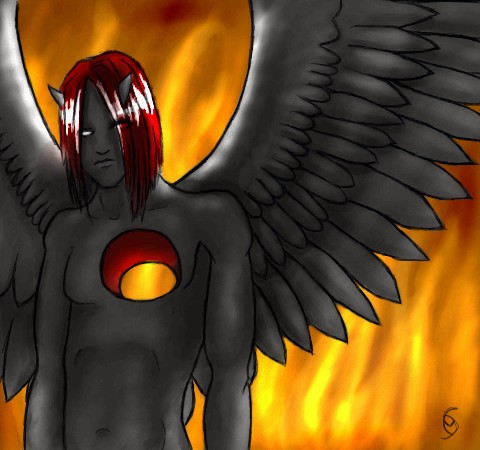
mazi
(Dec 12, 2003)
started out as an angel guy.. buy hey.vbxcvbxvhdhfgBFHF
Parelis (Dec 13, 2003)
Whatever it started out as, the final product is a winner. I wonder though, should those white highlights have some yellow or orange in them from the firelight?
Fin_beast (Dec 13, 2003)
That is really cool. :D. It looks really shit from the thumbnail tho. *Shoots him again at close range with 12 boar*
MC.Cracka (Dec 14, 2003)
nice depth in the hole, and great fire in the background |
| ||||||||||||||||||||||
|
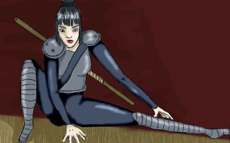
Krystiana
(Dec 7, 2003)
Drawn to get away from the hell that is repeat airings of "Ernest Saves Christmas."Once in a blue moon, I draw hands that I don't cringe at the sight of.
Deformed (Dec 13, 2003)
she looks kool! |
| ||||||||||||||||||||||
| |||||||||||||||||||||||
| 2draw.net © 2002-2026 2draw.net team/Cellosoft - copyright details - 4.36sec (sql: 40q/4.30sec) |
drawn in 1 hour 1 min
drawn in 35 min