| |||||||||||||||||||||||
|
tjock
Fin_beast
(Jan 1, 2004)
......
RabidMalikFanGirl (Jan 1, 2004)
Scary... very scary... But interesting!!!
angelbate (Jan 1, 2004)
yes, an intersting style, i like the loose sketch style. |

| ||||||||||||||||||||||
|
pyrobarbie
(Jan 1, 2004)
just a fairy in the woods.....
IDontLookTooGoodInPink (Jan 1, 2004)
i like the colors and everything. the over all tone is in check with everything, which is cool. But i think her hand is too small..
Sixelab (Jan 1, 2004)
wings are very nice, the lower half of the body is a little short me thinks, if she stretched her legs out they'd be a wee bit small, very well done though!
ky (Jan 1, 2004)
Wow, that's amazing. Please draw more and whatnot.
Childlike_Vampire (Jan 1, 2004)
I love the shading and the lineart on the wings. Her bo0b might be a lil too high. This pic is damn spiffy. |

| ||||||||||||||||||||||
|
Sixelab
(Sep 15, 2003)
an old tea cup full of dead flies
mazi (Sep 27, 2003)
ooh nice. like the shading on the neck. (though someone stole the colors.. >_>)im assuming your talking about the white not cooperating.. you can put the bg on and erase it when youre done in places like the eye and the arm.. poof.. things.. lol.
Renmazuo (Sep 27, 2003)
Lol, i ALWAYS mess with layers^_^For a first time is more than really good, plus i just love that colour^_-Maybe the right shoulder is just a little bit off?Nyahaha!Anys i wouldn't be able to do a body like that with a mouse^O^Good luck with your future attempts!
Xodiak (Jan 1, 2004)
You must make more drawings! >:D|XOD|
IDontLookTooGoodInPink (Jan 1, 2004)
omg draw more! I love the shading! |

| ||||||||||||||||||||||
|
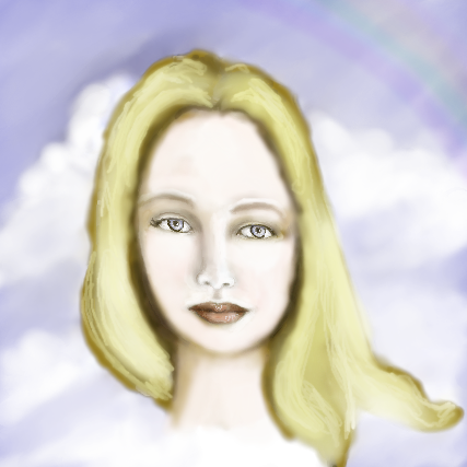
kstew
(Dec 28, 2003)
just playing around with the program
evil_cloud (Dec 28, 2003)
whoa, first one? Amazing!
strangeoid (Dec 28, 2003)
Great for a first picture! There is only one things that bothers me... it looks like she got stretched out diagonally. Very pretty girl, and the rainbow in back is nice, too.
kstew (Dec 29, 2003)
I see the crookedness and stretch....I'll have to try again...thanks for the comments!
Sixelab (Jan 1, 2004)
its beautiful but there isnt really a strong light source, which takes away from it looking like its a round object. nevertheless, its fantastic, i like the rainbow, nice and subtle. |
| ||||||||||||||||||||||
|
Porcelain
(Dec 16, 2003)
There you have it. Oekaki-Shi Painter.
Knockoff (Dec 17, 2003)
Hah,.Really nice porce. I especialy love the shading and the backgrond. =).
Edward (Dec 17, 2003)
OO!!! I luv the shading!!! And the BG!!! And the picture!!!except for the hand i think it looks a lil weird ^^;
Porcelain (Dec 17, 2003)
The hand 'does' look weird. But I'm too lazy to fix it -- good eye for catching it though.
IDontLookTooGoodInPink (Jan 1, 2004)
I love the background with all the colors.. And the bright colors contrasted with the girl and her kind of stoney colors.. she looks cold. |

| ||||||||||||||||||||||
|
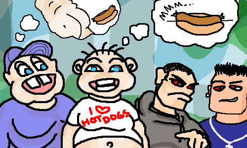
mikhail
(Dec 30, 2003)
how could u go out in public wearing a "i love hot dogs shirt" with ur gut hanging out and expext NOT to get beat up???
hannah_banana_2002 (Dec 31, 2003)
makes me wanna puke
tappie_chan (edited Dec 31, 2003)
the thug dudes are sexy... in a pure evil sort of way. you beat up a dude wearing an "i love hot dogs" t-shirt? man...thats wrong... *takes off her 'i love hot dogs' t-shirt* cool style though.
marcello (Jan 1, 2004)
I think this is good place to link to. the meatrix.
mikhail (edited Feb 19, 2004)
. |
| ||||||||||||||||||||||
|
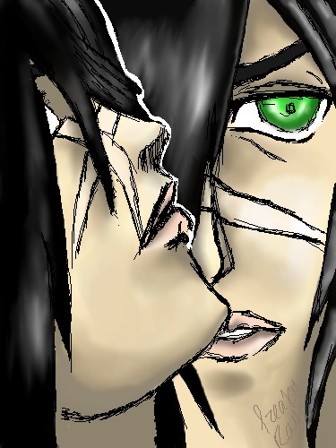
IDontLookTooGoodInPink
(Dec 31, 2003)
Omg ok.. i actually..only drew *this* image for like ten min..i drew two other things..as i think you can see on el animation. his name is draco..and hes rawr! i shall finish it tomorrooooooow.amd its Finished!
strangeoid (Jan 1, 2004)
He is indeed quite rawr! I love his profile.
ky (Jan 1, 2004)
Nice scars. I like how you did two views of him. |
| ||||||||||||||||||||||
|
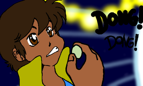
evil_cloud
(Dec 31, 2003)
Yes every 2draw user hehe LOL
PurpleLlamasRcoming (Dec 31, 2003)
very good! i like it! i'll...uh....be sure to gulp a )small( grape to reduce the risk of choking.
tappie_chan (Dec 31, 2003)
yay! happy new year! very nice and graphic looking. now he REALLY reminds me of cyborg 009, or maybe another character i've seen...anyways, i love your style!
strangeoid (Dec 31, 2003)
Yes!!! More of my future husband!! *cheers wildly* He is quite the cutie. *stops herself from drooling everywhere*
evil_cloud (Jan 1, 2004)
choke choke, and... 12 grapes ^^ |
| ||||||||||||||||||||||
|
raenboe
(Sep 20, 2003)
Sorry for the crappy background. :( I can't do backgrounds very well. C&C Welcome!
raenboe (Sep 30, 2003)
Oh. Yes. Right. lol :)
SandyDexHamtaro (Nov 17, 2003)
I fink she looks like Sango...but then again she doesn't...I'm so confused! *throws fork over shoulder*
PurpleLlamasRcoming (Dec 31, 2003)
i think she looks kind of like kikyo from inuyasha, but heck i've only seen 5 1/2 episodes of inuyasha NEway. nice pic raenboe! very detailed shading and lineart. |

| ||||||||||||||||||||||
|
Loogie
(Dec 30, 2003)
It is all purple and stupid looking- hooray!I suffer from artists block, all I can draw lately is eyes. That makes me sad. :'( |

| ||||||||||||||||||||||
| |||||||||||||||||||||||
| 2draw.net © 2002-2026 2draw.net team/Cellosoft - copyright details - 5.78sec (sql: 34q/5.70sec) |