| |||||||||||||||||||||||
|
fuzzy elf
rydicanubis
(Dec 6, 2003)
a quick'n'dirty one-layer sketch of 'crawler...always been, always be my favorite character from that world...
Gothic_Otaku (Dec 7, 2003)
*is speechless* :'O Nightcrawler is my favorite character besides Mistique.
Tamuriil (Dec 8, 2003)
o__O; Mistique scares me.But I luff Kurt! ^_^ *snuggles him*
Deformed (Dec 10, 2003)
Two words: MIGHTCRAWLER ROKS!!! nice light effect! it gives him a mysterious look.
Aimee (Dec 21, 2003)
AAAH! I LOVE NIGHTCRAWLER! This is really good. The shading, and everything. Oh, my...he's so beautiful. *dreamy sigh* |

| ||||||||||||||||||||||
|
The_Chosen
(Nov 29, 2003)
man i should finde somthing else to do ive ben oekaking all day -_-
Childlike_Vampire (Nov 29, 2003)
This is very pretty, I especially like his wings! Nice smooth lineart, and I dig the coloring. I like the snowy feel, as well. He looks kind of nice for a demon, lol. Nice!
Porcelain (Dec 21, 2003)
Wow.. That's fking beautiful. o_o |

| ||||||||||||||||||||||
|
Parelis
(Dec 11, 2003)
My CRKT folding knife glows funky blue in the monitor light.
marcello (Dec 13, 2003)
it has a background.
Parelis (Dec 13, 2003)
I actaully was going to draw it sitting on my tablet, but I decided to just add the shadow and move on to other things. It would look nicer with something in the BG and with that scribble gone, but I was really just interested in trying to replicate the effect of multiple light sources on metal. I'm happy with what I did in that respect, and learned a bit more about using the app.
MC.Cracka (Dec 14, 2003)
completely KICK ASS, but the bolt on the top of the blade is transparent.
mikhail (Dec 21, 2003)
hah. i have that same knife, except its not two-tone, very nice... |

| ||||||||||||||||||||||
|
Childlike_Vampire
(Dec 14, 2003)
Chicks can do it in a dress.
marcello (Dec 15, 2003)
this from a reference?cars were pretty big back then.
Childlike_Vampire (edited Dec 15, 2003)
Oh, duh, the reference. Thar.
mkkmypet (Dec 16, 2003)
Right on! Very nice picture.
Fin_beast (Dec 21, 2003)
This looks better than the original. :D |

| ||||||||||||||||||||||
|
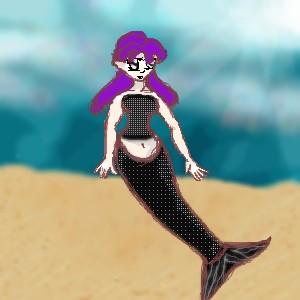
Gothic_Otaku
(Nov 22, 2003)
I WILL finish this...I promise. I will get to this as soon as I can....
Harmanye (Nov 24, 2003)
Looking great so far G_O, But if she's underwater, should the hair float aroundmore? Perhaps? *shrug*The hands are good, but the right one (her left) looks backwards, like the palm is facing us. I like the tail as well. Good job, finish soon ^_^ coloring.
Oh great. I hit the darn limit. And now I notice it needs a lt more fixin'.
Krystiana (Dec 20, 2003)
The light shining down through the top down through the water is a nice feel. |
| ||||||||||||||||||||||
|
Porcelain
(Dec 18, 2003)
Merry Christmas, everybody!Don't forget to share your X-Mas Spirit and donate to 2draw. :) We need more theme-settings! :P
ky (Dec 19, 2003)
Thanks, Porcelain.
marcello (Dec 19, 2003)
where is your site?
Childlike_Vampire (Dec 19, 2003)
Yay! The candy cane striping SO tops it off. I like her expression and cute pointy looking teeth. The lack of nose is fun too. :D
ky (Dec 20, 2003)
MarcelloOn some random IP server. |

| ||||||||||||||||||||||
|
Aunvi
(Nov 29, 2003)
The reason this isn't hidden is because I need some help on the tree. The way it's bending doesn't look right and it's irritating me a little >_0. Anybody got any ideas? And This didn't take me 17 seconds I actually accidently closed the browser and I had to go looking in my history for this url, and I didn't want to lose it again, and I needed opinions, and I need to get to bed. so psshht. stupid stupid stupid. Took me an hour or so to do.
tappie_chan (Nov 30, 2003)
the tree looks wonderful!I may have tp finish this all in one blow tomorrow if I get a chance to finish my homework ><. The afterimage faded away for the time being it will be back soon though, and I opaqued the ....decorater except for his outline because I couldn't resist.
Pretend that I didn't say tomorrow in v4. Sorry the roof of the thingy in the background being all crappyish. You can compliment the fake candy canes though :). I like it as a thumbnail...you cant notice anything wrong with it.
Childlike_Vampire (Dec 20, 2003)
Oh hey those candy canes do rule my world. Very cool, I love the subject, too. lol And dude's expression. ^_^ |

| ||||||||||||||||||||||
|
Snoozy27
(Sep 8, 2003)
The only part I really like so far is the eye. Blaaah.
Snoozy27 (Sep 10, 2003)
Snoozy is also under the impression that all children are deranged little monsters. ...And why is she typing in the third person?(heh, thanks for the comments/worship. :D) Darkened the eye a bit. I think it's finished now.
Hakkai (Sep 12, 2003)
It kinda reminds me of one of the Beatles.. Somehow.Might be the hair, or the drugged look. -shrugs- Shnazzy looking none the less!
IDontLookTooGoodInPink (Dec 20, 2003)
that is so awesome. i love the shading. and the eye is really cool. awesome job. |

| ||||||||||||||||||||||
|
mikhail
(Nov 25, 2003)
the female form at its best...
tappie_chan (Nov 29, 2003)
what is the white thing in the lower left-hand drawing? *looks down* don't see one of those...lol! seriously, what is it supposed to be? her clitoris? (looks like shes sprouting a penis^_^). i'm not trying to be critical, i'm just curious.
marcello (Nov 29, 2003)
hair maybe?
Neko (Dec 2, 2003)
Them tits on upper lefthand picture look silly. Not even the XXXL-boobsized bimbos have anything like that.The rest of the pics look a lot better. Though what really annoys me is the amount of white background. For these kinds of scribbles a smaller canvas would suit better.
mikhail (Dec 20, 2003)
hahah tappie, thats supposed to be pubic hair |
This is hidden because it is rated 18+. Edit your privacy settings to make it visible.
| ||||||||||||||||||||||
|
ky
(Dec 9, 2003)
The thing in the back is supposed to be a sort of horizontal form of transportation.
Childlike_Vampire (Dec 18, 2003)
This is extremely cute and wonderful. I want to take the dragon home as my little pet! Prettyful shading, and nice smooth lineart, I'm just wishing it wasn't wobbly! ^__^ Nice bg, as well.
Porcelain (Dec 18, 2003)
The background: Tres adorable.
marcello (Dec 18, 2003)
wow a picture with more than 2 people... that's unusual.
mikhail (Dec 20, 2003)
yeah this is great, i like how theres people, and how the dragon looks likea drunk |

| ||||||||||||||||||||||
| |||||||||||||||||||||||
| 2draw.net © 2002-2025 2draw.net team/Cellosoft - copyright details - 4.59sec (sql: 38q/4.55sec) |