| |||||||||||||||||||||||
|
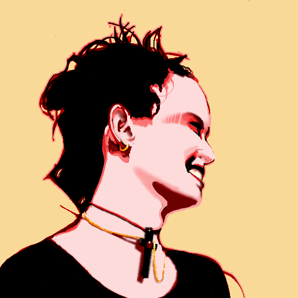
Axil62
(Jul 7, 2004)
Inspiration: A photo of my oldest daughter and Kasha's fantastic work. |
| ||||||||||||||||||||||
|
Fin_beast
(Jul 5, 2004)
I saw the other kitty by Gigandas and thought I'd do one. :)I used a reference and I will probably post it when I'm done. Soon... he will be finished.
davincipoppalag (Jul 7, 2004)
I like the eyes but I think the mustache and beard are too neat
laurael (Jul 8, 2004)
The eyes are wonderfu, and so is what you've done with the fur, so far...finish soon, please... :)
Bumble_Beez (Jul 10, 2004)
Very good! I agree, the eyes are nice!blah
|

| ||||||||||||||||||||||
|
Kasha
(Jul 6, 2004)
s
Aubrey (Jul 7, 2004)
I think the nostrils are botherin you cause the picture you're drawing from is black and white so they're not the focal point on it cause everything else is the same. When ya make it color with black nostrils it makes them more prevalent. But I think the eyes take away most of that anyhoo, beautiful eyes!
Kloxboy (Jul 7, 2004)
Nice work, have anice trip.
Childlike_Vampire (Jul 7, 2004)
Oh but it's damn spiffy anyways, what a pretty picture. I love the use of canvas space, and the eyes...*sigh* the eyes are beautiful. As I'm sure you are as well, since it is a picture of you! Nice pichur. :D
emmamommalag (Jul 8, 2004)
This is great, Kasha. Gee, you're a cutie! :) |

| ||||||||||||||||||||||
|
The_Chosen
(Jul 6, 2004)
I thought I might have needed more space than on intermediate that�s y I posted here if any mods c this & think it�s crap feel free to move it...not much else to say...my hand hurts...*yawn* Edit: Ur right mazi light & shadow can make or break a pic. I went back & shaded the face a bit more. I think this came out pretty good considering that I�m self taught ^^. Thnx 4 the comments people XD
mazi (Jul 11, 2004)
you could have posted on intermediate and asked for more space there. as it stands this is pretty good. my only complaint would be his face. it lacks definition. seems there should be more shadows and highlights according to the bg. reminds me of this drawing by estrigious.com's mel.i think you have great potential and could do a lot with a little more study on light/shadow. lighting effects can really make or break a pic.
Urei-sama (Jul 12, 2004)
mmm sexy. tatterd wings make big points with me... i like it
cherikit-chan (Jul 12, 2004)
OMG!!! I love his wings!!! And the title is awesome and so is the way you drew him!touch up... the timer`s off
|

| ||||||||||||||||||||||
|
dixielandcutie
(Jun 4, 2004)
sumthin i really wanna do well...PLEASE please please...c&c...
davincipoppalag (Jul 6, 2004)
Now.. tell us what jellybiener is talkin bout dix..come on spill!
Rosemary (Jul 6, 2004)
great drawing :)
dixielandcutie (Jul 6, 2004)
aw, thanks yall...and youre right ko...i could have spent more time on it...but, circumstances being what they were, i decided to callit done;pand davin, lol, shes talking about a website im trying to make...but, it's nowhere near done...lol...but ill leeecha know ;p thanks again
Hell_Boy1 (Sep 18, 2004)
You draw realy good keep it up and you could become famous. |
| ||||||||||||||||||||||
|
DeadlyBlondeArcher
(Jul 4, 2004)
Water
The_Chosen (Jul 6, 2004)
wow it`s so...wet... makes me thirsty XD
Supergurl103 (Jul 9, 2004)
wow, nice dba.. was away for awhile and u keep drawing good arts :S nice, dba, love to see ur art again ;)
Pence (Aug 17, 2004)
...how did you do that it's amazing.
Mipunai (Aug 17, 2004)
Wow, this is awsome, I love the water X3 |

| ||||||||||||||||||||||
|
15 comments
– latest 4:
Axil62 (Jul 4, 2004)
The stripes on the face look like shadows of barbed wire. I think that's the coolest part.
DeadlyBlondeArcher (Jul 4, 2004)
They are... I wondered if anyone would see that.
Zack (Jul 4, 2004)
I would have posted earlier, but Clox stole my comment. To me the lines across his face and curious texture to the right make it seem like he's unraveling. Nice work!
mangaflip (Jul 5, 2004)
i adore the eyes the effect and colour very good !nice! |

| ||||||||||||||||||||||
|
starmarked
(Jun 22, 2004)
Used a reference picture, but I changed some of the details. I am finaly glad to be finished with this one, it did take me a while but not as long as the timer says. Sometimes you don't realize how much detail there is in a picture.
coward-san (Nov 1, 2007)
it's amazing the contrast between red/orange and black color
Debrosi (Jul 16, 2008)
beautiful... love the colors!!!
betty96 (Mar 29, 2010)
I like the colors .....and the sky too.........good job!!!
davincipoppalag (May 2, 2020)
Still looks great |

| ||||||||||||||||||||||
|
DeadlyBlondeArcher
(Jun 29, 2004)
I wanted to paint some fireworks, so I did this from a pretty photograph I foundMost every year I get together with my brothers and we set a good example for all of our children by shooting roman candles at each other, wiring bottle rockets together and holding stuff in our hands until it almost (just almost) explodes, lighting the whole package of black cats and throwing it at the neighbor's annoying dog. It's still not as much fun as when I was little and my uncle would help us build homemade stuff out of gunpowder, foil, matches and stuff. Can't do that sort of thing anymore... it's dangerous.
Anna (Jul 1, 2004)
wohoo! Excellent. Your description reminds me of what I still do, too! :D FUN FUN FUN! I looooove the colors in the water! Just gorgeous!
davincipoppalag (Jul 2, 2004)
Gorgeous work on the reflected colors in the water! The shellbursts are particularly good also!
laurael (Jul 2, 2004)
This is just spectacular looking dba...wow. What G said about the colors reflected on the water...yeah. The Queen Mary, huh? I was so close to this ocean liner one time, I reached out and 'touched' it.... :] Awesome ship, awesome artistry, dba.
Aubrey (Jul 2, 2004)
I wish I had a view of the fireworks from there lol. Hope they don't get rained out this year.. seems to be a plague here lately :-/ |

| ||||||||||||||||||||||
|
EverDream
(Jun 29, 2004)
I'll try to get a better background on this sometime later...for now, I'm leaving this as finished. Hope it's not too bad. X(Char. Tandel and Falen (right to left) belonging to Adele Sessler.
Zack (Jul 2, 2004)
This is much better than animation cell quality. The shading in animation ('cell shading') is usually limited to two or three distinct shades per color. I think the kind of shading here is called 'gradient,' and to produce an animation where every frame was shaded to this kind of gradient quality would be an utterly insane undertaking. The shading in Disney movies is better than most, but still not this quality.As for Disney itself, I have no doubt ED could get a job there. But unless you're 'the best of the best', you'll end up doing little more than drawing repetitive frames of someone else's characters to smooth out the work of the lead animators, and might not even get your name in the credits. Additionally, while working for Disney, any artwork you produce, even at home with your own utensils, belongs to Disney. I would hate for ED to work where her art would go unappreciated.
EverDream (Jul 2, 2004)
Thank you for your support Zack. I've considered working for the Disney companies long ago, but the idea of sitting constantly and repeating drawings of something someone else came up with just didn't appeal to me. You don't even get to colour them you know? Any wayz I'm shooting for one of three things, either becoming a digital illustrator, a game character designer, or tatoo artist. :D
Aubrey (Jul 2, 2004)
I like the lighting and you did the shadows of it really well! The colors are great too :-D Another great picture by Everdream.
Cordelia_Pink (Jul 13, 2004)
oooh they both look cute. lol I prefer the blonde one. XD hehe wow, awesome. |

| ||||||||||||||||||||||
| |||||||||||||||||||||||
| 2draw.net © 2002-2026 2draw.net team/Cellosoft - copyright details - 1.21sec (sql: 34q/1.16sec) |
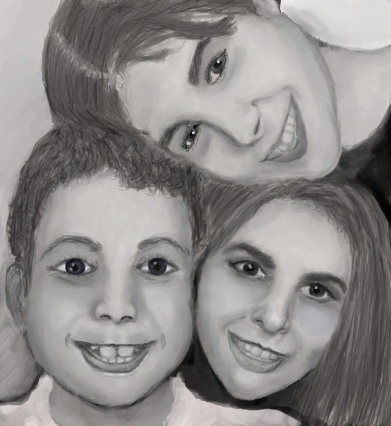
Edit: Seen your youngest, seen your oldest. But I still don't know how many girls you have. All I know is they're beautiful and probably taking after their mother. I mean because of the very lovely and distinct asian features, not that they couldn't have inherited their good looks fro.. ah forget it.