| ||||||||||||||||||||||
| Public Boards/Beginner | ||||||||||||||||||||||
|
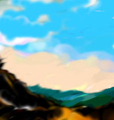
In the valley
Simonsays
(May 9, 2005)
Testing!
davincipoppalag (May 9, 2005)
Nice looking landscape! good colors. It looks a bit like the kind of scene that N C Wyeth would put his characters in, when he would illustrate books.
hideyourface (May 9, 2005)
wow.. That picture is awesome. The colours go really well together, ans the strokes.. I dont know, it's just really good. |
| |||||||||||||||||||||
| Public Boards/Advanced | ||||||||||||||||||||||
|
The_Chosen
(May 8, 2005)
Fudge Monkeys! I sent it to the wrong one. It wasn�t meant for advanced. * Sigh*-_- I guess It can stay... edit: DONE! ^_^
Pence (May 9, 2005)
This turned out wonderful, good job!
p3ndragon (May 13, 2005)
Wicked awesome job...You are an amazing artist...
SanzoGirl (May 14, 2005)
Gaara! *Glomps*
Animegirl250 (May 16, 2005)
This is awesome. it should BE on advanced in the first place. everyone likes to draw him it seems. |

| |||||||||||||||||||||
| Public Boards/Beginner | ||||||||||||||||||||||
|
hideyourface
(May 8, 2005)
some weird, quick picture..of link.. fire temple..? bananas..... k bye!
Shanghai (May 8, 2005)
Actually I think it looks pretty finished to me. There's a few places that might use a little more definition like a bit in the legs, but the blurred colors are a perfectly valid way of doing things. Since the blur is mostly horizontal and since the background is a very warm color it looks like he's in the middle of a fight late in the evening, running around trying to out manuver his enemy (in this case, the viewer).
TaCO (May 8, 2005)
O.O So warm!!!!Great job Bob
hideyourface (May 8, 2005)
well if anything, it was supposed to be link in the fire temple. and theres a long dragon as a boss. theres just supposed to be a lot of fire. thats the dragon on the bottom right.. But i dont think theres any pillars during that fight.. ohhhhhh well. I still dont like his eyes.
darkshadow (Jun 28, 2005)
great pic looks hot great pic |

| |||||||||||||||||||||
| Public Boards/Intermediate | ||||||||||||||||||||||
|
geekyshoes
(May 8, 2005)
.hope you like it
pandabarrie (May 8, 2005)
my first thought was Michael jackson...i like it though!
hideyourface (May 8, 2005)
are you saying that if someone drew michael jackson, it would be bad?
pandabarrie (May 8, 2005)
nooo...�_o |

| |||||||||||||||||||||
|
featherstone
(May 7, 2005)
pain in my ass
HunterKiller_ (May 8, 2005)
Haha! If that's Bono, then great picture! And those damn shades lol. Excellent stuff.
featherstone (May 8, 2005)
damn you two are smart.. no one was supposed to say that though ;) now I'm more embarrassed I x-d it 'cause it SUCKS! but I kept it 'cause it took a valuable hour of my life from me
hideyourface (May 8, 2005)
other than the fact that its pretty blurry (which isn't really a problem) and that his eyes are too far apart, I see nothing wrong with it.
Childlike_Vampire (May 8, 2005)
It doesn't suck, it looks great, I think. It looks really stylistic n junk. Besides the fact that is pretty clear as to who it is. Nice drawing!Get rid of that annoying X, yo. :P |

| |||||||||||||||||||||
| Public Boards/Beginner | ||||||||||||||||||||||
|
TaCO
(May 5, 2005)
playing with color....
K-Dizzle (May 5, 2005)
You mean to say that blurring something to hell is a style now?
Deformed (May 5, 2005)
Lol to K-Dizzle.XD Nice one.
TaCO (edited May 6, 2005)
I didn't use the blur toolEdit: Well I used It a little on the face. I just set the opacity really low. And I agree with what Hide said. |

| |||||||||||||||||||||
| Public Boards/Intermediate | ||||||||||||||||||||||
|
TheCrimsonKing
(May 5, 2005)
..and 'Sat Nam' to you.
davincipoppalag (May 5, 2005)
Damn,Joe. You have umpteen hidden talents, too. This is reminiscent of one of those cartoon monster movies.
hideyourface (May 5, 2005)
I reallyyy like the colours and the eye.
Anna (May 5, 2005)
Ohhh this drawing is so pretty and it makes me happy!
Kenshin (May 5, 2005)
I like the colors on the.. spikey thing x_X Nice and smooth :o |

| |||||||||||||||||||||
| Public Boards/Beginner | ||||||||||||||||||||||
|
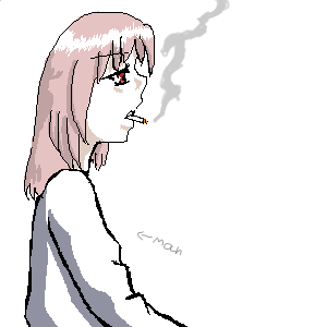
Mafuyu
(May 5, 2005)
With long hair. u_u
Maiko (May 5, 2005)
FEMME MAN! *lurve* XDDD he's pretty~~ though smoking murders your lungs and kicks your grannies ;_;
hideyourface (May 5, 2005)
he looks girly, probably because of his thick, pointed eyelashes.
Animegirl250 (May 5, 2005)
thanks for the arrow or i would still think its a girl. *walks away thinking its a girl* |
| |||||||||||||||||||||
| Public Boards/Intermediate | ||||||||||||||||||||||
|
Juni_gatsu
(May 2, 2005)
Yeah....a Hide picture for the matsumoto hideto memorial day !!!! ^_^um...*has just noticed timer* take about 2 1/2 hours off that time....I had to go see my horse...and didn't think that i was going to be gone that long. *shifty glance*
Nyuusen (May 3, 2005)
I love pink spider so much, it's my favorite song. This is a gorgeous piece.
Animegirl250 (May 5, 2005)
Super hot pink hair = fun
voodoobunny (Jun 18, 2005)
I love your work. They've got fantasy. The background is intresting.
sheniko (Jun 23, 2005)
Very nice. n_n The close-up on her makes this picture interesting. Beautiful choice of colors. |

| |||||||||||||||||||||
|
TheCrimsonKing
(Apr 29, 2005)
HandGo through the versions.. or else this is all you see.
Caddris (Apr 29, 2005)
That's an awesome concept. It was fun to walk through all the versions.
p3ndragon (Apr 29, 2005)
Badass, Joe.You rock, man. Keep it up!
davincipoppalag (Apr 29, 2005)
Great idea...fun to look at...
Urei-sama (edited Apr 30, 2005)
this is wild. very orignal although version four confuses me |
| |||||||||||||||||||||
| ||||||||||||||||||||||
| 2draw.net © 2002-2025 2draw.net team/Cellosoft - copyright details - 1.84sec (sql: 36q/1.06sec) |