| |||||||||||||||||||||||
| Public Boards/Beginner | |||||||||||||||||||||||
|
Koneko-sama
(Aug 11, 2004)
Oi. The last one sucked. Horribly. So I redid it. There ya go. |

| ||||||||||||||||||||||
| Specialty Boards/Contest! | |||||||||||||||||||||||
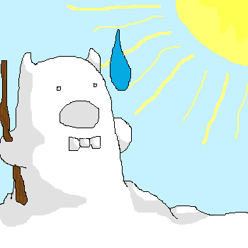
|
badgervince
(Aug 4, 2004)
Yes, the devil is a snowman.
davincipoppalag (Aug 5, 2004)
He kinda looks like Dilbert's boss buried in snow..
strangeoid (Aug 6, 2004)
...minus the pointy hair. *laughs* Marvelous.
Ty854 (Aug 9, 2004)
LOL, dave! He does. So dilbert's boss is the devil who is a snowman. Ok... i think i understand the whole heaven and hell concept now.
Pence (Aug 24, 2004)
this is so awesome. I LOVE SENOR DIABLO! |
| ||||||||||||||||||||||
| Public Boards/Beginner | |||||||||||||||||||||||
|
Pence
(Aug 17, 2004)
2draw went wacko so i couldn't finish the color, oh well... Maybe later i'll add to it. (title changed)
LovelyLori (edited Aug 19, 2004)
yeah this is cool... but ya know, and maybe I'm being a beast for mentioning it... but I can't take this "teh" instead of "the" much longer.... or maybe I'm just too old...
Pence (Aug 19, 2004)
OKay i'll change teh to the and I might draw his body, but before i was tired of it so i didn't do the body. I'll do another version then. ^_^ thanks for the wonderful comments!
Seshio (Aug 19, 2004)
O.O GREEN HAIR!! YA FOR FLOATING HEADS! Great job on Shading!!
Koneko-sama (Aug 24, 2004)
*bows down to the goddess of profiles* |

| ||||||||||||||||||||||
|
cheetos
(Aug 23, 2004)
this took longer than 6 min. more like 15.... one of my best pics... |

| ||||||||||||||||||||||
| Public Boards/Intermediate | |||||||||||||||||||||||
|
eh
(Aug 20, 2004)
Oh, woah. This is my first try at a person. A pic of the girl in my fav. band, Enon. Her name's Toko. I'm going to finish later, I'm kind of tired. I really gotta fix that eye on the right.
Jack_Fox (Aug 22, 2004)
This is really good work but I do have to agree with bumpinthenight: the anatomy is a little wierd. Her right arm and hand seem slightly disproportionate, it might just be the way you forshortened the arm but for some reason I don't think that's it. Also, her hand is too small and her neck looks just a little long (or is her neck really that long in real life?) Anyway, Loved the colors and the ideas; never stop! Peace, Jack
eh (Aug 22, 2004)
yeah that's the way her arm is shortened, it's bent. i don't know. you're right about the neck though. thanks.
bumpinthenight (Aug 23, 2004)
ooh... sorry for not coming to this earlier.... ummm, the shoulders need to be less loose and much more symetrical.... the bones in human shoulders dont quite go that bendy :)... also, it wouldve been better if you had done the shadows on the right (viewers left) shoulder using the burn function in lascaux (the dark blue circle underneath the light blue circle that is the dodge function)... using that function, you can select the opacity that you wish to use and even use a cell-shading style (with the rounded brush that has no fuzzy edges)... hope this helped... oh, it would also help if she had even a bit of a chest....
eh (Aug 24, 2004)
yeah i don't really get the burn or dodge tools ... the shoulders are like that because of the way she's leaning. and she doesn't have chest at all in real life sooooooo... |

| ||||||||||||||||||||||
| Public Boards/Beginner | |||||||||||||||||||||||
|
ironoxide_red
(Aug 11, 2004)
Well, I promised my sister to draw her a cat and I did. Not sure what board this should be on, I'm submitting it here and then the moderators can move it to Beginners if they think that's better, ok?
mx (edited Aug 12, 2004)
I think it should at least be in intermediate. (i think it has potential for going to the advanced...with work of course:) )Maybe consider adding more light to the road around the cat and add more definition to the cat. Have a play between "dark - light - dark" In other words...dont have the same tonalities next to each other, especially with the vocal point(the cat). Also get rid of the white in the top corners. It makes the painting feel very unlayered. It will seem much more finished if the white is gone:) I likes mx
Dragnakita (Aug 12, 2004)
Aww... I think that you have put this on the right board. The kitty cat is very cute. I think that you did a splendid job. I think that the bushes need a little help, though... more detail could have been added to them. The cat is really, really awesome, though. I also like the pavement. Overall great job.
ironoxide_red (Aug 12, 2004)
Oh, wait, I did put this on the Beginners board after all... Oh well. MX: Good points, though I think the whites could work - with a bit more work!:) I know I cheated a bit there, all I can say in my defense is I concentrated on the cat since my sis doesn't really care about bushes...;) Though I have a feeling something is very wrong with the perspective and/or anatomy of the cat... just can't put my finger on it.
mx (Aug 24, 2004)
well...i like it in any case:) |

| ||||||||||||||||||||||
|
mangaflip
(Aug 21, 2004)
i am searching ideas
Pence (Aug 21, 2004)
I like this so far. good jorb, can't wait to see the finished product.
damnskippytakn-a-break (edited Aug 23, 2004)
I like this! I hope you do add eyes. Kinda reminds me of a sketch artist rendering! lolSecond post: WOW, better then I could of imagined. You're missing the blood dripping from his lips. But, WOW that's what I think. ' } i add the eyes +few +color salt!:p ...
lucy_430 (Aug 23, 2004)
The mouth looks great. Nice job. |

| ||||||||||||||||||||||
| Public Boards/Intermediate | |||||||||||||||||||||||
|
DireOnion
(Aug 19, 2004)
Colorful.
damnskippytakn-a-break (Aug 21, 2004)
I knew this style and technique were familuar and it's so good that you could design cover pages for BARRONS magazine. Do they do women on the cover? lol
danc_c (Aug 23, 2004)
Dire, i think your drawing is a bit gay. But who cares, at least is nice.
DireOnion (Aug 23, 2004)
Ok, I will draw hot naked men from now on, since women are so gay. Oh, well.
danc_c (Aug 23, 2004)
fuck you :) |

| ||||||||||||||||||||||
| Public Boards/Beginner | |||||||||||||||||||||||
|
Tree-of-Dispair
(Aug 20, 2004)
wow, this turned out pretty good... its ville valo from HIM, doesnt look like him really...but you see i was just drawing a friends display picture on msn ^_^ to bad most people havent heard more than 2 HIM songs...cough-bam loving posers-cough...(i suggest everyone go buy razorblade romance)
Mipunai (Aug 20, 2004)
This is awsome, I love the hand!!! And the colors are amazing O_O
damnskippytakn-a-break (Aug 20, 2004)
COOL!!!!just a little trimming here and there, i also erased the outline so the animation didnt look like crap ^_^
LovelyLori (Aug 23, 2004)
I've been thinkin' this was pretty cool, it's time I said so ;) |

| ||||||||||||||||||||||
| Public Boards/Intermediate | |||||||||||||||||||||||
|
marcello
(Apr 12, 2002)
we'll see if it worked... |

| ||||||||||||||||||||||
| |||||||||||||||||||||||
| 2draw.net © 2002-2026 2draw.net team/Cellosoft - copyright details - 0.91sec (sql: 38q/0.58sec) |
*stares at self* If only I had that sweater... *stares more* Do I actually have that long hair? *stares until my eyes pop out* How can you still remember what I said the other day...? *Koneko-sama glares* I'll stop now.
The yellow color of the yang is probably better than the original white in this oekaki, and I'm glad that it's that color ^_^. I like the symbol, I love the swirls, and I adore the circles ^_^. The face is elegant, too, and although once again the lines could be more accurate, the figure seems almost perfect for some reason ^_^. I guess it really fits in this drawing.
I see that you haven't put any shading in this picture, and looking at it, I think it would've been nice if the left side was light while the right side was darkened to put more emphasis on the meaning inside the drawing. Yet it isn't as if it looks as if that's missing in the picture... to be honest, it looks as fulfilled as can be... except for minor adjustments ^ ^;;.
I love this oekaki: it's so meaningful *sniff*. Of course, this may be because that's ME, but still ^_^. The picture really goes well with my quote, and this whole thing inspired me to do ANOTHER poem that you have already read. It is an outlet for inspiration!
||Fantastic||
~Takeru