| |||||||||||||||||||||
| Public Boards/Advanced | |||||||||||||||||||||
|
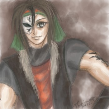
Tomb Raider
pix
(Feb 3, 2004)
Angelina Jolie
dorothyblueeyes (May 4, 2010)
very good skin tones,and skin work as to painting,nice.
Song (May 14, 2010)
wowowow... soo great :D Great work on the face, love the hair!! it looks so real, yet it still has the art feeling to it that makes it even better. Well done!
davincipoppalag (Jun 28, 2017)
front page
WolverineAlpha (Apr 17, 2021)
This is what you call a fierce girl |

| ||||||||||||||||||||
| Public Boards/Intermediate | |||||||||||||||||||||
|
marineblue
(Feb 2, 2004)
My novel's character^^;
Daymeon_StormRider (Feb 2, 2004)
Cooly very Cooly...If I may ask, what is you're novel about? I'm in the process of writing 2...3 if you count the possible sequel...their names' (novels I mean) are "Coyote's Rain", "Eye of the Shadow", and it's possible sequel, "Gaze of Blood" So yeah...memo me if ya like...anyways...on to the piccy! I love his mask, hair and jacket! **pets his jacket** hehe and the TATTOO!!! Cooly!! ^__^
Deformed (Feb 2, 2004)
novel?? are you gonna put it on 2draw because from the looks of this charecter it is gonna be pretty damn good!!!!
Gigandas (Feb 2, 2004)
Hey, it's Vega revealed (Street Fighter).....or not^^;.Actually it looks like a cross between Vega and Serge(the main character in Chrono Cross for PS).Anyways, I'd just like to say "cool character."I also like to create my own characters (not for novels, but...^^;), but they are all born from the ideas of FF since I'm a big FF fan.I even use Zell and Seymour's weird facial paints on my guys......wait a second I'm supposed to be commenting not relating ideas^^;.So yeah, overall nice job. |
| ||||||||||||||||||||
| Public Boards/Beginner | |||||||||||||||||||||
|
YukiEiriSan
(Feb 1, 2004)
So I didn't think this was even close to being good enough for the icons board.. So I stuck it here.. my ittle eyeicon.. Not done yet.. But yeah.. What you think for my first try at an eye? anyone? Anyone? C&C?
Gigandas (Feb 1, 2004)
The iris and pupil are pretty good, just make sure you don't make the eye looking like a football (very common eye mistake...).Try looking in the mirror and take a good look at the shape of the outside of your eye.It won't be an oval looking like a football.Actually, the part the eye is closest to your nose is pretty rounded as the line comes down from the top of your eye.Another thing to watch out for is how much white is above and below the iris, otherwise it will look like the person is scared.Anyways, I like the inner iris and pupil, good luck with the rest.Well.. added a bit more deetail to the bottom part of the eye... Not bad? Alittle better? What do you think?
Gigandas (edited Feb 1, 2004)
Umm....honestly^^;?I can't really tell any differences from the last revision (not trying to be mean but....><)....you know, you can't be afraid to change things more dramatically.like darkening up the skin tones so it doesn't blend so much into the whites of the eye.You might also want to add the eyelid unless this person is one of those people whose eye lid can't be seen.Another thing that always makes an eye look more relaxed is to pull the eyelid a bit over the iris.Otherwise you got the surprised look.I used to struggle on eyes before until I practiced over and over.Here's another trick when drawing an eye.People draw eyes with an outline(being the eye lashes) that goes all the way around the eye.You when you do this, you leave the center bottom (right below the iris) with the skin tone colors.It makes it look SOOOOO much more realistic.Add these ideas together and you can really make something out of it.Like I said, use a mirror.It WILL help.Hope to see some dramatic changes by the next revision^^.P.S. For some reference on what to draw, you can use my drawing "The Eye of the Wretched" to get a feel for what I'm explaining other than the surprised look thing because I intensionally made the eye look surprised in that drawing...^^;
YukiEiriSan (Feb 2, 2004)
n_n I am going for the surprised look, to be honest, so there's no problem with that. And I'm not anywhere close to a perfectionist. I'm actually happy with it the way it is.. But I appreciate the critiicism. Like I said. I'm nowhere as good as you or anyone else. .. But I'll never get better if I'm not satisfied first with what I can achieve. I think compared to my works in the past, this is a leap ahead. |

| ||||||||||||||||||||
|
3 comments
– latest 3:
Porcelain (Feb 1, 2004)
Aww, how adorable.. We have a japanese artist aboard? Sweet. 8)
graywolf (Feb 1, 2004)
I read lemons!!!!!! Yay! *mastrabates*
Gigandas (Feb 1, 2004)
Sugoku Kawaii desu><.Ore mo ichiou nihongo shyabererunde kikitaikotoga areba itsudemo ite kudasai^^.Yoroshiku desu.(<-Japanese) |

| ||||||||||||||||||||
| Public Boards/Intermediate | |||||||||||||||||||||
|
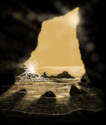
staci
(Jan 31, 2004)
Water
Mipunai (Aug 9, 2004)
Wow, shes so pretty, I love the robe, and the trees. I like her expression and her features too n_n
metalhead8363 (Aug 13, 2004)
pretty cool, nice contrast
Ty854 (Aug 26, 2004)
v.1 was wicked.
geekyshoes (May 9, 2005)
i covet that cloak!!:) |

| ||||||||||||||||||||
| Public Boards/Advanced | |||||||||||||||||||||
|
Gigandas
(Jan 28, 2004)
I actually happen to like this...^^(whoa, that's a first...)And since I like this one, as promised, I'd like to give this one to fleeting_memory^^.Hope everyone likes it too...
shell (Apr 2, 2010)
spot on
WolverineAlpha2 (edited Apr 21, 2021)
OMG I LOVE LEGOLAS YES! YAAAAAAAAAAAAAAAAAAAAAASSSSSSSSSSSSS!!!!!!!!! But the eyes are supposed to be blue not grey
WolverineAlpha (Apr 21, 2021)
Amazing! I love Legolas, not as much as Aragorn but still.
WeLoveNutella (Aug 25, 2021)
(: |

| ||||||||||||||||||||
| Public Boards/Intermediate | |||||||||||||||||||||
|
Cobra
(Jan 31, 2004)
Playing with light and water
davincipoppalag (Feb 11, 2004)
great splash..nice highlights.. nice warm lighting..
PinkuEspeon (Feb 21, 2004)
Aww... you're a lucky person... I really, really like this piece... I wish that I was that good at art....... > : I'm horrid. But, you... no... you rawk! ^_^
jasmin (Mar 11, 2004)
perfect no more words ,Iam amaze ,paralize!!! love it Nellyvette
Gigandas (Jul 4, 2004)
Wow....that is pretty friggin awesome.Actually, if you take a couple steps back and look at it, it looks like a photo^^;.Btw, where are you these days....I think we all miss your drawings :(... |
| ||||||||||||||||||||
| Public Boards/Advanced | |||||||||||||||||||||
|
pix
(Jan 29, 2004)
MODERATORS... hmm... how can I say... I need more space AGAIN... sorry... it reached the limit of 800 K... you can delete the previous edits... It will get much better, I promise!
theshadow-wolfKasumi (Jun 17, 2009)
wow that is one of the best drawling of a tiger i have ever seen
Wraith (Jan 23, 2012)
Where do these great artists go? Are they so Elite that they disappear into another realm? Get abducted by Aliens for their Eliteness?
dorothyblueeyes (Jan 25, 2012)
beautiful tiger! keep up the good work.
davincipoppalag (edited May 1, 2019)
This was done years ago.. Pix was great |

| ||||||||||||||||||||
| Public Boards/Intermediate | |||||||||||||||||||||
|
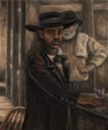
DeadlyBlondeArcher
(Jan 31, 2004)
Bill looks thirsty. ;)
Look (Jan 31, 2004)
It looks like an old movie. Awesome! I can't believe you have the patience of drawing it in 9 hours. But it's all worth it
laurael (Jan 31, 2004)
I bet the real paintings you've done are fantastic. I'd buy your paintings any day...love the dark style of them. This would look great in a room with a pool table, old western art...yeah...
DeadlyBlondeArcher (Jan 31, 2004)
Thanks, Laurael. My real ones I think are a bit better than here because I'm so new to doing this on the computer, but I sometimes wish some of them didn't turn out so dark. It's usually not consciously intentional - maybe it's just my mood at the time ;).
Gigandas (Feb 1, 2004)
Once again, great job.Unlike me, you weren't like "Eh, I drew the main person and I'm too lazy to draw another person in the picture so uh....I'm just gonna leave it the way it is..."^^;.You did a good job of bringing out the main focus, I'm impressed. |
| ||||||||||||||||||||
| Public Boards/Beginner | |||||||||||||||||||||
|
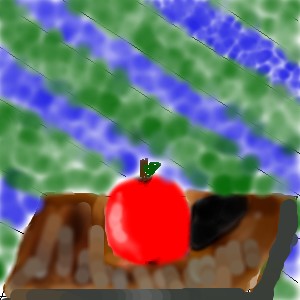
heart_songz
(Jan 29, 2004)
I was trying to practice shading...it didn't work out too well...any suggestions??
Gigandas (Jan 29, 2004)
Actually....you should have just used the dark color to create the shadow rather than mix it with the lighter one...i took another shot at it...
|
| ||||||||||||||||||||
| |||||||||||||||||||||
| 2draw.net © 2002-2025 2draw.net team/Cellosoft - copyright details - 2.43sec (sql: 37q/1.90sec) |