| |||||||||||||||||||||||
| Public Boards/Intermediate | |||||||||||||||||||||||
|
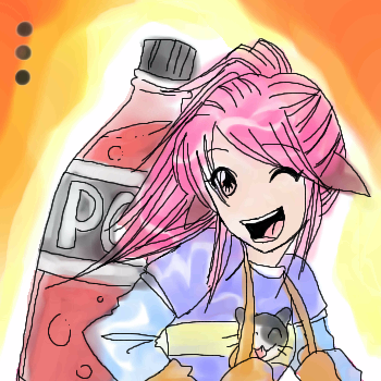
revolutions = MASSIVE BRAIN HEMORRHAGE
Snoozy27
(Nov 14, 2003)
Er, yes. I think the title says it all, really. Will finish tomorrow, or.. whenever. Yes.
Doodlibop (Nov 18, 2003)
sheesh...you ownz this. and everyone else. you are really talented. Girl Power!
Shiek (Nov 19, 2003)
Agent Smith was definately the main attraction in that movie :D The expressions in this picture are so great!
Five (Nov 22, 2003)
Hehe, this is cute!
rydicanubis (Nov 22, 2003)
absolutely fabulous, you have a way with colours... |

| ||||||||||||||||||||||
| Specialty Boards/Collaborations | |||||||||||||||||||||||
|
Lovely Sleeping Beauty (only awake. lol. I'm tired, give me a break)
1 comment
– latest 4:Going to church ^^
Meh. That's all I can do I suppose ^^
And Aurora was ready for the world... (let me know if you think otherwise)
Doodlibop (Nov 18, 2003)
Hey! this is good! Good job! |

| ||||||||||||||||||||||
| Public Boards/Intermediate | |||||||||||||||||||||||
|
JAM-BAD
(Nov 17, 2003)
didnt know what to draw, i saw this pic and thought id draw it. i liked how it looked.C&C if ya like. :)
Doodlibop (Nov 18, 2003)
real good. REAL Goood. Love it.
marcello (Nov 18, 2003)
they're as big as her head o_o
mazi (Nov 18, 2003)
haha i second what marcello said but thats an awesome style. tons of detail. and her boobs would be highlighted a bit more i think?
Porcelain (Nov 18, 2003)
I saw that picture in a magazine too. Great job of reproduction--gorgeous colors. |

| ||||||||||||||||||||||
| Misc. Boards/Sprites | |||||||||||||||||||||||
|
Harmanye
(Nov 9, 2003)
More pixelized something-or-other.
marcello (Nov 14, 2003)
I only mentioned it since you said open to suggestions. :-)I generally try to give suggestions when I can, so my posts aren't completely empty and pointless.
SuzieSuze (Nov 20, 2003)
I like this. very peacefull
Harmanye (Nov 20, 2003)
Thanks SuzieSuze ^_^ it is, rather.
foxman8245 (Mar 7, 2004)
love this one..... so soft and lovable :-) |

| ||||||||||||||||||||||
| Public Boards/Intermediate | |||||||||||||||||||||||
|
furyofroy
(Nov 12, 2003)
��5{�������� color, and I tried with halftones. Went with the halftones. :) I thought about doing a background the same way, but--- heh, hell no. So behold the wretched action lines! Just thought I'd do a pic before 2draw moves to the new server.
mazi (Nov 13, 2003)
wicked cool. nice movement and i <3 the inky/halftone effect.
Doodlibop (Nov 13, 2003)
Hm! not too shabby! me likes! though, the motion confuses me a bit. I saw the animation and I have to say that the firstish one withthe weapon shooting forward was really cool...
haruko_ryuu (edited Nov 13, 2003)
i like how it looks like an old comic book using the halftone/sketch effect! nice job!
nyao (Nov 16, 2003)
ooo... cool! ^^ the movtion shows really well. ^^ |

| ||||||||||||||||||||||
|
Childlike_Vampire
(Nov 12, 2003)
13+ for implied sexual content.
Nyuusen (Nov 13, 2003)
*yawns* straight sex, how boring...Lol, j/k, I'm a yaoi fangirl so I usually tend to get bored when it comes to straight relationships. Weird? Oh well. Anyways, it's a nice picture, the anatomy could be fixed up a bit but the coloring is excellent. Nice job ^^
marcello (Nov 13, 2003)
am I the only one who sees the irony in a yaoi fangirl?
Childlike_Vampire (Nov 13, 2003)
You know, methinks there are more yaoi fangirls than boys...*pokes the piccy* d'you notice the heart? *thought summun might of noticed it*Yeh, she kinna skinny, it's kinna this style I made, almost stick figure peoples...they're both actually meatier than I had intended...and I guess serious and sad look similar, nyah...Thanks you very much! :D
Ari (Nov 22, 2003)
*agrees with Nyuusen*Great pic, v. interesting style... Marcello: No, you're not... Though I do know quite a few yaoi fan-boys... |

| ||||||||||||||||||||||
| Information/News | |||||||||||||||||||||||
 |
marcello (edited Nov 14, 2003)
So here it is, the new server. There are probably many kinks to be worked out, and I'm still testing things, but the fact that you're seeing this page means you've got to the new server! Feel free to donate to help offset the costs of the new server. :-)
20 comments
|
||||||||||||||||||||||
| Specialty Boards/Contest! | |||||||||||||||||||||||
|
Porcelain
(Nov 11, 2003)
THEME. I didn't feel like drawing it nicely.. Nor coloring it appropriately. But you know what? I don't care. 8)
haruko_ryuu (Nov 12, 2003)
i think that it looks good still. even if you may not have taken as much time on it it turned out nice
Doodlibop (Nov 13, 2003)
very well done as usual porcelain!
Childlike_Vampire (Nov 13, 2003)
Oh cute! I love her expression, and the wittle kittie! Very nice :D |
| ||||||||||||||||||||||
| Public Boards/Intermediate | |||||||||||||||||||||||
|
mazi
(Nov 11, 2003)
augh. trying out some landscape stuff.. im so horrible at rocks -_-[p.s. thats supposed to look like snow -_-]
Snoozy27 (Nov 14, 2003)
Absolutely lurvely. Esp. love the flowing water and... well, everything else. :D
Harmanye (edited Nov 15, 2003)
*peers around* You're going to kill me, I know. Just so you know I know.Let me say that I'm not saying I could do anything half as good. There, I said that. Let me also say that the foreground part is wonderfully flawless. So that said. But. However. None-the-less. In any case. That waterfall part in the background, it's a pretty rocky place, and I'm thinking the water should be splashing around a bit more. Like... | [color=white]\[/color]\ [color=white]\\[/color]/ [color=white]\[/color]| Or something to that^ extent. Don't hurt me. I'm no expert. I mean, I can't even draw on regular intermediate yet. So there you have it. Or something like it. *shuffles away quickly*
mazi (Nov 15, 2003)
no no i really appreciate criticism. i know its flawed and i was just messing around. im really astonished its in the showcase.. o_o the rocks are so crappy. rocks hate me. i hate rocks. its a lovely relationship.
Look (Jan 26, 2004)
That's really beautiful! Ilike the background and the blocked part in forground, make it as if we are looking at it thru a cave |

| ||||||||||||||||||||||
| Misc. Boards/Sprites | |||||||||||||||||||||||
|
haruko_ryuu
(Nov 8, 2003)
its just like the classic game on the NES system. NOT ATARI nintendo company produced and licenced galaga, not atari...i dont see why so many people think that!
Harmanye (Nov 8, 2003)
NES. My grandma has that system.Never played Galaga, is it fun? I like Duck Hunt, you know; with the gun. At first glance this doesn't look like an Atari game at all, if your drawing is true to the game. Atari has more blob-like shapes in very bright colours. I think I like the little border around the picture. It kinda -adds- something, but maybe it's just me that thinks that. Cool ships, nice star field, is that a blue-winged bumble-bee?
Doodlibop (Nov 12, 2003)
ha! very well done!
Ty854 (Jul 16, 2004)
Swell. I likey. |

| ||||||||||||||||||||||
| |||||||||||||||||||||||
| 2draw.net © 2002-2026 2draw.net team/Cellosoft - copyright details - 0.92sec (sql: 42q/0.44sec) |