| |||||||||||||||||||||||
| Public Boards/Intermediate | |||||||||||||||||||||||
|
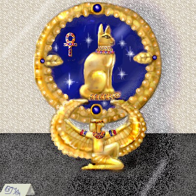
cat
brushes4
(Feb 14, 2004)
i think it turned out ok, i'm on a bit of an egyptian kick since visiting the ROM but hey, its all good :o)ok i think this has it... dont want to overwork it lol, added a few highlights and touched up a few rough edges...i'm pleased.
Gigandas (Feb 19, 2004)
That's some real nice designs you slapped on that artifact^^.That's also cool how you snuk in your sig in the tag thingy in front of the artifact XD.From the thumbnail, this picture looked like a photo.
Alinnia (Feb 19, 2004)
Hey.. I like that XD That's pretty good.
dixielandcutie (Feb 19, 2004)
oh wow, awesome shading, cool sparkles...and really neat texture. nice work!
DeadlyBlondeArcher (edited Mar 3, 2004)
Wow, how could I have missed all your great stuff? I love this...that is exactly the color of 24k and the way you got those cabechon sapphires so round and glowing is amazing. I gotta check out the rest of it! :) |
| ||||||||||||||||||||||
|
LovelyLori
(Mar 2, 2004)
well... ya see...
DeadlyBlondeArcher (Mar 2, 2004)
Yes, I do! And... did you hear...? I like the original palette you used in this. The colors work well together.
davincipoppalag (Mar 2, 2004)
interesting ..I like the patterns..looking at it one way I see an abstract Orca swimming and another I see an eye... I like how you experiment...
dixielandcutie (Mar 3, 2004)
yup yup. the pattern is very neat! hehe. i wanna be inside your head. thats be so interesting >.< ;p
LovelyLori (Mar 3, 2004)
you don't wanna be inside my head....!!!! lol... no no you don't... lol... |

| ||||||||||||||||||||||
|
7 comments
– latest 4:
Consequential_Biopsy (Mar 3, 2004)
Looks like lots of work(hole)s in space.
dixielandcutie (Mar 3, 2004)
thats pretty cool, lol. makin me hungry
15grifficorntears (Mar 3, 2004)
mmmmmm.....candy.
marcello (Mar 3, 2004)
looks more like intenstines to me than anything else... |

| ||||||||||||||||||||||
| Public Boards/Beginner | |||||||||||||||||||||||
|
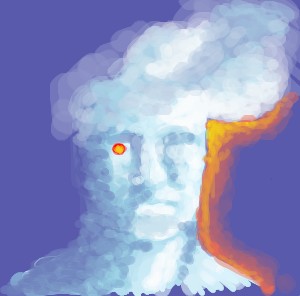
madadric
(Mar 2, 2004)
just testing, since last time i tried to submit java threw a fit. No real story, just testing out the funky applett, some nice blending modes.
davincipoppalag (Mar 2, 2004)
this is a nice effect..cloudman..
Xodiak (Mar 2, 2004)
Awesome effect!!! Hehe, Xod likes the paint style. Draw something sexy next, Madadric! >:D|XOD|
DeadlyBlondeArcher (Mar 3, 2004)
This is just cool, I love the way you shaded to make his facial features.
mazi (Mar 3, 2004)
thats awesome. love the shading effects. its so instinctive to me to blend everything to death. -_- |
| ||||||||||||||||||||||
| Main Forums/Drawing Discussion | |||||||||||||||||||||||
 |
DeadlyBlondeArcher (Feb 27, 2004)
I don't know how many ppl know this or already do it, but a friend shared it with me so I thought I'd share it with yall. I have a Wacom and don't know if it works with other types of tablets, but if you put about 3 pcs of typing paper over your tablet, it gets rid of that slippery feel when you draw, and it becomes more like using real tools, and you have more control. It doesn't affect the pressure sensitivity or anything. It takes a few minutes to get used to it, but I like it better that way...
14 comments
|
||||||||||||||||||||||
| Public Boards/Beginner | |||||||||||||||||||||||
|
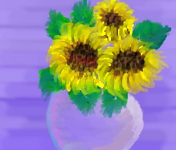
simonelle
(Mar 3, 2004)
sunflower arrangement
davincipoppalag (Mar 3, 2004)
I like the petals and the colors.. the bg needs more to keep it from obliterating the vase.. which itself could use a bit more shading and differentiation.. nice though
DeadlyBlondeArcher (Mar 3, 2004)
Very pretty sunflowers, nice and painted looking. I agree about the bg, If you darkened it some and changed the color value of it it would bring the vase forward and give this depth. Very nice!
dixielandcutie (Mar 3, 2004)
nothing to add, but it looks pretty! nice work!
drworm (Mar 3, 2004)
I like the painterly feel... sort of Impressionist and loose and cool. |
| ||||||||||||||||||||||
| Public Boards/Intermediate | |||||||||||||||||||||||
|
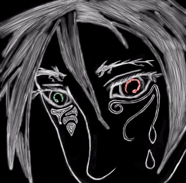
Krystiana
(Mar 2, 2004)
I may call this done, but I'm thinking I might want to smooth a few things out. But in some places I like the sketchy look... Dunno.
DeadlyBlondeArcher (Mar 2, 2004)
I'd leave it rough in places, it almost looks like a wood carving.
drworm (Mar 3, 2004)
It does have a bit of a woodcut look to it! The sketchy quality is really cool in places (I like the eyebrows a lot) but I would go back and refinish some of the lines, especially the really definite ones of the jaw and nose. The eyes are nifty too... snake eyes? :PMrrrrph. Something is bugging me about this pic, and I can't figure out what it is.
dixielandcutie (Mar 3, 2004)
i love the tattoo things on her face. thats just cool. good work |
| ||||||||||||||||||||||
|
Fin_beast
(Mar 2, 2004)
Quite Freaky?
davincipoppalag (Mar 2, 2004)
an ethereal spookthing good choice of colors very eerie
DeadlyBlondeArcher (Mar 3, 2004)
To me it looks like someone afraid of the dark, clutching a blanket. Very cool colors, I like this.
Consequential_Biopsy (Mar 3, 2004)
Rather chilling. Love the ghosty effect, and the hints of purple and blue.
dixielandcutie (Mar 3, 2004)
wow...its so 3-d, but it look like a chalk picture. oh wow. i love it. nice job |

| ||||||||||||||||||||||
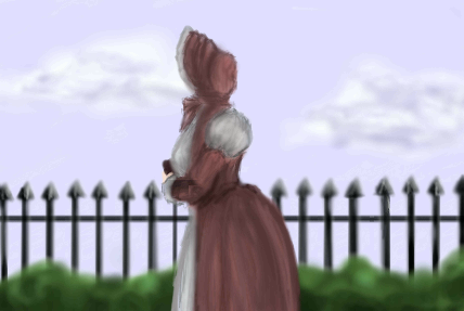
|
hannah_banana_2002
(Mar 1, 2004)
On all my time here I draw lousy and half ass (excuse the foul language) drawings. I really wanna try my best on this one walk in a park, inspired by a short story.
morbidboblover (Mar 2, 2004)
Wow, I love the shadowing and the dress all togeather
davincipoppalag (Mar 2, 2004)
I like how this finshed.. nicely drawn ..I like the clouds and the fence
DragonClaw (Mar 2, 2004)
i like this pic alot because the shape of the body is perfect and the clouds look sooooo real. love it ^^.
dixielandcutie (Mar 3, 2004)
you did a wonderful job! |
| ||||||||||||||||||||||
|
LightBen
(Jan 19, 2004)
Music can inspire your subject (Violin is one of the best musical instruments ! ^^).It's a girl playing violin in front of her young brother.
DeadlyBlondeArcher (edited Jan 24, 2004)
I strongly agree with Marcello's suggestions. Also, if that is a mirror on the left wall, it would be reflecting something, and doesnt even contain reflections of the wall color opposite. If it were a window, it would partially continue the other window scene.Other than that, this is wonderful composition and the subjects and colors are very well executed. It also has alot of feeling - You should consider illustrating children's books!
oversoul_trump (Feb 29, 2004)
Looks really good, I like the way you did the hands.
marcello (Feb 29, 2004)
Well, I am assuming what you think is a window on the left with the clouds is probably a painting on the wall. Kind of disappointing that he did not fix the violin, but one can only do so much, I suppose.
LightBen (Mar 3, 2004)
The "window" on the left is actually a painting ^^.And for the violin ... I think I'm not gonna touch this picture as I won't be able to draw a better violin ... I should practice drawing musical instruments on paper instead ... For my next big picture :) |

| ||||||||||||||||||||||
| |||||||||||||||||||||||
| 2draw.net © 2002-2026 2draw.net team/Cellosoft - copyright details - 3.51sec (sql: 36q/3.21sec) |