| |||||||||||||||||||||||
|
solve
(Jul 26, 2005)
ughh damn instant messages begone! |
| ||||||||||||||||||||||
|
xswirvex
(Jul 25, 2005)
workin on it
xswirvex (Jul 27, 2005)
well thanks for the comments, im glad i helped with someones smoking habits XD jk
Xodiak (Jul 27, 2005)
Wow, very great and realistic! It looks so real, especially the clear fluid in the transparent casing. Awesome! <:D|XOD|
squee (Jul 27, 2005)
This is amazing! So Realistic!
HunterKiller_ (Jul 29, 2005)
Amazing. |

| ||||||||||||||||||||||
|
Hopeless
(Jul 17, 2005)
i love Useless ID >_<
darkshadow (Jul 26, 2005)
looks like is an albem cover cool draw
Xodiak (Jul 26, 2005)
Very nice, cool, teenage girl! >;D|XOD|
renire (Jul 27, 2005)
oooh....xods moving in! XP cool pic :)
maureen (edited Aug 1, 2005)
hey! i like this! although i don't know this band...nice coloring work on her face! (her chest seem a little weard to me....but i wish i can draw people like this- i find it hard and getting on the nerves just trying to draw it proportional) :) |

| ||||||||||||||||||||||
|
Shmoopy
(Jul 26, 2005)
Finish later, chilluns.
Punky (Jul 26, 2005)
I will forever love this style. :D Awesome drawing, i like the background. Like solve said, this would make a great t-shirt. :D
demon666child (Jul 27, 2005)
wah i love this it's so kewl <3 i love the coloring and the effects it makes ^___^ I also think it would make a great t-shirt X3
Urei-sama (Jul 27, 2005)
that. is. amazing @_@
Pence (Jul 27, 2005)
I love that background! XD This picture just makes me giggle it's so cool!! |
| ||||||||||||||||||||||
|
nekodesu
(Jul 26, 2005)
Ref: http://dxsibo.spymac.com/mana4.jpgUh...This came out demented. >_< Meh, whatever. I'm done! This is supposed to be Mana from Malice Mizer. But doesn't really look like him. **edit** What's this? I'm a master now?! O_o
Minty_hippo (Jul 26, 2005)
wow wow wow wow
darkshadow (Jul 26, 2005)
it the number of points you have like the way the hair goes across the eye but the nose and mouth are at funny angels compaired to the rest of the face still cool pic
Pantera (Jul 26, 2005)
Beautiful eye :) |

| ||||||||||||||||||||||
|
Kraisa
(Jul 26, 2005)
started off as a doodle...turned into this...I like it..
darkshadow (Jul 26, 2005)
this pic is awasome great colore and well hellyou could make it 2 pics i cant get past the moon
Pantera (Jul 26, 2005)
This is very pretty, the moon is awesome :)
Gemmy619 (Jul 27, 2005)
love the colours in this, very nice draw :)
Satern (Aug 5, 2005)
oooh love this, it tells a story alll to itself :) lovely colours and its well balanced to not be too overburdand by the darkness :) |

| ||||||||||||||||||||||
|
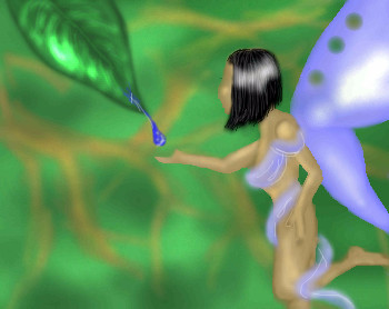
Gollywoggers
(Jul 23, 2005)
I am not having very much luck with this one so I will just stop.
fleeting_memory (Jul 23, 2005)
cute start-she's kind of blurry around the edges of her hands and arms mostly but you're not done so you prolly already know that.
emmamommalag (Jul 26, 2005)
Thisi is very nice, Golly. I like that leaf, especially. It's almost iridescent. |
| ||||||||||||||||||||||
|
Kraisa
(Jul 26, 2005)
la la la la la la la la its PINK!...ish...
Cianteed (Jul 26, 2005)
i like the colours, its like recalling the pages of your favourite storybook when you were a child... all light and hazy and pretty... plus the wings are freakin awesome!
nekodesu (Jul 26, 2005)
Beautiful! Everything just perfect. :D
SanzoGirl (Jul 26, 2005)
It's so cute! <3
Sutafani (Jul 29, 2005)
this is so beautiful! i love dragons! |

| ||||||||||||||||||||||
|
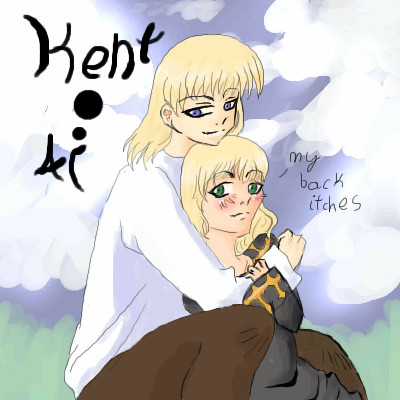
Mafuyu
(Jul 26, 2005)
Wheeeee. Princess Ai fanart. Yay for Kent and Ai! =D
Minty_hippo (Jul 26, 2005)
amazing, amazing, amazing.....AMAZING!!!!!!!!!!!!!!! wow I wanna draw like that!! Not fair! ¬¬'
Shmoopy (Jul 26, 2005)
I like it and all, it's adorable. But it looks like she has whiskers on her face. >.>;=o.o= |
| ||||||||||||||||||||||
|
Kraisa
(Jul 25, 2005)
I once had a kitty named asuka, cause she was a "red" headed b*$ch.I crapped up the background, I just didn't know what to do with it...so its as done as its gonna get.
Xodiak (Jul 26, 2005)
Wow, she looks very hot and sexy and naughty! And so adorable and cute at the same time... I love how she looks small sized. The patches of fur on her body make her even more deliciously sensual. Very pretty drawing! I do not know if Xod would caress her like a pet, or kiss her like a beautiful girl. I hope she does not scratch! Fantastic art! >;D|XOD|
Kraisa (Jul 26, 2005)
She did unfortuneately scratch lots...but that could be fun in this form no?
Xodiak (Jul 26, 2005)
Indeed, it would be worth all the pain and bleeding! >;D|XOD|
Gemmy619 (Jul 27, 2005)
i think the background is good and goes great with the rest of the drawing :) |
This is hidden because it is rated 18+. Edit your privacy settings to make it visible.
| ||||||||||||||||||||||
| |||||||||||||||||||||||
| 2draw.net © 2002-2026 2draw.net team/Cellosoft - copyright details - 3.45sec (sql: 32q/3.40sec) |
drawn in 33 min
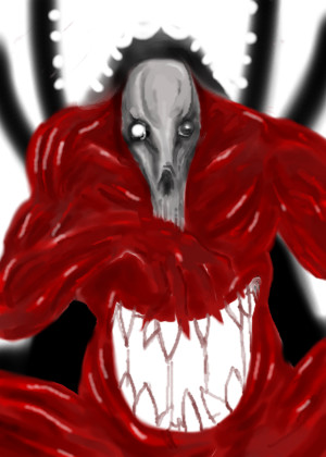
some side notes.
the white mouth is not a cop out. its the reason for his hunger. its a form of godly matbolism. think of a black hole within himself. this is in relation to want. want stems and leads to pure nothingness, or the desire for more till the endless cycles doom.
yes he is muscular compared to the previous de outh pic. this is because he just ate. within no time hes thin again wanting more.
bovine skull, maybe symbolism (ha)
he has no skin, all muscle. meat meat meat.
man i wish this looked like what it appears as in my mind.