| |||||||||||||||||||||||
|
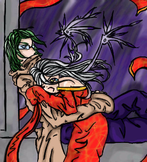
Those damn black lips
rosalyn
(Aug 28, 2005)
You know you like them.
Cineya (Aug 29, 2005)
Beautiful ^^ That chain-thing around her(?) neck is nice and that eye is... there's no word for that ^-^ I don't like that backround very much, but but, nice job. n-n
Noremac (Aug 29, 2005)
:3 darkly
TaCO (Aug 29, 2005)
O.O Cool pic!!!!
rosalyn (Aug 29, 2005)
tis me in anime :\ And I bs'ed the bg ^.^ |

| ||||||||||||||||||||||
|
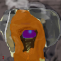
TaCO
(Aug 21, 2005)
Done cause I don't feel like finishing It.I drew this to practice a few things, I had know Idea what I was drawing when I drew this.
KH44N (Aug 22, 2005)
This looks really cool. I like the different colours u used so far. Keep going, it'll look awesome when its done!TaCO
hideyourface (Aug 28, 2005)
I love the contrast and colour in your pictures. |
| ||||||||||||||||||||||
|
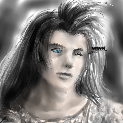
nekodesu
(Aug 23, 2005)
I've started drawing seriously for an year from yesterday. And compared to my very first drawing, it's safe to say that I really have gone a long way...Added the hat because the head was comming out really weird. And I'm not really happy with how it came out.
KH44N (Aug 28, 2005)
This looks amazing! You did a great job on the eye.
dreaminSTARgirl7 (Aug 28, 2005)
the background is sooo awesomely amazingly cool!!! i dont know if i like the hat all that much..but i like all the rest of the pic!!
renire (Aug 29, 2005)
Wow....it's SO amazing! But....You can kill me for saying this...It kinda looks like he has a turd on his head...! <:D Sorry! Other than that, this pic is totally awesome! ^_^'''' |

| ||||||||||||||||||||||
|
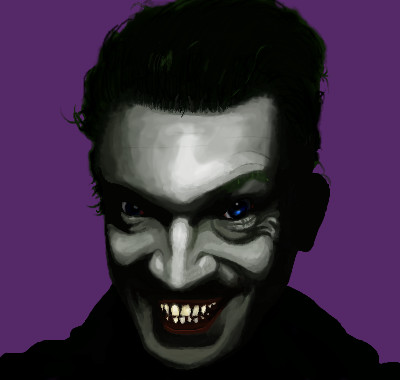
bokko
(Aug 15, 2005)
he resembles someone!
renire (Aug 29, 2005)
AAARGH! *Screams* Thats so freaky! >.< *Runs away*
bokko (Aug 29, 2005)
The man in the photo is Vincent Cassel, and he resembles the joker!
GOODBYE (Aug 29, 2005)
great contrast
solve (Aug 30, 2005)
i saw this and orgasmed. not really but i shouldve. this is so fucking badass and stylish! you should collab with cloxboy for a match made in heaven. honest to ogd you two together would be pure and utter insanity.im very glad you joined 2draw, your skills are impressive. now we fight. |
| ||||||||||||||||||||||
|
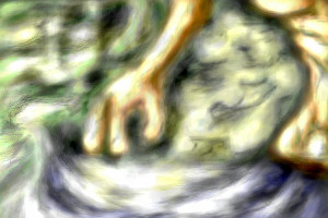
pencilhero
(Aug 28, 2005)
O_O XD
anarie (Aug 28, 2005)
Dude... It defies gravity. O_o Oh and the neck looks a bit odd... I dunno. COuld just be me. |
| ||||||||||||||||||||||
|
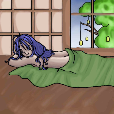
brainspiller83
(Aug 28, 2005)
"omg, omg, omgawwwwwdd!"
LisaAnne (Aug 28, 2005)
Haha...very cute. They seem like they are some part of the body...cilia in the lungs of a smoker or something....I'd like to know more about this, whether there is more to it or if you were just drawing some funny little characters. The eye balls really please me the way way that you kept them not completely white.
brainspiller83 (Aug 28, 2005)
Its nothing really, just a drawing I did while at uni using a blue ball point pen. It was a base for character ideas to imitate a mainstream youth culture. :D |

| ||||||||||||||||||||||
|
mm, one of the days cole's sweet and not sexy, which kind'a pisses him off Lol xD 13+ for skin?
19 comments
– latest 4:noooooooooooo~~~
my compy went all bleeh on me, so I'm at my school doing this... with A MOUSE!! people like me just cant use a mouse >_< and if that wasn't enough: the colors looks so weird on this computer... I'm messing ot all up *cries* I was bad at coloring even before this, but this sure as hell doesn't help >_< dooooooooooooooooooooooooooe.... finally done ! omfgz it took way to long xD
Kenshin (Aug 29, 2005)
Looks like he has a boob :O
Truearashi (Aug 30, 2005)
yeah it does xD those fat cookies aint good for young boys.. they'll get fat and grow boobs *points at cole* xD |
| ||||||||||||||||||||||
|
Truearashi
(Aug 27, 2005)
The Cole and Drew thing didn't hold, so Cole turns to Green for comfort (>:< bad choice, since green vas the bitch who raped him and really hates him so... meeeep)anyway, coles wearing a cool red kimono ^_^ �And then when all hope is lost, And you�re out on you own Hurt and broken, you know.. just like before, You turn to an old friend Just to make sure you�ll be hurt again Some people never learn. Unfortunately I am one of those people. What does that mean? It means that I have an extraordinary �gift�. The ability to get myself hurt, no matter what I do or who I chose. Maybe I really do like to be hurt� Did I not once say that I defined myself from my misery?� � COLE ^_^ jeg er p� vej til dig JULEMAAAAAAAN~~~~~~!!!
damn :rofl: ! lineart done
done... and this is way worse than I thought it would be... maybe UI should stop drawing... *chops her hands of*
whitebunny1063 (Sep 1, 2005)
I feel so bad for them |
| ||||||||||||||||||||||
|
TheCrimsonKing
(Aug 28, 2005)
This really isn't finished...but because I know I'll never go back to it; finished it is, sorta.
LisaAnne (Aug 28, 2005)
I really like the color interactions on this piece, and the texture of the background. Its a very curious piece, finished or otherwise.
HunterKiller_ (Aug 29, 2005)
What a happy family. That pencil sharpener face guy is lol.
TaCO (Aug 29, 2005)
I love love this.The colors, the expressions, and the whole composition of this pic is simply beautiful.
DinoFlorist (Aug 30, 2005)
You have always been so good, but the new stuff you have been doing is my favorite yet. |

| ||||||||||||||||||||||
|
IkariIreuL
(Aug 25, 2005)
? |
| ||||||||||||||||||||||
| |||||||||||||||||||||||
| 2draw.net © 2002-2026 2draw.net team/Cellosoft - copyright details - 3.85sec (sql: 41q/3.82sec) |