| |||||||||||||||||||||||
|
Heiros
(May 13, 2005)
not done |
| ||||||||||||||||||||||
|
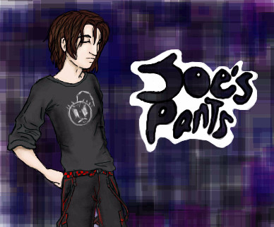
rosalyn
(Aug 26, 2005)
My friend Joe is cool
KH44N (edited Aug 26, 2005)
This is pretty cool. I like the background and the dude's hair is pretty good too.
davincipoppalag (Aug 26, 2005)
does he wear purple plaid pants?
Semblance (Aug 26, 2005)
I love the t-shirt eej.. |
| ||||||||||||||||||||||
|
sagenev
(Aug 22, 2005)
i don't know why ever need the line in my draws... only know that i need to use her.
KH44N (Aug 22, 2005)
This is coming along great. The eyes looks really good so far. Can't wait to see this when its done!
davincipoppalag (Aug 22, 2005)
The lines are your trademark ,sag..they have to be there. Terrific expression in the eyes on this one
sagenev (Aug 22, 2005)
do you think so davinci? yes, me too... but sometimes i think that i need to explore another technic, and when i try, anyway use the line...always i stay in the line probably i must work in the limit, and my limit is the line... a simple limit, jeje. my gnomos... follow me?
a few days; to see my girl, to travel with her. |
| ||||||||||||||||||||||
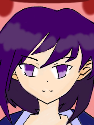
|
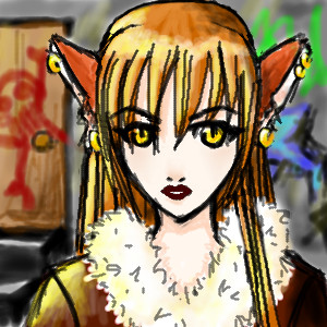
Namori
(Aug 26, 2005)
Sketch of a character in my new manga.... :D |
| ||||||||||||||||||||||
|
ChiFriend
(Aug 25, 2005)
er
Sai_Wo (Aug 25, 2005)
Looking really good so far, remember to put in eyebrows (unless you intend to leave them out). Welcome to 2draw by the way.thanks
finished
KH44N (edited Aug 26, 2005)
This looks amazing for someone who's a newcomer. The eyes looks great, and the background looks cool too. Great work and welcome to 2draw. |
| ||||||||||||||||||||||
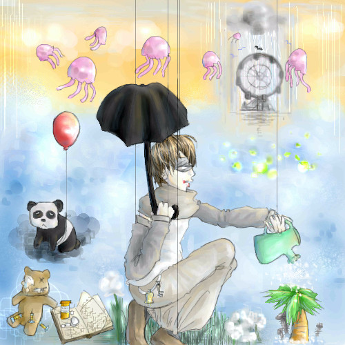
|
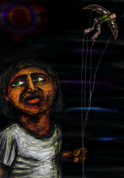
broken-lock14
(Aug 18, 2005)
.
lycene (Aug 25, 2005)
Well, I'm not Everybody, but I certainly love this scene. I especially like the coloring on the boy's clothes.
Urei-sama (Aug 25, 2005)
this is very cool. i like the imagination involved
broken-lock14 (Aug 25, 2005)
Spank you all very much so for the lovely comments (I accept friendly critiquing as well *hint hint*). =^n____n^=
Maiko (Aug 26, 2005)
ahh!! Fellyfisks X3 <3 <3 <3I love the fellyfisks <3 |
| ||||||||||||||||||||||
|
Mal
(Aug 25, 2005)
One day they will be wine :o)
darkshadow (Aug 25, 2005)
looks like a water color very nice
KH44N (Aug 25, 2005)
Damn... this is pretty good. I love everything about. Great work and keep it up!
davincipoppalag (Aug 25, 2005)
Lookit Mal drawin up a storm... good job! |

| ||||||||||||||||||||||
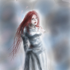
|
Sorciere
(Aug 25, 2005)
Sorry for the sketchiness. I might ink/colour this later.
whitebunny1063 (Aug 25, 2005)
How did you do her on PaintBBS?
darkshadow (Aug 25, 2005)
like the form of her but her hand looks a little big to me very well done on the face
lycene (Aug 25, 2005)
She is so cute! I like her eyes, especially. The only thing I would change about this is that her hand looks a bit stiff. I'd keep the size of it, though, I like it big.
Childlike_Vampire (Aug 26, 2005)
This is very awesome. I love her body, and the style of the hand, but most especially I love her hair and face. The rounded shapes and movement are super appealing. I definitely think you should finish this. *nodnod* |

| ||||||||||||||||||||||
|
pencilhero
(Aug 25, 2005)
just a crappy doodle >__________> *looks the leechget window to see when the mmorpg client download will be finished*tsk wrong section it should go----------------->beginers board
deleted34235 (Aug 25, 2005)
I like it alot!!!!!!!!!!!! I dont think its crappy......maybe cuz its not!!!!!!!!! I cant even draw that!!!!!!!! anyway, nice job!!!!!
KH44N (Aug 25, 2005)
This is so nice. I love the different colours u used for the background. The hair looks pretty nice too. Great work. |
| ||||||||||||||||||||||
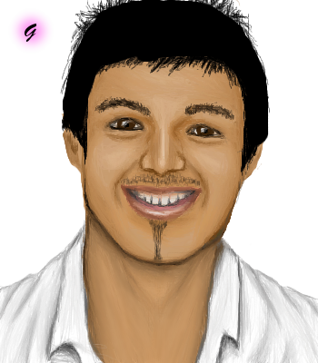
|
Gemmy619
(Aug 25, 2005)
The winner of Big Brother 2005YAY ive finished them all at last :D thank god lol
davincipoppalag (Aug 25, 2005)
Very nice series, too. |
| ||||||||||||||||||||||
| |||||||||||||||||||||||
| 2draw.net © 2002-2026 2draw.net team/Cellosoft - copyright details - 5.65sec (sql: 37q/5.59sec) |
Use the Anti-Alias button on Lascaux! It will make your lines look purdy.
Or just use the Pen tool in Oekaki Shi-Painter!
Also, try blending the hair colors a little bit, like blend the shines in so it doesn't look as awkward.
Right. Keep it up, I'm sure you will become amazing very quickly! :P
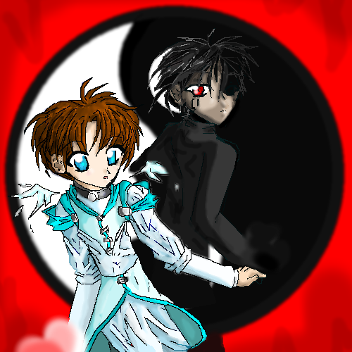
Yin: Female, submissive
Yang: Male, Aggressive