| |||||||||||||||||||||||
|
somebody
(Apr 1, 2005)
.. |
| ||||||||||||||||||||||
|
littlepony
(Aug 24, 2005)
ok i know its not that good but thats because im not done ill finish it later i gotta check alot of stuff right now um if you would like to help me out with this like make a colllaboration and help me out uhh just ask me here ok
littlepony (Aug 24, 2005)
would you like to make a collaboration with me KH44N
sephiroth54321 (Aug 24, 2005)
This isn't really intermediate but it looks alright....
littlepony (Aug 24, 2005)
well i would like someone to collaborate with me on this picture so that it would look better also i will add more as time comes
silvercoyote (edited Aug 27, 2005)
I'll collab with you. I want to fix the eye. But be warned, I'm not used to Lascaux. |

| ||||||||||||||||||||||
|
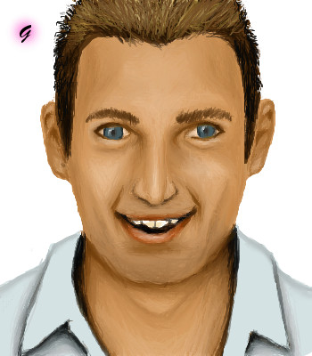
Urei-sama
(Aug 23, 2005)
A commition for Gaia. http://peyo.gaiaonline.com/gaia/members/ava/2c/f4/3d827c7d13f42c.png?t=1118588559 <<Refrence The avi
Urei-sama (edited Aug 24, 2005)
thanks. i really needed the input ^^Tadaa For Marley_Man
Timers way off.
AuschwitzBurns (Aug 24, 2005)
I love the hat. Good work.
KH44N (Aug 24, 2005)
This looks amazing! Everything looks so beautiful. Excellent work! ^__^ |

| ||||||||||||||||||||||
|
Gemmy619
(Aug 24, 2005)
Came 2nd in Big Brother house..
davincipoppalag (Aug 24, 2005)
Happy face.
KH44N (Aug 24, 2005)
Nice face. The hair looks so cool.
AuschwitzBurns (Aug 24, 2005)
Kinda looks like Michael Flattly. (Spelling?)
Renuar (Aug 24, 2005)
You captured his facial expression very well. Looks just like him :D |
| ||||||||||||||||||||||
|
Mal
(Aug 24, 2005)
Based on this pic http://www.corriere.it/Media/Foto/2003/01_Gennaio/27/TORNADO.jpg
Anna (Aug 24, 2005)
All these tornado drawings makes me wanna do one too!We get tornados in the UK , most recent one was near me, http://news.bbc.co.uk/1/hi/england/west_midlands/4725279.stm
StrawberryPaintbrush (Sep 5, 2005)
Ooooo *stares* Wow your tornado totally kicks my tornados booty! I'm loving the lights and darks in this. Great Job.
DeadlyBlondeArcher (Sep 5, 2005)
Not as easy to paint as it might look, very nice... this just sucked me right in. |

| ||||||||||||||||||||||
|
LisaAnne
(Aug 24, 2005)
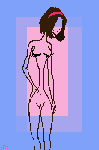
Umm...I just haven't drawn on the computer for awhile, so I decided to mess with a series of sketches I have in my sketchbook/journal. I'm currently at my parent's house, and their mouse really is slow to react, so I became frustrated, and left for a while. Either or this isn't something I expect to get alot of comments on or anything...its for myself. -If the rating should be changed to from 13+ let me know, thanks and take care.
Qwerty_Wittle_Fawah (Aug 25, 2005)
Quite interesting...nice job its very different but i like it
Xodiak (Aug 25, 2005)
Very sexy girl, hehehe, nice drawing! Xod is aroused! She has so beautiful eyes and mouth... >;)|XOD|
Kloxboy (Aug 26, 2005)
That is what women should look like. Nothing gets me going like a boney, malnourished zombie. I like real women, with real curves and with at least a good 30 pounds of fat inside of them. Time to upgrade your diet from water to solids dear.
LisaAnne (Aug 26, 2005)
Haha...yes, I know, all those sketches are supposed to be very extreme and out of proportion reality, but its nice to see some people like real women. |
| ||||||||||||||||||||||
|
sagenev
(Jun 12, 2005)
the lines in the second chance....tootiraotantiraoquemetareferencias, ycadavezqueveoreferencias, quedodesconformeconelmono......... prefieromislineasondajazz |
| ||||||||||||||||||||||
|
Kenshin
(Jul 19, 2005)
I was doing other things, and kept messing up in the beginning because I didn't know what to draw, so the timer is a little bit off. I hope this turns out good >.< I know she's a little to one side, I want it that way :xAny comments/critics/questions?
ILoveKenshin (Aug 24, 2005)
Her b00behs seem kinda BOOM. >_< (stupid sound effects) I love the coloring on the hair and everything. :3
sincity (Aug 24, 2005)
Well I'll just let my imagination run with the stuff on the shirt. >;}Doink
saucy (Aug 27, 2005)
She has a huge crotch. :P |

| ||||||||||||||||||||||
|
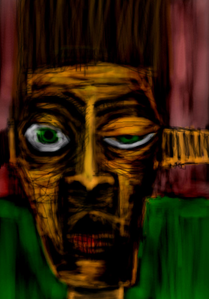
Kloxboy
(Aug 23, 2005)
Making his demons visible
davincipoppalag (Aug 24, 2005)
..Good depiction of how I feel at work some days..and those are just my coworkers around me
DeadlyBlondeArcher (Aug 24, 2005)
This floors me. *Picks self up from floor* I swear I have these dreams sometimes (more like nightmares) with these "melting face" demons. This is the closest I have ever seen to that. Mine aren't red, they are sort of fluorescent viridian and black. There is an old "master" who did really dark demonic art like this but I can never remember his name... I have a book on him somewhere, I should find it. I love this. May I save it? :)
LisaAnne (Aug 24, 2005)
DBA...goya? http://www.wga.hu/art/g/goya/9/blac633.jpg or hieronymus Bosch? http://www.boschuniverse.org/hisworks/garden_of_earthly_delights/large.jpg (Third pannel)This is a very interesting piece to me in the way that you composed it. I guess it seems the demons are haunting him (perhaps depressed?) rather than him opening his mouth to reveal ugly demons? Either way the colors and expressions work great.
Alex-Cooper (edited Aug 24, 2005)
That looks real cool with the mouthhead. Those angular, jagged faces you do are always so damn sexy. I need a smoke now. |

| ||||||||||||||||||||||
|
FLYING_SQUIRREL
(Aug 23, 2005)
yes i know i still have too add alot... and props to to the creator. i dont have time to go check thier name but thier on 2draw anyways g2g to soccer
FLYING_SQUIRREL (Aug 24, 2005)
know the creator of the ref i used ^_^
starmarked (Aug 24, 2005)
redpanda..possibly?
Maxster (Aug 31, 2005)
This is pretty good, but ur still gay
bobernater (Sep 5, 2005)
hey wazzz upp!!!!!! maxter i never knew u come on here??? |
| ||||||||||||||||||||||
| |||||||||||||||||||||||
| 2draw.net © 2002-2026 2draw.net team/Cellosoft - copyright details - 6.02sec (sql: 38q/5.93sec) |
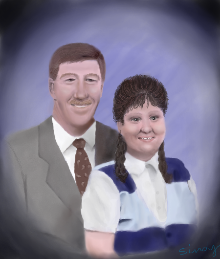
Thank you Dave. ;o) I miss your encouraging words. I guess I need to draw more. ;o)
Sin....thanks. You're a great guy. It was a challenge for me.
I'm sure they all will love the portrait. It's always hardest to draw someone you actually know. I'm glad to see another drawing from you. :-)