| |||||||||||||||||||||||
|
Juna
(Jan 20, 2004)
My namesake.. I miss drawing furry's, they're so much fun to draw.. btw Juna is a white lion with blue stripes |

| ||||||||||||||||||||||
|
DieChan
(Jan 19, 2004)
It didn't really take that long, I was watching The Ring and helping to fill out an application. Uh... the shading technique I used didn't turn out like I wanted it to. Um... yeah. |

| ||||||||||||||||||||||
|
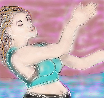
Alicia
(Jan 19, 2004)
In Christ. And my life is not my own. :) I don't show my belly button off, but this started nude. I made it more modest. :)
DMV (Jan 20, 2004)
like this one alot alicia...the belly button is cool |
| ||||||||||||||||||||||
|
thug
(Jan 19, 2004)
fun subject
staci (Jan 20, 2004)
well done! do you prefer this applet ?
thug (Jan 20, 2004)
I found that on the advanced setting I can do more editing and complete a piece. The only thing bad about it is that I can only submit the piece as advanced or intermediate, and I am very much a beginner. I also think that the animation feature is very cool. I like the first aplet better than this one because you can zoom in for details but for some reason I have always been unable to finish a piece on it. I guess I'm not efficient enough to use it yet.
DeadlyBlondeArcher (Jan 20, 2004)
I understand the prob w/ the applets - although I disagree that you are "beginner" level. This is very good work. |
| ||||||||||||||||||||||
|
thug
(Jan 20, 2004)
experiment in color
sal (Jan 20, 2004)
the left 1 looks really good... |

| ||||||||||||||||||||||
|
DinoFlorist
(Jan 19, 2004)
color is too hard
DeadlyBlondeArcher (Jan 19, 2004)
This is WWWicked, Dino. I like it, but are you in a violent mood again? lol And color is not hard, stop whining.
DinoFlorist (Jan 19, 2004)
animations spank
Kloxboy (Jan 19, 2004)
That's kinda trippy. Nice work. |
| ||||||||||||||||||||||
|
Alicia
(Jan 19, 2004)
A gift from my son, The silly thing is; He picked it, I paid for it. |
| ||||||||||||||||||||||
|
Ultimamk
(Jan 19, 2004)
Just a little project I did for my love of Friday the 13th, not the best in the world but alright in my point of view. |

| ||||||||||||||||||||||
|
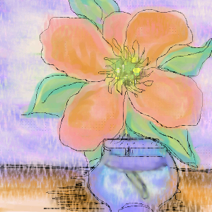
Alicia
(Jan 19, 2004)
This flower stole the show and took a all deserved bow.:) |
| ||||||||||||||||||||||
|
Loogie
(Jun 16, 2003)
it wont let me delete?
Zappo (Jan 19, 2004)
lmfao oh man i just stumbled upon this......all in the past im a changed person......sry if im rude, its in my nature....lol
marcello (Jan 19, 2004)
omg lmao
Zappo (Jan 19, 2004)
hey Loogie what happened to beths board, Ide love to stop by and strut my skills one of these days....... |
| ||||||||||||||||||||||
| |||||||||||||||||||||||
| 2draw.net © 2002-2026 2draw.net team/Cellosoft - copyright details - 5.25sec (sql: 32q/5.21sec) |
drawn in 2 hours 21 min