| |||||||||||||||||||||||
|
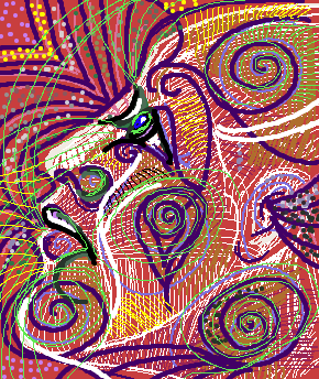
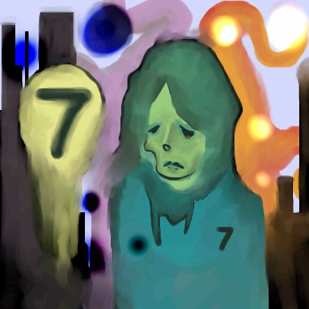
cmb
(Jan 21, 2004)
the trouble is knowing when to stop! |
| ||||||||||||||||||||||
|
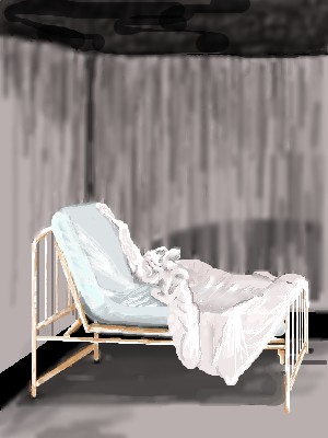
thug
(Jan 20, 2004)
new aplet
thug (Jan 21, 2004)
funny you should say that, the photo I looked at was from a ruin of an insane asylum! I wish my version looked like the photo...kind of lonely and disturbing. I'll keep practicing, I'm only a doodler and have never painted.
staci (Jan 21, 2004)
yeah i think its disturbing but a tad too clean. thats why a urine or blood stain might add to the eerie-ness. but i like it just like it is as well
ToraNeko (Jan 21, 2004)
>.< Eww, Okay, nasty images to that comment Icats, but yes, I agree. Darken the sheets, rust on the frame, and the frame is too shiny to be glum. It looks goldeny, now we are thinking of happy ponies! Not nasty stuff on the floor....
DeadlyBlondeArcher (Jan 21, 2004)
OMG! Never mind me napping there then! lol Please dont stain the sheeeeeeets!!!! ;) |
| ||||||||||||||||||||||
|
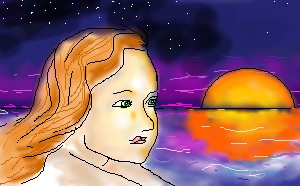
3 comments
– latest 4: Color mwahaha! ^ ^
Childlike_Vampire (Jan 19, 2004)
Oh, I lovars the wings! The movement of the hair is pretty spiffy too. ^^
Alicia (Jan 20, 2004)
I love this image. Is the shirt missing something ?
pyrobarbie (Jan 21, 2004)
*tilts head* well i don't think its missing something porsay...is it? *looks around nervousely* O.o |

| ||||||||||||||||||||||
|
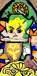
UppityCracker
(Mar 21, 2003)
Hi, this is me at one of my Star Trek conventions, Spock was there and Captain Kirk was there, it was such a magical time, I was dressed as Trogdor of the planet Zalminion, its my own planet I made for my own race, i made the costume myself, it was made out of my dad's Mechanic Jumpsuit. Some people were yelling at me telling me I looked stupid, and I was sad.. But my mommy says I am handsome and very smart! YAY!
UppityCracker (edited Mar 21, 2003)
FINE.. but this one was better... Dragon For the creation of Trogdor :)
Blink (edited Mar 23, 2003)
... I think I've improved on your methods some. I've applied some chiaroscuro shading ...
Soshell (Jan 21, 2004)
i know this is probably an outdated comment but i think this picture is cool as i am a trekky and a trogdor fan :-p |

| ||||||||||||||||||||||
|
fleeting_memory
(Jan 21, 2004)
I really like this one-it's one of my first intermediate ones-what do you guys think? |
| ||||||||||||||||||||||
|
marcello
(Aug 15, 2002)
dunno... comments?
Zebulan_Zackary (edited Aug 17, 2002)
I really like this... Nice movement and energy. Beautiful texture. I think the eyes and clothing came out beautifully. I am new to the site, but I am really impressed by some of the work on here.
rosalyn (edited Sep 21, 2002)
Angle Girl!!^^
Alicia (Jan 21, 2004)
I love this pic. Now , where can I find that fabric? I have big plans for my sewing machine! :) |

| ||||||||||||||||||||||
|
Alicia
(Jan 21, 2004)
My husban lent me his important papers.:) |
| ||||||||||||||||||||||
|
Zappo
(Jan 20, 2004)
this took way too long to think up..... |
| ||||||||||||||||||||||
|
ToraNeko
(Jan 20, 2004)
Yey! I try another new style. Please commwnet, I'm trying to figure out if these results are worth redoing in another Oekaki or not *goes into deep though*
Juna (Jan 20, 2004)
It looks alittle messy, sketchy.. but i love the way it looks the tiger is my fav! The problem i see with the dragon tho is that its blurry ^^ Would love to see more battles like this
Childlike_Vampire (Jan 20, 2004)
I like the tiger, and the shapes, but there isn't enough contrast, I can hardly discern which is what on the dragon. But it looks really cool otherwise. |

| ||||||||||||||||||||||
|
Peipera
(Jan 19, 2004)
A request from a good friend. As well as my first Hellsing fanart. ^.^;;
Tenor (Jan 20, 2004)
As per the translation/subtitles its Arucard, but I suspect its just a pronunciation getting mangled--dunno ask someone who has more Japanese experience than IPip, it owns ^__^ do more hellsing stuff
marcello (Jan 20, 2004)
Any L or R in a transliteration of a japanese name/word is ambiguous, there's no necessarily correct way. In the case of names it's a little easier to say for sure is if a) the name was based on an originally non-japanese word/name and you happen to know that word/name (for example, Julia instead of Juria), or b) the official site has a spelling for the name. Oftentimes, even on the japanese sites, they'll have the spelling in english, because it's "cool."
Childlike_Vampire (Jan 20, 2004)
This looks even better with color, although compression didn't really help it seems. The reason I said that wasn't because I don't know that Alucard is Dracula backwards, but because there is a debate among fans as to which is the real spelling. I say Alucard just cos I think it's cooler, but apparently even on the official series they changed it halfway through. I wouldn't know, I've only seen crappy downloads with fan subs. Both versions have a "u" though, so there. lol. I'm still working on all the red. I worked on the blending on the face and glasses. More to come.
|

| ||||||||||||||||||||||
| |||||||||||||||||||||||
| 2draw.net © 2002-2026 2draw.net team/Cellosoft - copyright details - 3.14sec (sql: 37q/3.12sec) |
CMB You Draw fantastic...( no pun intended)