| |||||||||||||||||||||||
| Public Boards/Beginner | |||||||||||||||||||||||
|
Mafuyu
(Oct 28, 2003)
She looks so deep in thought and spaced out the first title that came to my mind was "Who needs a care bear hug?!" XD |

| ||||||||||||||||||||||
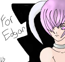
|
Reku
(Nov 9, 2003)
This is for you Edgar!(Gothic Flames)Gah! My mouse kept messing up on me and popups kept on coming >.> So be glad I finished it....all that took about ten minutes of my precious time up! XP.
tappie_chan (Nov 9, 2003)
i think if you work offline, you won't get the popups. anyway,this is a cool pic. for some reason, it reminds me of Rei's pink twin (rei from evangalion)
marcello (Nov 9, 2003)
If you don't use spyware/adware, you won't get popups, simple as that. remove software like kazaa and whatnot.
furyofroy (Nov 9, 2003)
The hair looks like limp pasketty. :D |
| ||||||||||||||||||||||
| Public Boards/Intermediate | |||||||||||||||||||||||
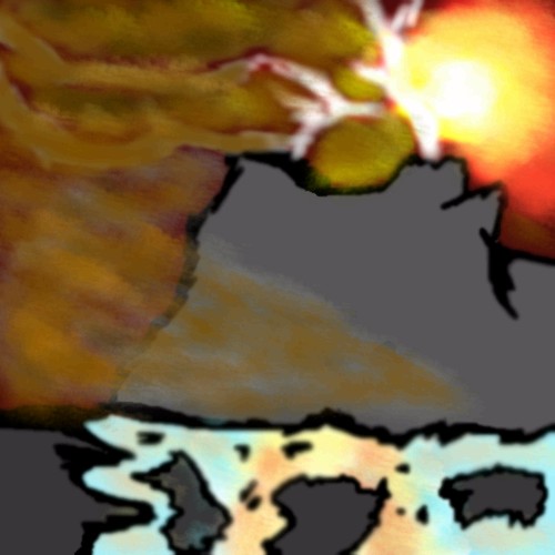
|
JesusFreak89
(Nov 9, 2003)
Alright I'm definitly NOT done...That's why it's real basic looking...I gotta goto church.It's coming along and by the way my reference was a calender..
tappie_chan (Nov 9, 2003)
i love the smoke and the sun. also the way you did the reflection in the water is VERY nice. but i think my fav is the sun. its probably a beautiful, albeit frightening place. i'd love to see the ref pic. what calendar is it from?
JesusFreak89 (Nov 9, 2003)
Faith Passages 2003It's finished...Sorry that the colors in the smoke aren't that good...I'm not a good coloror...If that's a word..
|
| ||||||||||||||||||||||
| Specialty Boards/Collaborations | |||||||||||||||||||||||
|
This is based on a sketch I drew. I just don't have the energy to color it, so... I'm leaving it to you. XD
6 comments
– latest 4:Feel free to mess with the lineart if you 'need' to. Note All lineart is done on the top layer. (Layer 1).
mazi (Oct 11, 2003)
very nice. cello the shadings fine except the face is a tad blotchy
raenboe (Oct 11, 2003)
Pretty spiffy! Great job, you 2!
tappie_chan (Nov 8, 2003)
actually i like the splochiness of the face and all the coloring. i think it adds such wonderful feeling to the pic. very nicely done, both of you.
nyao (Nov 9, 2003)
so prettiE! I luv the colourz and the flowieness of the hair! |

| ||||||||||||||||||||||
| Public Boards/Beginner | |||||||||||||||||||||||
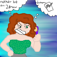
|
jtptan
(Jun 30, 2003)
not done, im not happy with it
mkkmypet (edited Jun 30, 2003)
I like it!
tappie_chan (Nov 8, 2003)
i like the BG a lot. also, the thick lines give the pic a nice, graphic feeling to it i think. (graphic as in graphic design) |
| ||||||||||||||||||||||
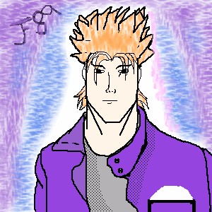
|
JesusFreak89
(Nov 7, 2003)
Hey how do you like it?
Knockoff (Nov 8, 2003)
Nice! This has to be your best yet,.! Your improving! Try some different shading, get the lines a little neater and youll be pretty good.,
Harmanye (Nov 8, 2003)
*claps* Yay! It's a head with a body, no sarcasm, this is nice ^_^. The blonde doesn't even bother me (In my opinion, guys with very blonde hair look kinda weird, but thats just me, I bet.)Some shading on the jacket would be nice, just a few highlights and shadows, tonage would be nice too... ehh, anyway, good going ^_^ Here's to all the commentors I tried adding in some detail for you.
Tagged it
|
| ||||||||||||||||||||||
| Public Boards/Intermediate | |||||||||||||||||||||||
|
x-syndrome
(Nov 6, 2003)
hitotsu minuki onore ga yeu -crow-futatsu yuyushiki riyyu ga yue -crow- mittsu araburu risei ga yue -crow- yottsu subete wa kono hi no tame uzou muzou no ishuu no naka hitotsu kagayaku anata no tame kono yo no hate de wo kimi wo matsu anshiki shouso crow.
Marienkind (edited Nov 7, 2003)
very nice color scheme. for some reason, i think this person is male, judging from your previous pic. either way, he or she must use very good shampoo. :] oops, sorry about the mistake then. ^^;
mazi (Nov 7, 2003)
awesome. very shiney. lol.
x-syndrome (Nov 7, 2003)
to Marienkind: this was inspired by indies band Duel Jewel's song Binah [crow]nvr heard of garnet crow....
furyofroy (Nov 7, 2003)
Looks like Dracula left his glasses at home. Heh, get it? Yeah? I kill me. |

| ||||||||||||||||||||||
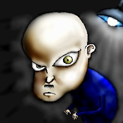
|
KNPMASTER
(Sep 1, 2003)
Quite a creepy man, isn't he?
left_hander (edited Sep 4, 2003)
This guys great he reminds me of this evil doctor i saw on courage the cowerdly dog once hehe i love that show yah anvi i think your right good job snaps for you
Aunvi (Sep 2, 2003)
Courage the Cowardly Dog! hnmmmnnn he looks like that hunchback dude, or that evil green dactor dude with the evil rat, I mean depressed doctor dude with the evil rat. Yeah. There we go.
Knockoff (Sep 2, 2003)
Hah very nice. As darkkangle would say "wheres the eye brows"
tappie_chan (Nov 6, 2003)
he scares me to the core of my being. i am seriously surpressing the urge to scream right now. ^___^ i LOVE the coloring though! it is fabulous dahling! |
| ||||||||||||||||||||||
| Public Boards/Beginner | |||||||||||||||||||||||
|
Mafuyu
(Nov 6, 2003)
Just a person. C&C please.
tappie_chan (Nov 6, 2003)
moo. i like the experimentation w/pink lineart, especially cuz the pink and green are almost complementary colors. your structure is improving nicely, just watch out for the lump on the top of the head. also, the character seems a little out of place in the background because its so dark. maybe try a more pastelly BG, unless you purposely wanted that contrast. overall, i think that this is pretty good!^___^ |

| ||||||||||||||||||||||
| Public Boards/Intermediate | |||||||||||||||||||||||
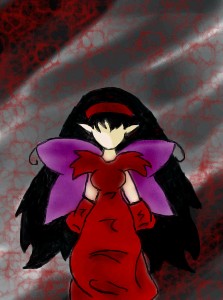
|
Reku
(Oct 26, 2003)
I'm drawing this for a friend,I took 15-20 minutes out to eat breakfastWhoo,done!
Ace (Oct 27, 2003)
This is very pretty. I love your background- red, grey and black are my favorite colors. ^^
tappie_chan (Nov 6, 2003)
i love the texture stuff in the background. it adds something to the feeling of the pic. |
| ||||||||||||||||||||||
| |||||||||||||||||||||||
| 2draw.net © 2002-2026 2draw.net team/Cellosoft - copyright details - 1.25sec (sql: 40q/0.49sec) |
yes ok ok I probably shouldnt be commenting on how good ppl draw cause i suck but ok
keep drawing mafuyu; one of the most rewarding things about art is improvement!
^______^