| |||||||||||||||||||||||
| Public Boards/Beginner | |||||||||||||||||||||||
|
Rave
(Jul 30, 2005)
This is my first oekaki here...! And with a completly new program. @___@; I couldn't find the opacity meter for the image itself. .__.; Anyways, I don't think I'll colour this one, I'll just leave it black and white. =3 And I know it's not that great. ^^; It was a spontaneous idea I decided to act on. =D |

| ||||||||||||||||||||||
| Specialty Boards/Collaborations | |||||||||||||||||||||||
|
WHEW! ^^ finally done with this.......Timer is off a bit, I was messing around and reading comics....The right arm was a BISNITCH to do for some reason...anyway, I hope this classifies as a 'pretty girl', p3ndragon ^_^ I originally started another picture for you, but I decided I didn't like it and that this girl was much cuter....anyway, THIS IS A COLLAB WITH p3ndragon!!!!!!!!!!!!!!! I hope they like this ^_^ um, thats all ^^;;;
14 comments
– latest 4:
davincipoppalag (Dec 14, 2004)
This finished up very good. So much detail in the lines. Very nice!
clowangel (Feb 3, 2005)
Woah..This is awesome! O_O; Spiffy!
tattered_wing (edited Jul 30, 2005)
Wow! She's so beautiful now...X3 And a spiffy background indeed. Diggin' the lime green. I love the chestnut hair, and the shade of red you used that emphasizes the white... and the shade detail on the jewel! You're great p3ndragon! :) I'm all too honoured. |

| ||||||||||||||||||||||
| Public Boards/Intermediate | |||||||||||||||||||||||
|
pencilhero
(Jul 23, 2005)
:/ oh man i feel awfull... with all those patent things on graphic formats :( turns out that the only thingi can use in gimp is bmp all the others(jpeg,png,gif,tiff) got to pay royalty licence in order to use them i guess gimp is slowly going down.... :( oh man and i don't like photoshop i guess i have to buy it :(
hideyourface (Jul 23, 2005)
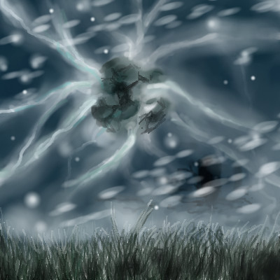
awesome. It's like looking at your other picture of the sky and grass, but in some huge supernatural storm.
p3ndragon (Jul 23, 2005)
Or you could.. Um.. "Acquire" it for free.Great draw.
HunterKiller_ (Jul 29, 2005)
Great modern fantasy-abstract draw. |
| ||||||||||||||||||||||
|
TheCrimsonKing
(Jul 27, 2005)
I must...do things.
p3ndragon (Jul 27, 2005)
Color! Great thin lines and shading.
Kasha (Jul 28, 2005)
great, like always.
DinoFlorist (Jul 28, 2005)
Wow, this one really impresses me.
HunterKiller_ (Jul 29, 2005)
He looks very constipated indeed. The green-ness is good, even though i don't like green. |

| ||||||||||||||||||||||
| Public Boards/Beginner | |||||||||||||||||||||||
|
JK-Arts
(Jul 25, 2005)
..
JK-Arts (Jul 25, 2005)
it is the spoofy comic thing from the mad but i added a nneck and some shading. lol yea i sorta ran low on ideas wanted to drawl so i looked threw some my mad mags for ideas.
Shmoopy (Jul 26, 2005)
Drawl is a word, but... not in the artistic sense.
Fulgore (Jul 26, 2005)
okie dokie :D pretty cool tho :D no hard feelings
RawrTeddy (Jul 26, 2005)
why do you wanna be in my nightmares?aren't they... bad? |

| ||||||||||||||||||||||
| Public Boards/Intermediate | |||||||||||||||||||||||
|
Arisu-chan
(Jul 18, 2005)
post everything what you think of this drawing ^^ im a dragon freak wow ^^ phoenix are coowl too ^^
Deformed (Jul 25, 2005)
Wow! This looks like a kind of Axe.
darkshadow (Jul 25, 2005)
dude this is awesome looking better then the original great job! :Phttp://membres.lycos.fr/dragondebronze/dragonsrouges.htm
suzie (Jul 25, 2005)
Wow..it is better than the original too. Just hypnotic to look at, love this :D
p3ndragon (Jul 25, 2005)
I thought it was an original, but oh my lord. This is beautiful. |

| ||||||||||||||||||||||
|
DarkHorses
(Jul 25, 2005)
Amost killed this pic, but i liked the nose, so i worked with it....hope you all like.
Gemmy619 (Jul 25, 2005)
very nice, love the lips and the mask :)
darkshadow (Jul 25, 2005)
lost in the eyes wow this is beautful th hair the lips the eyes.wonderful pic glad you did not kill it
davincipoppalag (Jul 25, 2005)
Great nose..shiny hair glad you didnt kill her.
p3ndragon (Jul 25, 2005)
Keep it comin' :)Great draw. |

| ||||||||||||||||||||||
|
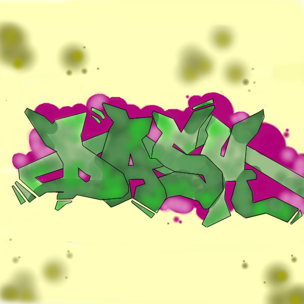
cold_graffiti
(Jul 24, 2005)
i think it came out good hope you graffiti fans enjoy this one!this is intermediate sorry i screwed up!
Zinc (Jul 24, 2005)
I think the lettering came out really well. it would be really cool if you messed around with line thickness. just an opinion.
p3ndragon (Jul 24, 2005)
Hey.. Dunno if I told you this already, but check out www.IMAMONSTA.com. Click on the graffiti section. This guy does the most amazing graffiti I have ever seen.Nice work, keep it up! |
| ||||||||||||||||||||||
| Main Forums/The Post Board | |||||||||||||||||||||||
 |
Akechi456 (edited Jul 23, 2005)
do u ever get tired of looking at urself?? well then,dont look in the mirror. ever want to just walk up to ur mom and damn ur ugly? do it and run. r u 19 years old and still a virgin? do worry,some pretty girl will come along and please u in ur sleep. dont worry all ur needs will be fulfilled if u just do it. shit happens cuz ppl make it happen, this aint really a poem and it aint about the mods, its about how my friend wants to get laid. so have a good evening and remember, get ur ug...
99 comments
|
||||||||||||||||||||||
| Public Boards/Beginner | |||||||||||||||||||||||
|
Chaotic
(Jul 23, 2005)
yeah...so this is me just sittin around...I hope this is intermediate enough O.o;;; This is a sort of new way to draw for me because I'm not really used to drawing without using the soft tool. Anyway, tried to improve my line quality an stuff so yeah, here you go. Plus the BG is just CrAzY...Enjoy XD;;
p3ndragon (Jul 23, 2005)
What's the soft tool? The blur tool? o_OTry blending in the shadows/highlights into the picture. The smoother transition will probably make the picture look better. If you're going for the cel-shaded style, though, try to make the shaded/highlighted parts smooth shapes. For instance, on the viewer's left sleeve, you could make that a smooth block instead of a, um, squiggly block. ^-^ Good luck.
Chaotic (Jul 23, 2005)
it's the blur tool....an' thanks for the ideas an stuff...I'll have to try that out...ok, so I blended it a bit...but it looks ok....so yeah
|
| ||||||||||||||||||||||
| |||||||||||||||||||||||
| 2draw.net © 2002-2026 2draw.net team/Cellosoft - copyright details - 0.94sec (sql: 41q/0.42sec) |
Also, there is no opacity setting for the entire image, although you can modify the opacity of individual layers (at least you can in Oekaki).
Great start so far. Perhaps you should try drawing a bigger image :D The only gripe I have is that the, um, bass is a little.. wobbly. :)
That's what I meant, really. ^^; Because I usually use skeletal-lines, and I put in a new blank layer to trace over it, but I couldn't find the opacity bar for a layer to make it easier to trace over. .__.;
Yeah, I can't really draw small things. ><; But the biggest it can go is 300 x 300... Right?
That was my first time ever drawing an instrument. xD;