| |||||||||||||||||||||||
| Public Boards/Intermediate | |||||||||||||||||||||||
|
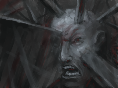
Zack
(Sep 9, 2005)
he's stuck angry |
| ||||||||||||||||||||||
| Public Boards/Beginner | |||||||||||||||||||||||
|
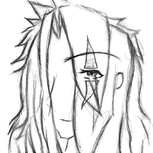
Jack_Fox
(Jun 28, 2005)
Yeah, something along those lines.
Inu-chan (Jun 28, 2005)
I like the eye. It's shiny. ^_^The eyebrow seems a little too long and high up, but maybe it's just me.
Axil62 (Jun 28, 2005)
or maybe it's not just you
Jack_Fox (Jul 17, 2005)
or maybe it's just your mom.
p3ndragon (Sep 9, 2005)
I think you need to work on facial proportions. The crazy hair is always a plus though. |
| ||||||||||||||||||||||
| Public Boards/Intermediate | |||||||||||||||||||||||
|
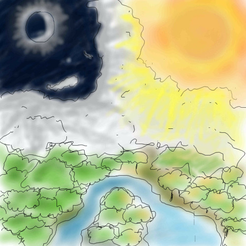
thesolarwinds
(Sep 8, 2005)
any better?
Phil (Sep 8, 2005)
time limit is low on this board:) and yes its much better then the lasttry blur tool out in the hair it works for me:)
darkshadow (edited Sep 9, 2005)
i like the water color look this has but i dont like how the black lines almost jump at me i would remove them if the are on their own layer or smoth them out the hair looks good and the blur tool could help but i like the blend moreedit* oh ya i like the disk in the back ground alot
emmamommalag (Sep 9, 2005)
Hey.. you're getting the hang of that hair drawing! Looks good. :)
p3ndragon (Sep 9, 2005)
I don't think you should use the blur tool. Try using anti-aliasing and a low opacity and work your way to thinner and brighter colors for the hair. Also, the body looks a little contorted. Looking at pictures really helps. Plus you can use layers to help you got rid of those messy scratchy pencil lines. |

| ||||||||||||||||||||||
|
darkshadow
(Sep 8, 2005)
freind left one on a glass table liked how the smoke looked glass
i think its done still holding out for comments
thesolarwinds (Sep 9, 2005)
very nice... I like the way the smoke looks.
p3ndragon (Sep 9, 2005)
Looks good, but I don't think you are all the way there yet. Not really sure what is going on with all the lines and whatnot. |
This is hidden because it is rated 18+. Edit your privacy settings to make it visible.
| ||||||||||||||||||||||
|
FLYING_SQUIRREL
(Aug 23, 2005)
yes i know i still have too add alot... and props to to the creator. i dont have time to go check thier name but thier on 2draw anyways g2g to soccer
FLYING_SQUIRREL (Aug 24, 2005)
know the creator of the ref i used ^_^
starmarked (Aug 24, 2005)
redpanda..possibly?
Maxster (Aug 31, 2005)
This is pretty good, but ur still gay
bobernater (Sep 5, 2005)
hey wazzz upp!!!!!! maxter i never knew u come on here??? |
| ||||||||||||||||||||||
|
Zer0
(Sep 3, 2005)
Started with nothing in mind. Layered bunk appeared. Followed by many rectangles.
p3ndragon (Sep 3, 2005)
I really like this.Looks amazing.
sincity (Sep 3, 2005)
this came out really nice. good jobbers. :}
HunterKiller_ (Sep 4, 2005)
I really love the white outline around the red. ^.^
Nightmare (Sep 4, 2005)
Came out looking really nice. I bet if you took your time and used the grey foreground buildings you could've made a interesting city scene. |

| ||||||||||||||||||||||
| Public Boards/Beginner | |||||||||||||||||||||||
|
crowquill
(Sep 3, 2005)
My friend- it's done now! I hope you like and and sorry if I shouldn't have posted it here.still working on it...
Finished! Sorry if this isn't intermediate quality... but after looking at how bad the beginner pictures are I thought I should post this here. Please inform me if I was wrong! (and I know the hand sucks!)
p3ndragon (Sep 3, 2005)
Try practicing on the beginner board first. |

| ||||||||||||||||||||||
|
Shoebox
(Sep 2, 2005)
Just some odd, foggy street...
p3ndragon (Sep 3, 2005)
I really like this, though I think that specific shade of blue is a little off. Maybe if the sidewalk was a different color from the wall. Also, the spacing of the blocks on the sidewalk is a little off compared the the brick wall, but it's still a great picture.
KH44N (Sep 3, 2005)
This is amazing! Keep up the good work. ^__^ |

| ||||||||||||||||||||||
| Public Boards/Advanced | |||||||||||||||||||||||
|
Shanghai
(Aug 20, 2005)
This is for 15grifficorntears. I wanted to make something much better than the first one of these fish I made, partly for her and partly so I'd feel like I was improving.
Minty_hippo (Sep 1, 2005)
This is soooo cute n cuddly!! *huggles* oops....sorry 15grifficorntears, its yur pic..uh nice one redpanda!!~*nya nya*~ This should be in the showcase ;)
Shanghai (Sep 1, 2005)
Thanks, but I have enough things there already. Other people need a chance to be there too, without it just being a collection of anything and everything good. ;)
Minty_hippo (Sep 2, 2005)
hehe thats why your so good!Your right....but this one is just.......UNIQUE!!!
Animegirl250 (Sep 2, 2005)
This is a really interesting fish. *_* COOL |

| ||||||||||||||||||||||
| Public Boards/Beginner | |||||||||||||||||||||||
|
D-Yoop
(Aug 31, 2005)
First real oekaki ive ever made. Used to work with paint and stuff. Im here to learn from oekaki. This Image is me w00t
mortalpoet (Aug 31, 2005)
Very sweet! I love the cel-shading!
p3ndragon (Aug 31, 2005)
Good so far. The eyes are a little big, though. Also, you have no eyebrows?!
D-Yoop (Sep 1, 2005)
WHO SHAVED MY EYEBROWS!!!??
xiau (Sep 1, 2005)
I love the cell-shading! You're really good at that! This is amazing for a first Oekaki, my first one ever was so blurred up you couldn't see a thing, lol |

| ||||||||||||||||||||||
| |||||||||||||||||||||||
| 2draw.net © 2002-2025 2draw.net team/Cellosoft - copyright details - 0.71sec (sql: 40q/0.30sec) |
Looks great, Zack. Keep it up.