 |
| |||||||||||||
| Public Boards/Intermediate | |||||||||||||
|
i blorked on 2draw
method3
(Jul 26, 2003)
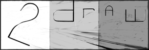
This was going to be an sloppy sketchy ink thing... at least that was the original idea. then it kinda turned into the opposite.... now i don't know what it is. but i blorked it!
Knockoff (edited Jul 27, 2003)
Woaw thats awsome.! greeat work!
safescene (edited Jul 27, 2003)
I'm with rosalyn on this one: looks all sandyish :) very, very cool
raenboe (edited Jul 27, 2003)
Yeah it does look sandy-ish, like rosalyn and safescene already said. I like it! Great job!
nyao (edited Aug 4, 2003)
woooo... *starz* cool.... i luv the sand texturing... and the wordz... ^^ |
|||||||||||||
|
method3
(Jul 16, 2003)
proportions are still off, i don't know what i can do without removing and redoing alot of the face. helmet should be taller still, and the facemask needs to be longer as well.------------------------------------------------ here's my tribute to one of my favorite animes, Jin-Roh. unoriginal concept pulled from: image 1 and image 2 i will have to finish the rest later, i have been working on this straight through at 4 in the morning. this started very badly because i wanted to get that clean detailed look out of the piece, when i realized all i had was my mouse. then i went in the complete opposite direction, going all out sketchy/watercolor style. please c&c! thanks.
quintessence (edited Jul 17, 2003)
Wow. Extremely creepy. Hope you finish soon.
Turtlebuster (edited Jul 17, 2003)
he looks pretty swank, but i KNOW the GI-Joe 'generic' bad guy troops look just like that (for one army or another). i can tell you like using the opacity tool for brushes. an awesome tool ;)
marcello (edited Jul 19, 2003)
blork. |
|||||||||||||
|
method3
(Jul 14, 2003)
probably one of the funnest works so far, did it while rendering the blob.you know when you go to the movies and you see a spiffy company logo with lense flares and stuff? here's my company logo or something =P ------------------------------------- thanks for the c&c, i'm going to continue trying to make this clearer as i can. the only problem is that it's a bitch trying to erase stuff with so many subtle effects going on and such. maybe should move this to the large board just for layers.
darkk_angel (edited Jul 14, 2003)
woah.... pretty good;)tad bit blurry though!
Turtlebuster (edited Jul 14, 2003)
or SOMETHING! it looks pretty swanky, but the image seems completely unrelated to the difficult to notice 'method3 productions'. XP
method3 (edited Jul 14, 2003)
hrm, yes. the stuff has nothing to do with the logo. nothing whatsoever. |
|||||||||||||
| Public Boards/Advanced | |||||||||||||
|
method3
(Jun 11, 2003)
it's a flying fish. still incomplete. i think the water is just about done, with perhaps a little more tweaking. i took off the crappy looking scales, not sure how that's going to be done yet.
Fin_beast (edited Jun 21, 2003)
Method. Ure art is so gud! U are 1 of the best artists here. What kinda tablet do u use, and how do you get your line art so precise? im sooo jealous!! ";
method3 (edited Jun 23, 2003)
thanks for the comments everyone.first off, i don't use a tablet. yes, this was all done with a mouse. secondly notice the time i spent on this... i think it's only an hour off... or so. the way i did this was basically going over lines again and again until the edges were smooth enough (requires alot of zooming in/out to make sure) with a soft edged brush. this could be a tutorial in the making >:)
concannon (edited Jun 26, 2003)
....*gape* We need to get this boy a tablet!
tappie_chan (edited Jul 12, 2003)
the water is FABULOUS. to think, you did it all with a mouse...i have a new level of respect for you buddy! wow ^___^ |
|||||||||||||
| Public Boards/Intermediate | |||||||||||||
|
method3
(Apr 22, 2003)
this turned out to be a keepable/submitable sketch out of many, used to have alot of hair. turned him into a ninja. this is a practice piece for cell shading, the angularity/sharpness to the look helps.
xvolcomx (edited Apr 23, 2003)
This is cool. Looking good.
Doodlibop (edited Apr 29, 2003)
excellante .what more can I say?
tappie_chan (edited Jul 12, 2003)
i really like the colors you've chosen.going nowhere right now... the eyes are shaped terribly so i decided that pupils wouldn't really do it since i don't want to redraw anything at this point.
|
|||||||||||||
|
method3
(Jun 3, 2003)
so i decided i should turn this into a worked piece (rather than a test drawing), and here's the final thing. now it's got a much darker feel which i like.-------- testing out new AA features. mess with AA but keep in mind that the larger your brush size gets, the slower it'll get. isn't that text crisp? *edit* oops, text AA was already in there! (a checkbox on the text tool popup) the thing about AA is that it is for small lineart (mostly sketching in otherwords). AA doesn't work well with large brush sizes, and it won't do too much if you're using a really soft brush either. AA can also screw up if your flow is really really low (below 150-180 or something).
Avirex (edited Jun 3, 2003)
wow dats kewt!
SandyDexHamtaro (edited Jun 3, 2003)
OMG! This is so awesome, I can't beleive my eyes! It's stylish! Haha!
Sererena (edited Jun 4, 2003)
**drool** Such good Anti-aliasing.... |
|||||||||||||
| Public Boards/Advanced | |||||||||||||
|
method3
(Apr 11, 2003)
feathers, feathers, and more feathers. christ....... what the hell am i thinking?? i'll never finish this damn thing....
Arekushi (edited May 2, 2003)
BRILLIANT! Love the texture =D
pyrobarbie (edited May 10, 2003)
i luvs ardigras masks i have one! u must finish this! please
concannon (edited May 26, 2003)
Holy crap...this is fabulous. O_O So...much...detail...*dies* |
|||||||||||||
| Public Boards/Intermediate | |||||||||||||
|
method3
(May 24, 2003)
there was some really terrible "techno" musak playing in the background,did this at 4am at a lan party. i was "this" close to scrapping this thing.
rosalyn (edited May 24, 2003)
Cool!!! It looks like something from a dream...*stars*
marcello (edited May 25, 2003)
I hope you don't plan to edit this, cause I could use help testing LSD on the large board...
mazi (edited May 25, 2003)
oooh thats really cool the lower right corneres all swirly and pretty
Turtlebuster (edited May 25, 2003)
LSD? OH... you mean lascaux! that's a relief.. i guess.this is bloody brilliant! |
|||||||||||||
| Public Boards/Advanced | |||||||||||||
|
method3
(Apr 6, 2003)
practice with layers and burning to get vague shapes, then going back in with dodge tool to get that shiney stuff. more experimentation complete, that's some intensity modification to get some nice patterning with a dodge layer to give it that bang (bling?) look. excessive orange was toned down. more detail added. more flashy flashy later.
marcello (edited Apr 16, 2003)
no he just has waaay too much time on his hands. ;-)
method3 (edited Apr 17, 2003)
quiet you!!!!!!!!!!!! actually, i don't think that time is actually accurate cause i was probably eating and looking at it, or just messing around until i finally came up with a workable idea. btw, i'll have less free time from now on...
Equus (edited Apr 24, 2003)
That is so very cool. I like it. Very much.
ofphenwa (edited May 12, 2003)
*whistles* Wooo.... That's amazing! What, it took you four hours!!! I wish that i could do that. |
|||||||||||||
| Public Boards/Intermediate | |||||||||||||
|
method3
(Apr 18, 2003)
this started as a sketch of a snake. i got pissed off, so don't even fuckn ask me how this happened.
darkk_angel (edited Apr 18, 2003)
interesting...... for a fubared sketch of a snake, not bad!
Mnemosyne (edited Apr 19, 2003)
I see it! I see the snake! (Is Sake Snake mispelled? haha)
Teej (edited Apr 19, 2003)
Looks very good.
method3 (edited Apr 21, 2003)
contrasty stuff added, and stuff. and it's not snake, it's sake. |
|||||||||||||
| |||||||||||||
| 2draw.net © 2002-2026 2draw.net team/Cellosoft - copyright details - 0.65sec (sql: 28q/0.30sec) |