| |||||||||||||||||||||||
| Public Boards/Intermediate | |||||||||||||||||||||||
|
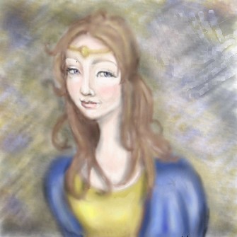
princess
kstew
(Jan 4, 2004)
just playing around
mazi (Jan 4, 2004)
looks like shes missin a chunk of her head there on back. little too much blur tool. but the face is really good. very calming expression
Neverthought (edited Jan 4, 2004)
Very true. Easy on the blur, at least on her hair. Nice nose and mouth though: no outlines=talent.
strangeoid (Jan 4, 2004)
That's quite pretty! Her face is beautiful.
Trey (Jan 9, 2004)
Actually, I kind of like the effect of the blur. It's kind of like a dream-girl and all you can really see clearly is her face... Yeah, but it's a really good drawing. Maybe not the greatest proportions, but for all I know, you did that on purpose too. :) Hey, if you call it Art, just about anything goes so long as that was what you intended, I guess... ;) |
| ||||||||||||||||||||||
| Main Forums/The Post Board | |||||||||||||||||||||||
 |
Fin_beast (edited Jan 9, 2004)
[link contains web exploit, removed] Click on people and its there! This is a drawing i started in lascaux....but...internet explorer mucked up! :( Luckly I took a screen shot just before it mucked up...so i finished it on photoshop! :) "; Im quite pleased with the result!
14 comments
|
||||||||||||||||||||||
| Public Boards/Beginner | |||||||||||||||||||||||
|
P-Chan
(Jan 5, 2004)
errrrrmmm i dont know i can finnished it +sobs+ cool
P-Chan (Jan 9, 2004)
its a comic that we are makeing at school.....if u dont like them just tell us 2 stop ok :D
mazi (Jan 9, 2004)
its fine to draw them. but draw them from 300 different angles, all differnent parts instead of just profile heads with little detail, all the same. its boring and gets you no improvement. not to be mean or anything but its true. theyre 3d objects, not flat panels that are always drawn the same. and theres no set rules to draw something. -_- |

| ||||||||||||||||||||||
|
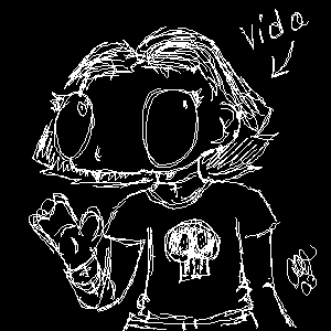
h0micidal-pupp3t
(Jan 7, 2004)
This is Vida. She's one of my generic characters; you know, the ones you draw all over your binders but never give any depth to. I have quite a few of these.Vida is my first submission. I'm sorry there's so little detail; I'm getting used to a brand new tablet, and don't have much skill to start with. Alors. Feel free to delete this if it's considered spam.
mazi (Jan 9, 2004)
awesome style. though yeah you could have spent more time on it. |
| ||||||||||||||||||||||
|
Lully
(Jan 8, 2004)
Zip !! He look deep. +snuggles him+ Garfunkle's Bust Budster !
Wolfheart (Jan 8, 2004)
You might want to think about spending more time on your submits, or maybe instead of 3 seperate ones, you could do it all in one so as not to get people mad.
P-Chan (Jan 8, 2004)
yup but r u there lully?
mazi (Jan 9, 2004)
try drawing something else. all of your drawings are the same. drawing the same thing over and over again will never get you to improve. |

| ||||||||||||||||||||||
| Main Forums/2draw.net | |||||||||||||||||||||||
 |
mikhail (Jan 1, 2004)
well, xod linked me this site... its... ill let u decide for yourself really, this really isnt for the children... so whadduthink, is this art, do u like it or find it sexy? or the extreme opposite... i usually dont mind gore... or porn--but when u combine them.. that really doesnt work for me
20 comments
|
||||||||||||||||||||||
| Public Boards/Intermediate | |||||||||||||||||||||||
|
ender79
(Jan 5, 2004)
Here Is my first finished drawing using an Oekaki program. I had fun, hope you guys enjoy!
mazi (Jan 6, 2004)
best first pic ive seen. nice. hes very pointy and angular.welcome to 2draw. read the rules.
Childlike_Vampire (Jan 7, 2004)
Hey, awesome, I didn't see this. I like it alot, my favorite is the expression. Also how you drew spiky hair without making it look like Vash! lol. Welcome. |

| ||||||||||||||||||||||
|
Knockoff
(Dec 23, 2003)
I guess you could say i drew umm whats that word something cute? *gasp*
Merulotte (Dec 24, 2003)
Ah, you're getting better in leaps and bounds, I say. The eyes are really nice. And even the lack of defined nose doesn't detract from the picture.It would look better with a nose, but it's quite nice either way. Good job, KO.
Minitsaru (Dec 26, 2003)
Merry Christmas!wow, amazing work! u've really got better!
Knockoff (Dec 27, 2003)
Thanks you all for the comments, as for the nose, I meant it to be that way as being small and "chuby". |

| ||||||||||||||||||||||
|
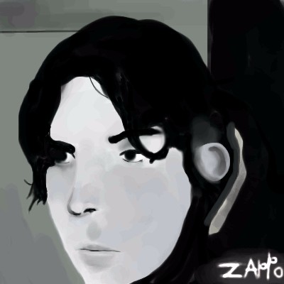
Zappo
(Jan 5, 2004)
Not finished im working on it, just asafety save! Please do not delete!!!? Realism is hard! I didnt even come close. This is the refrence! any kind of help with this would be apriciated, I suck at coloring and shding in shi painter.
jord (edited Jan 5, 2004)
i think it's starting to look pretty good...when i compare to te ref. maybe the lips should be a bit 'fuller' and a bit more to the edge of the face...the same goes for the nose...and maybe the righ eye should be a bit bigger...but it's good, you got the 'atmosphere' right and 57 min is not at all long...
mazi (Jan 6, 2004)
=O is that who i think it is? ^^;; eheh.id say just flash back and fourth between the two pics if you wanna improve it. (since its still called "not at all done") very nice zappo. sexy. (almost as sexy as your uber sexy abstract stuff) |
| ||||||||||||||||||||||
|
mazi
(Aug 2, 2003)
another installment of guess the celebritygotta clean up the lineart a bit then move to coloring [edit:still needs a bg but hey]
Genkaiart37 (edited Aug 3, 2003)
i love linkin park, im just not sure whats better, metoera, or hybrid theory?
nick452 (edited Aug 3, 2003)
that looks cool you sould do some one eles from the band a other time but this one looks good i like it
nyao (edited Aug 4, 2003)
wow.... great lineart and colourz... ^^
Daymeon_StormRider (Jan 6, 2004)
CHESTER!!!!!!! **GLOMPS onto Chester's neck and licks his nose** Take me I'm yours!!!! WAAAHOO!!! Can't WAIT till February!!! Yeah I know I didin't spell it right, but I'm half asleep!! |

| ||||||||||||||||||||||
| |||||||||||||||||||||||
| 2draw.net © 2002-2026 2draw.net team/Cellosoft - copyright details - 1.30sec (sql: 37q/0.81sec) |