| |||||||||||||||||||||||
| Public Boards/Intermediate | |||||||||||||||||||||||
|
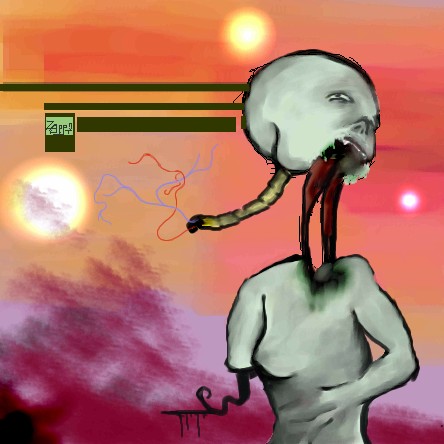
Touch
Zappo
(Feb 17, 2004)
C&C?
Fluffysheep (Feb 18, 2004)
Woah that's great, very original !
mazi (Feb 18, 2004)
hm. well abstracts so hard to c&c.. as theres no real rules. though im not a fan of the purple stuff on the right? it doesnt really match the rest? imho
Deformed (Feb 18, 2004)
Is that a tape worm eating him from the inside out??
davincipoppalag (Feb 18, 2004)
this should be on the cover of a science fiction novel.. very imaginative.. the spinal entrails are a particularly nice touch |
| ||||||||||||||||||||||
| Public Boards/Beginner | |||||||||||||||||||||||
|
sal
(Jan 15, 2004)
first time usin the airbrush..
marcello (Jan 15, 2004)
But to contrast what mazi said, this style has its own merit, and isn't necessarily bad. it's 10x better than the rest of the stuff you've posted.
sal (Jan 16, 2004)
ty for the advice...
ambermac (Jan 22, 2004)
i agree with marcello. there are other styles other than airbrushed/hilight-shiney musclebound comic book styles. you have a unique style.
PinkuEspeon (Feb 17, 2004)
I also agree with Marcello. Hey, ambermac, you should capitalize people's names. |
| ||||||||||||||||||||||
| Specialty Boards/Contest! | |||||||||||||||||||||||
|
11 comments
– latest 4:
lucy_430 (Feb 5, 2004)
Fixed it. :)
tryagainpixie (Feb 6, 2004)
i like incubus....thier an an awesome band....this picture is also awesome...the light, engery, preportions, and hair are very very good <3 it's my new background for my desktop :3
dixielandcutie (Feb 9, 2004)
*swoon* what's cookin good lookin? ;p
lucy_430 (Feb 17, 2004)
Thanks for all the comments. :) |

| ||||||||||||||||||||||
| Public Boards/Beginner | |||||||||||||||||||||||
|
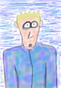
Zappo
(Jan 13, 2004)
The one in the blue is supposed to be me, but whatever.......The person in red, well hes number fourty seven. Hes just like fourty six.....theyre all like fourty six.
furyofroy (Jan 14, 2004)
This one's my favorite, Zappo. And this blurry style is superb. Very smooth.
mazi (Jan 14, 2004)
awesome. reminds me of snoozys matrix pic. love the style.
alwaysLearning (Feb 16, 2004)
This is a very emotionally effective piece, despite its simplicity! I love the message in it. :) |

| ||||||||||||||||||||||
| Public Boards/Intermediate | |||||||||||||||||||||||
|
Zappo
(Feb 8, 2004)
its dexter
staci (Feb 8, 2004)
do you use the watercolor tool to get all that blendieness?
Zappo (Feb 8, 2004)
yea i use watercolor 2on 100 pressure about 7-15 size
dixielandcutie (Feb 9, 2004)
wow, dont know how i missed this one. i love it! its strange, its crazy, it rocks!
alwaysLearning (Feb 16, 2004)
Woah, this is cool, but I don't think I want to stare at it too long this soon after a migraine!!! <LOL> My eyes keep trying to resolve that doubled eye into one. I *REALLY* like your style! This piece in particular has actually inspired me, there's something I'd like to try based loosely on this piece (though when I say loosely, I mean it - I don't copy people's styles without checking with them to see if they mind). Keep up the good work, and though I've said this before, the more I see of your work, the more certain I am: I can't wait to see where you go from here! |

| ||||||||||||||||||||||
| Public Boards/Beginner | |||||||||||||||||||||||
|
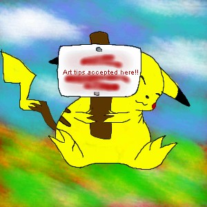
PinkuEspeon
(Feb 15, 2004)
Okay... yeah, that's a Pikachu... and, I bet your wondering why I wrote "Tsuki" (Japanese for moon) on the little picket sign that Pikachu is holding up... I wrote that there as a sub for drawing tips accepted here... why? Because, I'm like... not finished with the picture of the Pikachu holding the sign up! ^_^ I've still gotta write that (in English) on the picket sign that Pikachu is holding up. You may post some drawing tips here early, if you want to, that is! ^_^ But, first, look at my drawings that I have previously drew. Thanks! :D
marcello (Feb 16, 2004)
it could just be a fat pikachu
sal (Feb 16, 2004)
true, true
PinkuEspeon (Feb 16, 2004)
No, no, no... I wanted y'all to look at all of my other drawings. Not this one! |
| ||||||||||||||||||||||
|
Zappo
(Feb 16, 2004)
man this stuff is great! |

| ||||||||||||||||||||||
|
Childlike_Vampire
(Nov 17, 2003)
Hey, I thought this was supposed to be a threesome! Remember me, hellooo, over here, guy with a penis? *miff*Request from a friend, altered to snub his dirty mind. lol.
mazi (Nov 19, 2003)
lmao awesome.
mikhail (Nov 24, 2003)
looks good (=}... the skinny 1 tidus?
Childlike_Vampire (Dec 4, 2003)
Yes, tis Rikku from ffX, no, not Tidus, es Landon. *nod*
lilypad (Feb 16, 2004)
poor guy. mwamwamwa. hehe |
This is hidden because it is rated 18+. Edit your privacy settings to make it visible.
| ||||||||||||||||||||||
| Public Boards/Intermediate | |||||||||||||||||||||||
|
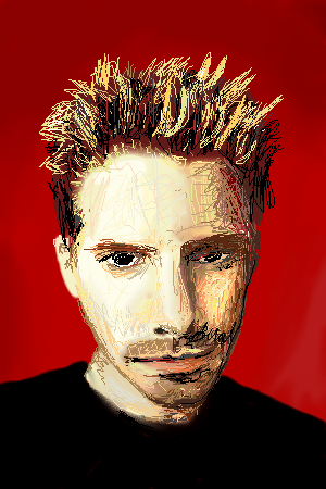
rydicanubis
(Jul 7, 2003)
yay! i liked my louis pic so i decided to do this one...could be better, but it's one of those the-longer-you-work-on-it-the-better-it-gets pictures and i con't want to work on it any longer, so there...! 8 Pyay! :3
nyao (edited Aug 13, 2003)
ooo... wow... cool style... me like... lookz like that dude too. ^^
PinkuEspeon (Feb 15, 2004)
Weird... but, it looks neat.
Fluffysheep (Feb 15, 2004)
Weee, Seth Green ! You've got a nice style, great ! :)
Tuukke (Feb 15, 2004)
nice style.. the forehead is still a bit messed up but the colours are great! it looks like him, really |
| ||||||||||||||||||||||
|
mazi
(Aug 14, 2003)
more lain-inspired stuff.. just a quick one before i get back to some work. hm. the sky was fun to do though.
joe_shmo (Oct 15, 2003)
i thought it looked like lain then i read the comments wowo this is amasing!
false_truths (Jan 15, 2004)
before i read your comment and other peoples comments, my first thought was, "lain! cool!" lol.. the picture is so good, i like the background.. .^__^
Look (Jan 24, 2004)
simple and nice! i like the color
davincipoppalag (Feb 12, 2004)
This is excellent...you have really captured the scene.. it looks real.. nicely done |

| ||||||||||||||||||||||
| |||||||||||||||||||||||
| 2draw.net © 2002-2026 2draw.net team/Cellosoft - copyright details - 3.63sec (sql: 32q/2.69sec) |