| |||||||||||||||||||||||
| Public Boards/Beginner | |||||||||||||||||||||||
|
hm
Childlike_Vampire
(Feb 16, 2004)
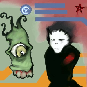
Playing with abstract style to deal with emotions. Bla.
marcello (Feb 17, 2004)
is this person talking on a phone while blood splurts out the back of the head?
dixielandcutie (Feb 17, 2004)
definitely very cool looking...but yea...is that a phone? >.< hehe. nice job.
PinkuEspeon (Feb 17, 2004)
O_O... that's scary...
davincipoppalag (Feb 20, 2004)
This is a cool illustration of what happens when you exceed your allotted anytime minutes on most popular wireless services... lol and its a great job too |
This is hidden because it is rated 18+. Edit your privacy settings to make it visible.
| ||||||||||||||||||||||
|
Zappo
(Feb 16, 2004)
Bored, thats right, I said it!
ky (Feb 16, 2004)
It's not fair to ask how you can constructively criticise this picture. Just because it's a different style doesn't mean you can't constructively criticise it. Art shouldn't have any rules or boundaries, and that goes for any style.Either way, it's a picture by Zappo. I don't dislike anything of his.
alwaysLearning (Feb 16, 2004)
Sorry about the dense text - I'll work on that. I didn't know what the "+/-" was for - I'm still trying to learn how to best use the site.I'll work on my formatting, but I hope the comment itself was okay; the main goal was to offer what useful comments I can. :) I hope I achieved that, at least.
staci (Feb 16, 2004)
yes it does mean "I" cant constructively criticise it. maybe you can ky...*shrug
Zappo (Feb 17, 2004)
horay, comments, lol Thanks alwayslearning, although i have to admit i olny got about 3/4 of what you said.....and as for the background colors, i like the contrast between the blue and orange lines, to me it makes the bg seem not so boring...Ty for the comments! |
| ||||||||||||||||||||||
|
Kirby34221
(Feb 16, 2004)
I kinda messed-up... The BG is what I'm talkin' about.. PLEASE COMMENT! T.T
DieChan (Feb 17, 2004)
Really? Do you know me from there of all places? Do you have a username there, too? If so, what is it? Anyway with the pic, I think it's cute for a first try. But Marcello's right, it's too blurry. And it's lacking shading. You might wanna use layers, too. But this is only your first try, right? RIGHT?! *hypervenelates* Well if it's not, oh well. I'm not a mean and evil person, and I don't wanna be, but the BG could use some work. I'm only trying to give construcive criticism which is good for an aspiring artist. (Look at me sounding like a high school art teacher or something...) Oh, and use Oekaki Shi-Painter, ish teh best! ^^
marcello (Feb 17, 2004)
no, it isn't
DieChan (Feb 18, 2004)
*sits on Marcello* Hush you. �_- It was an opinion. Nothing wrong with opinions.
Noremac (Feb 18, 2004)
i wanna be sat on.... :( |

| ||||||||||||||||||||||
|
sky_warp
(Feb 16, 2004)
sorry about the arms my computer screen wouldnt show the rest of the paper so i couldnt do the arms |
| ||||||||||||||||||||||
|
PinkuEspeon
(Feb 15, 2004)
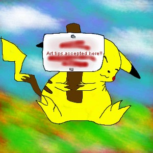
Okay... yeah, that's a Pikachu... and, I bet your wondering why I wrote "Tsuki" (Japanese for moon) on the little picket sign that Pikachu is holding up... I wrote that there as a sub for drawing tips accepted here... why? Because, I'm like... not finished with the picture of the Pikachu holding the sign up! ^_^ I've still gotta write that (in English) on the picket sign that Pikachu is holding up. You may post some drawing tips here early, if you want to, that is! ^_^ But, first, look at my drawings that I have previously drew. Thanks! :D
marcello (Feb 16, 2004)
it could just be a fat pikachu
sal (Feb 16, 2004)
true, true
PinkuEspeon (Feb 16, 2004)
No, no, no... I wanted y'all to look at all of my other drawings. Not this one! |
| ||||||||||||||||||||||
|
foxman8245
(Feb 15, 2004)
This is a guy that shoots pool where I live. He kinda looks like this for real, I just put the cartoon hook on him.. LOL cause he usually beats me in pool. Kinda like my subtle revenge :)
marcello (Feb 15, 2004)
want to finish some before starting new ones?
foxman8245 (Feb 15, 2004)
Yeah.. I know LOL .... I'm new on this site.... so I started several and as I learn, I finish other ones. Mabey I just wont post them till their done but I was hoping for some artistical feedback... besides... is there a guideline against strarting a few pics at one time?? If there is, I'm sorry.8-Ball
Hey.. finally put somewhat of a bg on this old....old... drawing!! LOL
|

| ||||||||||||||||||||||
| Specialty Boards/Collaborations | |||||||||||||||||||||||
|
16 comments
– latest 4:
lucy_430 (Feb 21, 2004)
Cool. I like the thick outlines on the wings.
KiwiKitsune (May 3, 2004)
...OMG!! This is... so... awesome... I love it!! It looks so cool! I wish that I could accomplish something like this... if I were to rate this... I would give it a ten/ten! ^_^||:~*KiwiKitsune*~:||
Urei-sama (Jul 19, 2004)
THIS IS FRIKKEN COOL!!! so awsome. i LOVE IT!
Noremac (May 19, 2005)
why cant i draw like this anymore? |

| ||||||||||||||||||||||
| Public Boards/Beginner | |||||||||||||||||||||||
|
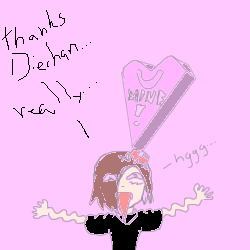
Noremac
(Feb 15, 2004)
thankya diechan and heres my reaction :) |
| ||||||||||||||||||||||
| Information/News | |||||||||||||||||||||||
 |
marcello (Feb 15, 2004)
Read the rules if you haven't! Poll: Do you think there should be an Expert Level board? Expert level is the next step up from advanced, where pictures have a level of finish and detail that sets them apart from the rest. Professional artists would have a hard time finding anything major to validly critisize. Drawings here would most likely be posted far and few between with 5 hours as a reasonable minimum time for this board. You would get ...
57 comments
|
||||||||||||||||||||||
| Public Boards/Beginner | |||||||||||||||||||||||
|
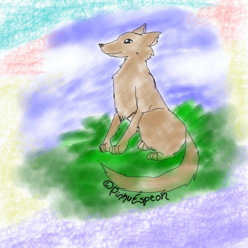
PinkuEspeon
(Feb 15, 2004)
Hmm... I drew this because I was bored... but, anyway, I beg and plead for someone to comment on this! Well... anyway, this was a really, really, really easy picture to draw. I hope that you people out there like it! ^_^ !! Oh, and by the way! Right now, just right now as we speak, it just started snowing/icing/hailing outside. O_O... and... imagine that at the beach...
marcello (Feb 15, 2004)
well the lineart is ok, but the coloring does no justice to the piece. The grass is alright, but everything else, especially the textured brush crap with seemingly random colors around the edge seems poorly thought out. You may try just a solid white or offwhite, or continue the grass and sky to the rest of the piece. On the dog, the main problem is all those white bits. I would suggest start by coloring on a layer between the background and the lineart, and use a solid brush to completely fill in the character (not the fill tool!), then use a darker or lighter brush and add shadows/highlights to give it depth. Last of all, as I've mentioned before, the copyright notice is really tacky. Personally I'd leave it out altogether until you're actually good enough that someone might want to rip you off. Anything you draw is automatically copyrighted whether you put that stupid little notice or not. If someone wanted to use it without your permission they could easily erase that copyright message anyway. If you actually want to include, I suggest making it a lot less obvious (the copyright notice has a bigger presense than the drawing itself!). You could use a thin brush and write it very small, or simply use the text tool and put it in the corner of the picture out of the way and not distracting.
PinkuEspeon (Feb 15, 2004)
Thanks, Marcello... I see... I see the errors that I have made... I will try not to make them again... |
| ||||||||||||||||||||||
| |||||||||||||||||||||||
| 2draw.net © 2002-2025 2draw.net team/Cellosoft - copyright details - 3.14sec (sql: 36q/2.74sec) |