o m g. hey! how can i constructively criticise something like this? i love his face man. and all of it..and im a big fan can i have your autograph please?
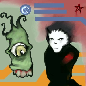
I have to agree with Icats, it's hard to offer much constructive critique on this -- but what I can say is that it's really striking and distinct, and stands out among the other pieces I've been flipping though. There is something that either my monitor or my stomach doesn't seem to like about the combination of colours in the background, but you wouldn't be the first artist whose work has that effect on me... <chuckle> I like the way you've combined the layers of imagery and symbolism, disturbing as some of it may seem (hey, if artists never portrayed anything disturbing, we'd lose a LOT of great art!), and the way the abstract elements seem to highlight that, although I think that's an area where your work will probably improve over time - I see potential for more than I'm seeing here, and I'm already impressed with what I see. The degree of realism in things like the monster's teeth and gums highlights the intentional use of other forms of representation of images, in the rest of the picture, making it clearer that it's a deliberate choice and not just a lack of skill. All in all, a very arresting image - I wouldn't be at all surprised to see your work in a gallery or museum someday, if you continue from this kind of a base. It reminds me of a darker aspect of the expressionist art that I've seen in programs on TV -- and, like that art, this too seems very representative of the era. Before all this praise goes to your head, let me pop the bubble a little and say that I would consider this to be an early work of an artist who shows potential, not the work of the same artist once their skill has matured -- but I still see a lot of strong points in it. I'd consider spending a little while focusing on your grasp of the interaction of colour values, because I think that may be this piece's weakest point, but it's got more than enough strong points to make up for that, in my opinion. Altogether, a very promising work.
holy shit that's some dense text... you should use paragraphs.... It might help to click the little + in the corner so you can see more of your message at once...
It's not fair to ask how you can constructively criticise this picture. Just because it's a different style doesn't mean you can't constructively criticise it. Art shouldn't have any rules or boundaries, and that goes for any style.
Either way, it's a picture by Zappo. I don't dislike anything of his.
Sorry about the dense text - I'll work on that. I didn't know what the "+/-" was for - I'm still trying to learn how to best use the site.
I'll work on my formatting, but I hope the comment itself was okay; the main goal was to offer what useful comments I can. :) I hope I achieved that, at least.
horay, comments, lol Thanks alwayslearning, although i have to admit i olny got about 3/4 of what you said.....and as for the background colors, i like the contrast between the blue and orange lines, to me it makes the bg seem not so boring...Ty for the comments!
post comment
You need to be logged in to post a comment. If you don't have an account, sign up now!
drawn in 24 min
Either way, it's a picture by Zappo. I don't dislike anything of his.
I'll work on my formatting, but I hope the comment itself was okay; the main goal was to offer what useful comments I can. :) I hope I achieved that, at least.