| |||||||||||||||||||||
| Public Boards/Advanced | |||||||||||||||||||||
|
d y h s m t s ?
zep
(Aug 6, 2005)
i h a l o m t s ? i d k
Zinc (Aug 7, 2005)
I'm just in awe. zep, you're just too good. very inspirational.
zep (Aug 7, 2005)
thanks a lot for all your nice comments guys....and Kasha you don´t need a teacher, believe me i´m one of them :)
fleeting_memory (Aug 11, 2005)
do you have some more time stamps? That's all I could come up with for the title but the picture is awesome. I like the idea of the two half moons-one bright and one not leaving only half the moon in the sky. Maybe that's not what you were going for but thats what I saw. Very cool.
sincity (Aug 11, 2005)
Well Sh-! I can't comment enough on your stuff to begin with and you still manage to pull something like this out and leave me speechless yet again. Great work sir! :} |

| ||||||||||||||||||||
| Specialty Boards/Collaborations | |||||||||||||||||||||
|
ok if you going to paint this you gotta do heavy painting(i mean no lines(" opaque painting" just like paintings, got me ^_- :D .) have fun.
6 comments
– latest 4:ps. i have to rework the girl on the back see looks like a man XD XD lmao *remember don't paint the original layer
pencilhero (Aug 6, 2005)
oooops i totally forgot the collab O___oit's really good ill try to fix his jacket when my hand is ok. :D although i am afraid of doing it cause i have problems with the memory size i don't know but for some reason when i draw i always spent a lot of memory i did one on advanced board just a quick sketchy version and it took me 1.5mb /1.2 mb i had to immediately delete it :( dunno maybe lauscaux is eating too much memory...
lycene (Aug 6, 2005)
Oh... I had completely forgotten about the memory. It's probably my painting style, it tends to completely consume it. I think the guy's mouth is sort of too far to the left, but I can't seem to get the selection to work. Could you try to fix that? I also need to adjust the angle of his nose, it's kind of wierd.
pencilhero (edited Aug 6, 2005)
ok now it's working my lagging pc kinda freak me outmy selection tool doesn't work either so i drew a new mouth i set the nose angle and i lightened the girls face, it was
little bit dark |

| ||||||||||||||||||||
| Public Boards/Beginner | |||||||||||||||||||||
|
dragon-spirit
(Aug 6, 2005)
Another dragon :D,, this dragon is better than my first one. ^^
Namori (Aug 6, 2005)
wah!! I envy you! I'm so terrible at drawing creatures, especially dragons!
lycene (Aug 6, 2005)
This looks very delicate in a sharp sort of way, if that makes any sense. I like it a lot.
dragon-spirit (Aug 6, 2005)
Thank you all so much, I'm going to draw more dragons soon. ^^
Chaotic (Aug 6, 2005)
I like it, it's looks nice an' serpentine-ish...I love dragons, especially when they're drawn as well as yours is, nice job ^-^ |

| ||||||||||||||||||||
| Public Boards/Advanced | |||||||||||||||||||||
|
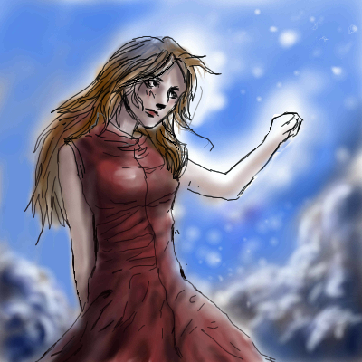
me007
(Aug 4, 2005)
Ok, I am not exactly sure what to put as the background, so I was hoping for a few suggestions.
EyeOfSauron (Aug 14, 2005)
awesome. looking forward to seeing this finished. I think the background would look great as a horizon with sky and sea. up to u tho
TaCO (Aug 25, 2005)
O.O Me likes!!!!!Great perspective!!!!!!
LisaAnne (Aug 27, 2005)
I'd leave the background the way it is right now, because I think if you added other details it could take away from the skill and beauty shown in this piece. I enjoy the position of the figure and how she's sort of pushing on the edges of the canvas.
Roxana1890 (Jul 23, 2008)
nice.very nice. |

| ||||||||||||||||||||
| Public Boards/Intermediate | |||||||||||||||||||||
|
pencilhero
(Aug 5, 2005)
i guess the main theme is the clouds XD i don't like comicstyle artwork but i could'nt do anything else with shi-painter i should have chosen lascuax XD .shi painter isn't good it's very buggy when i scroll or zoom in weird lines appear XD. Tsk i need a new wacom this thing is bad my drawings look like i have parkinson or something :/ i bet those wacom intuos must be good...
friend (edited Aug 5, 2005)
Parkinson lol! They don't make you look like that! the clouds are Very good, they are so puffy and...delicious! The girl is gorgeous!
davincipoppalag (Aug 5, 2005)
This is a nice drawing..I like how you drew her dress (no evidence of parkinsons)..
darkshadow (Aug 5, 2005)
Great pic the clouds are very nice i am drawn to her face........... Lovly
lycene (Aug 5, 2005)
I really like the shading on the dress and the clouds--you definitely have a talent for it.I've been working on our collab (not done yet); please let me know if you're happy with it so far or if you want any changes made. |
| ||||||||||||||||||||
|
Renuar
(Aug 5, 2005)
It practically drew itself. Needs some touching up here and there. Shall finish soon.
solve (Aug 10, 2005)
the color work is mind blowing!!! holy shit! it looks as if someone took a face between two hands and pulled.
LisaAnne (Aug 10, 2005)
I really enjoy how the little hidden face in the lower right corner, and envious color work right along side the title. I'm still new here, but your work is some of my favorite. I appreciate how you have clean lines, yet they still have a very soft look to them. Very expressive, not just in facial position, but color and "brush work". Nice job.
Cordelia_Pink (edited Aug 12, 2005)
That's incredible. The way the colors and the short thin lines can shape a figure such as a face, and can still make you distinguish the eyes, nose, and lips, is just incredible. This is great. Good on ya.
KH44N (Aug 12, 2005)
I agree Cordlia, this is incredible. I love everything about it! |

| ||||||||||||||||||||
|
kisara
(Aug 5, 2005)
I posted at the intermediate for tips to get better..alas in beginner I get none..u__u..please critique..?? ^^.. this was based off a painting in real life..^^ my hand hurts now..e__e..*shakes mouse* and ...I am sorry if colors seem off to everyone. My computer is bad and colors get weird on me..^^;;;;
emmamommalag (Aug 5, 2005)
I like this picture very much. I agree that it needs more sharpness in places. The places depend upon your intention.. I see the plants as mostly underwater with the water surface being the defining line.. in that case, the plants and grass above the water line need sharpening. If you intended the plants to be in the foreground with the the water as the background, then the whole thing needs sharpening. Hope this makes sense. :-\
kisara (Aug 5, 2005)
thank you all very much *^^* I will work on this some more with what has been stated ^^
oikitsumaru (Aug 5, 2005)
I disagree with davin about the water that is furthur away being the darkest. Its not nessesarily true. Maybe if it were at nighttime. And I also disagree with emma, If you want your focus to be on the plants in the front, that is where you should be more detailed. Not even nessesarily sharpened. The background you can get away with it being more out of focus. And with shading, things closest to the sun should be brighter. Since there isn't anything blocking light. XD It is really nice, what you have. I think you have a really good feel for backgrounds!
lycene (Aug 5, 2005)
Actually, I don't mind the coloring at all; it's very pretty, and could be more so if it was more defined. Also, I think that it would be much more powerful compositionally if you lowered the horizon line and/or raised the hill in front to make the difference between the two really stand out. I can't do landscapes for beans, but you really have something going here--good luck! |

| ||||||||||||||||||||
| Public Boards/Advanced | |||||||||||||||||||||
|
lycene
(Aug 2, 2005)
Stumbled across her while doing a search for reference pictures of birds, and figured this would be more fun to do. (Yay, portraiture.) She was the first female Australian aviator.First Advanced posting, hope it's OK. Ref: Link Edit: Made it sepia in Photoshop: Link, Take 2 I'm actually proud of this one, yay.
lycene (Aug 4, 2005)
Thanks so much, JK! I had problems getting the relative darkness and shadows correct, as I work from print-outs, and my printer is almost out of black and white ink. The whole pic ended up several shades lighter, with horizontal lines running through the whole thing (eew)! I didn't want to go into too much detail in the clothing, as I wanted to really focus on the face. (That, and I got lazy). I probably should have made the shadows much purer than they actually are.Hideyourface, I can't really see the angle difference, but that's probably just me being biased and blind because I drew it. Oh, well, too late to fix it now.
Gigge (Aug 5, 2005)
I like this alot. I think it conveys that sense of free-spirit and adventure that she must have had to compel her to fly.
Renuar (Aug 5, 2005)
Much talent. Good draw. I look forward to seeing more.
Rosemary (Aug 11, 2005)
wonderful picture the expression is just great! |

| ||||||||||||||||||||
| Public Boards/Intermediate | |||||||||||||||||||||
|
quintessence
(Aug 3, 2005)
Mm, solids.
fleeting_memory (Aug 4, 2005)
nice job on the lips and good hand-very nice :)
Ian (Aug 4, 2005)
ooohh ahhh! very well done! like the pastel colours!
Knockoff (May 3, 2006)
I love this, everything about it. Esp. the colors. Wish she'd draw here more :[
Sweetcell (May 5, 2006)
Looks like a pop poster, this is beautifully colored, I'm with you knockoff. |

| ||||||||||||||||||||
|
oikitsumaru
(Aug 3, 2005)
minus a few deformaties, I like it. My RP idenity and my friend 'chaddish'. (who should go back to DA! XD *grumbles*)
lycene (Aug 3, 2005)
Very cute; I love their expressions and the colors work very well together.
nyao (Aug 5, 2005)
hee hee... so cute ^^i love the ears~ and their expressions ^^
Cianteed (Aug 6, 2005)
amazing work! it looks so professional.
Urei-sama (Aug 13, 2005)
this is nice. the style is very professional although their expressions bother me alittle... |

| ||||||||||||||||||||
| |||||||||||||||||||||
| 2draw.net © 2002-2026 2draw.net team/Cellosoft - copyright details - 1.11sec (sql: 38q/0.35sec) |