| |||||||||||||||||||||||
| Public Boards/Beginner | |||||||||||||||||||||||
|
So-na
(Jul 22, 2005)
The forehead looks weird. :p |
| ||||||||||||||||||||||
|
whitebunny1063
(Jul 22, 2005)
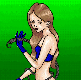
Tracey is craddling Marill to sleep because it had a bad dream
whitebunny1063 (Jul 22, 2005)
What's wrong with you? I'm doing best here and this is the thanks I get! Thanks for hurting my feelings :(
FLYING_SQUIRREL (Jul 22, 2005)
I dont wana be mean but thier right, this belongs on the beginer board. where not trying to hurt your feeling.
hideyourface (Jul 22, 2005)
18+ would be for something that shoes nudity.
lycene (Jul 22, 2005)
For this to be posted on the Intermediate Board, you would need to add deeper shading to make the characters more 3-d (three or four shades of each color, at least), as well as refining your line-art a bit more to make the pic appear more clean and professional. In addition, you'll be amazed at what you can do if you spend a little more time on each picture.The 18+ rating is reserved for explicit nudity, violence, etc. This is a very cute scene, and should be rated Everyone. Try looking at pictures by artists that you admire, and focus on how they work with shading and composition. Try not to take it so personally, everyone starts out in the Beginner's board. Good luck! |

| ||||||||||||||||||||||
| Public Boards/Intermediate | |||||||||||||||||||||||
|
sephiroth54321
(Jul 6, 2005)
it's just a rough right now, but it will look good when finished
SimplyX (Jul 23, 2005)
I would like to commend you on your effort put through this long process. At least you decided to put quality first rather than quantity and ignoring the 10 hours that state for the duration time. Or was it really 10 hours or a bit off? Seeing the number of revisions you've done, it is obvious that you were persistent in making the lines as crisp and arranged properly just as you've observed on the original picture (or I suppose the reference). A background would be nice too but I suppose making a duplicate of the original is satisfying enough then there is no need to make any more hassle with it. Not really what I call exceptional but acceptable enough for this board, if I say so myself.
sephiroth54321 (Jul 23, 2005)
thanks, I really didn't pay much attention to the ref though, and the timer isn't really off.....most of the extra time in between is just me thinking of what to do next.....
Minty_hippo (Aug 9, 2005)
wow thats really cool! Looks juts like the other one! Sep did add his own colour kinda!hey sep, if you get any more space add a shine to the blade! make it look like if you touch it ever so slightly you'll get cut! Nice one!! this is brill!!
sephiroth54321 (Aug 11, 2005)
Thanks....I really would like to take you up on your advice, but I put so much time into this I kinda just feel like leaving it as it is... |

| ||||||||||||||||||||||
| Public Boards/Beginner | |||||||||||||||||||||||
|
deception_rose
(Jul 22, 2005)
*huggles* I love Link and can't wait for the new game to come out!
JK-Arts (Jul 22, 2005)
Good idea' worst rpg.... the old skool versions were cool only about the time of nintendo.
hideyourface (Jul 22, 2005)
ocarina of time is definitely in my top 3 favourite games ever.
JK-Arts (Jul 22, 2005)
1 ff72 fight night 2004 3 disgaea 4 warcraft 3 5 C&C Renegade 6 D2 (diablo 2) 7 ff 9 8 Wild arms 3 9 ff 10 10 GTA
Childlike_Vampire (Jul 22, 2005)
Zelda rules. Great drawing of Link, it's cute and pretty yet masculine, it looks just like him. |

| ||||||||||||||||||||||
| Public Boards/Intermediate | |||||||||||||||||||||||
|
fleeting_memory
(Jul 13, 2005)
Alright I am afraid to add anymore to it. All I really wanted to fix way the skin to tail transition. Thank you to Maiko for the space! YAY you are awesome. If you guys feel that this should be moved then I can't stop youl, but I am proud of it.
Asriel (Jul 22, 2005)
for all the simplicity of the rain and lightning, it still works. and yeah, lets see hideyourface do better, or copy it for that matter.
hideyourface (Jul 22, 2005)
hey, It's just my point of view.Im giving my thoughts on the picture.
Gigandas (Jul 22, 2005)
I think there's a difference between helping and just saying that you dislike the picture. If you don't like something, you could point it out? Then say what you think needs to be done to fix it. That way, it'll be beneficial.I like the rain, but now the tail seems to blend into the background a bit. You could try lightening up one or the other to separate the two. I might also add some glow around the lightning too. I like seeing how hard you're trying here for sure :). Keep on going.
Knockoff (Jul 22, 2005)
Pretty cool idea, unfortuantly this isn't advnced quality. The clouds are a bit blurry and could have more detail in them, Maybe a bit more variation in them too, it look like one big line of clouds. The lightning is a bit harsh on the eyes, no offence. It looks like you used the linetool. The rain is too thick and you can see it too much. Blocks the picture a bit. Good wings, but they look a little thick at the edges. I'm not sure about the hand behind the back, and after that the proportions go whacky. (though I think that was on purpose) The colors in the black sky are neat, but maybe you could add more detail and add variaiton. The circle of light really needs work on. Make it brighter and less blurry. (it'll bring your eyes to the character) Good attempt. More practice would be better if you plan on taking your art into this board. |

| ||||||||||||||||||||||
| Public Boards/Beginner | |||||||||||||||||||||||
|
two-na
(Jul 20, 2005)
love;
Cordelia_Pink (Jul 22, 2005)
Ohhh NOW I see a boy (my other computer was just too dim and it won't allow me to change the brightness). He looks a bit nude. lol I see the shadows and the reflection on the water though maybe not really any ripples. It's good... but not quite... good. Well, it's a good 15 mins.
AuschwitzBurns (Jul 22, 2005)
I'm intrigued.
fleeting_memory (Jul 23, 2005)
isnt the minimun two hours for this board?
Xodiak (Aug 7, 2005)
This is very great. Nice naked boy in the water! >:)|XOD| |

| ||||||||||||||||||||||
| Public Boards/Intermediate | |||||||||||||||||||||||
|
lucy_430
(Apr 9, 2005)
:l
FLYING_SQUIRREL (Jul 21, 2005)
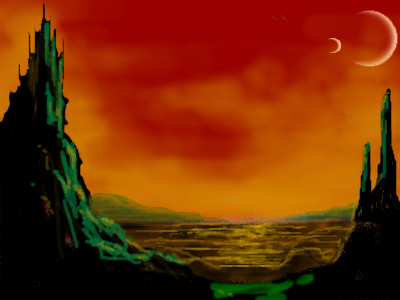
I like the moon and the clouds
davincipoppalag (Jul 21, 2005)
This is great..Good water and I love the mystical castle
JK-Arts (Jul 21, 2005)
This picture is pretty cool but, where is the flying dragons?
HunterKiller_ (Jul 29, 2005)
This is absolutly fantasic. |
| ||||||||||||||||||||||
| Public Boards/Beginner | |||||||||||||||||||||||
|
Silenceinblackandwhite
(Jul 21, 2005)
its a five year old star!
hideyourface (Jul 21, 2005)
young, and fat! |

| ||||||||||||||||||||||
| Public Boards/Advanced | |||||||||||||||||||||||
|
sagenev
(Jun 15, 2005)
from today I will begin to write some signals to remember and create the history...some words some letters from today ... looking
the final... a seven.
a new day to born
friend (Jul 21, 2005)
This man will get plenty of peace in the ocean....
hideyourface (Jul 23, 2005)
I dont really find your style that appealing, but do appreciate it for all the time you put into it with the little details. Still, the arms, boat, and water look unfinished. |

| ||||||||||||||||||||||
| Public Boards/Beginner | |||||||||||||||||||||||
|
Xodiak
(Jul 21, 2005)
He is not sad. He is just unhappy. <:)|XOD|
Minty_hippo (Jul 21, 2005)
awwwwww *gives the man a tissue*
darkshadow (edited Jul 21, 2005)
splash water in to knock it out * hands bucketcool face XOD like the colors
hideyourface (Jul 21, 2005)
is that little symbol supposed to spell Xodiak? Because if it is, I cant find the A..
Xodiak (Jul 22, 2005)
Not really, but you can find all the letters in the symbol if you try to. http://xodiak.keenspace.com/images/name.gif|XOD| |

| ||||||||||||||||||||||
| |||||||||||||||||||||||
| 2draw.net © 2002-2025 2draw.net team/Cellosoft - copyright details - 0.82sec (sql: 39q/0.45sec) |
I don't think I'm ready for intermediate. I don't feel too confident with the applets.. yet. ;)
|XOD|