| |||||||||||||||||||||||
| Public Boards/Beginner | |||||||||||||||||||||||
|
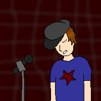
angel bear
spine-to-the-effin-shank
(Aug 10, 2005)
well this is my second picture on here its a little better than the first one but it still sux pretty bad....the background especially sux...thats not exactly what i was goin for....still tryin to get the hang of it though....
darkwings45 (Aug 10, 2005)
awww it looks so cute!!!!
hideyourface (edited Aug 10, 2005)
what you should do is, draw the background on first layer, draw the outline on the 3rd layer, and colour in the lines on the second layer. When you use the pen, and the fill tool, you get that ugly whiteness outside the pen line.
spine-to-the-effin-shank (Aug 10, 2005)
why thank you much...ill do that next time
inatyrb (Aug 10, 2005)
Thats definatly good advice! If you do that drawing will be easier, and colors will come out better. |

| ||||||||||||||||||||||
|
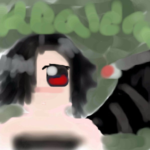
Juni_gatsu
(Aug 9, 2005)
Inspired by Hisashi's kick-ass hair....more tablet practice, i think i'm getting better....>_>
hideyourface (Aug 9, 2005)
the neck and shoulder area could use work, but I really love every aspect of the face.
spine-to-the-effin-shank (edited Aug 9, 2005)
whoa dude....that effin rox...u shud get some kind of an award for that....
Juni_gatsu (Aug 9, 2005)
yeah, the shoulders got really slopey and I just was too lazy to fix them >.<
whitebunny1063 (Aug 10, 2005)
who's he? |

| ||||||||||||||||||||||
|
darkshadow
(Jun 28, 2005)
from naruto the outcast head protecter with blood who do you think it belongs too? o_O you have a few to pick from. happy with the way it cane out :P even if you are right i cant tell you. cuz a few people fussed at me for letting something go last time :)
hideyourface (Jun 29, 2005)
It's not horrible or anything, and Im sure you're quite capable of making this same picture intermediate.
darkshadow (edited Jun 29, 2005)
thanks i am going to try doing it a little diffrent next time but keeping the idea of this pic i learn and figured out a number of things doing this one i still like it and am glad i made it. but if i do it smaller i should beable to do more detailed things to it thanks
oikitsumaru (Aug 2, 2005)
Itachi-sama!! XD love the wood effect and the blood and everything.
darkshadow (Aug 10, 2005)
thanks |

| ||||||||||||||||||||||
| Public Boards/Intermediate | |||||||||||||||||||||||
|
Tezzy
(Aug 9, 2005)
My friend Colitas requested this pic from me xD yes he is fruity like that. he gave me the Ref pic alsoI have a feeling Xodiak mught like this too lol
hideyourface (Aug 9, 2005)
her shoulders are pretty far apart, and makes her look manlyy. the detail in the nipple ring is nice though :D
TheCrimsonKing (Aug 9, 2005)
Maybe the woman in the reference pic was manly, hide.Well done Tezzy. Like the detail in the chest area, but why the lack of detail in the head and mask?
davincipoppalag (Aug 10, 2005)
Interesting, yet confusing picture...man/woman thing ...nice work
Xodiak (Aug 10, 2005)
Yes, Xod likes the drawing alot! I feel Xod's erection growing already. >;) I love the fetishes with body decorations and accessories, like leather masks, straps, belts, bondage suits, chains, handcuffs and body piercing. They are very sexy and artistic! Beautiful and sexy artwork! *enjoys the drawing in Xod's way* >:p~~~~~|XOD| |
This is hidden because it is rated 18+. Edit your privacy settings to make it visible.
| ||||||||||||||||||||||
|
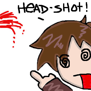
hideyourface
(Aug 9, 2005)
MEH
hideyourface (Aug 9, 2005)
yeahh, before he was like D:, but now hes like, "ooo fire".
darkshadow (Aug 9, 2005)
nice pic again hide like the in contemplation or constipation look great shading
solve (Aug 10, 2005)
this is an excellent picture to have as an icon. its full of emotion, uses great colors to add to emotion, and is straight to the point (for me).wonderful work.
Xodiak (Aug 10, 2005)
Wow... this is a great face. I like how it is bright red. The shading is perfect. Yes, this is a fantastic icon. <:)|XOD| |

| ||||||||||||||||||||||
| Public Boards/Beginner | |||||||||||||||||||||||
|
xaxsinglextearx
(Aug 10, 2005)
um...just messing around with the hair and face and hat
oO-Bluestar-Oo (Aug 10, 2005)
I think you could've used more detail, but the concept of the picture is pretty good. Nice job.
hideyourface (edited Aug 10, 2005)
You should shade more. And if those are bricks in the back, the lines seperating them should be darker. Also, I dunno about lasaux, cause I never use it, but in oekaki shi, you cant get really good textures that look a lot like brick when they're the right colour. That's only if the background is a brick wall though >.>
Drummer6 (edited Aug 10, 2005)
He looks like the lead singer for Fallout boy. :P |
| ||||||||||||||||||||||
|
oO-Bluestar-Oo
(Aug 10, 2005)
^^;;; This is my first time on 2draw, so I hope it's okay. It's a Gaia Avatar, and the avatar's name is xX~Kealdra~Xx, she's my best friend in real life, and her Avatar is really easy to draw...Anyway, the website link is www.gaiaonline.com, and I'm pretty sure the entire appearence shown here can be used, save for the demon wing... I think it's pretty good, considering I suck royally at colouring, so yeah... >w< Comment, demmit!
Please? *Begs you*
hideyourface (Aug 10, 2005)
A few people have drawn gaia avatars on here for people. You should try outlining with the pen tool, and colouring it in with the pen on a layer beneath that one. however getting used to the watercolour tool is good too, as long as you get the details in.
oO-Bluestar-Oo (edited Aug 10, 2005)
Alright. ^^ Thanks for the advice.I was sort of going for a grungey feel though, so I decided not to outline. Plus where I am, it's 2:42, so I was feeling a little lazy... |
| ||||||||||||||||||||||
|
sexy_thriller
(Aug 9, 2005)
lo lo lo
KH44N (Aug 10, 2005)
LMAO! It looks cool.
hideyourface (Aug 10, 2005)
18+ is only for nudity and gore I think. 13+ is ok if it's just blood.
Rudeezy (Aug 10, 2005)
heheh. whats up wit mah eyes? |
| ||||||||||||||||||||||
|
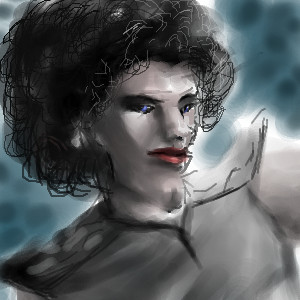
suzie
(Jul 25, 2005)
Ok its done. I just need to practice so much more!!! Nearly deleted it, as I am not that happy with it, all I see is the faults..lol Don't you think we are our own worse critics?
emmamommalag (Jul 26, 2005)
Yes, you can but it's harder than it would seem. Good job, suzie. :)
Cordelia_Pink (Aug 9, 2005)
Who is he? I think he's a cutie. The latest revision is great because I don't see any errors or need for more improvements. Looks good.
hideyourface (Aug 9, 2005)
some parts needed to be shaded/highlighted more. However it's very good.
emmamommalag (Aug 9, 2005)
You've finished it up very nicely, suzie. :) |

| ||||||||||||||||||||||
|
pencilhero
(Aug 9, 2005)
XD
hideyourface (edited Aug 9, 2005)
certainly original >.>one thing.. draw less greyscale ;o I really like your picture with that really blue water, and I'd like to see more of it. |
| ||||||||||||||||||||||
| |||||||||||||||||||||||
| 2draw.net © 2002-2025 2draw.net team/Cellosoft - copyright details - 1.32sec (sql: 35q/0.77sec) |