| |||||||||||||||||||||||
| Public Boards/Intermediate | |||||||||||||||||||||||
|
Posing
Mal
(Aug 22, 2005)
Human form practice
HunterKiller_ (Aug 23, 2005)
Hehe, nice. Something a little strange about the breasts but i'm anatomist so i really don't know what.
Mal (Aug 23, 2005)
Thanks all, I used a tutorial in an art book for the reference. & I need more practice drawing people & picking up on the Subtleties of anatomical details.
davincipoppalag (edited Aug 23, 2005)
There are also some good tutorials in the forums someplace for all that kind of thing.. might take some hunting but they are good ones...actually they were easy mazi pinned it... http://cellosoft.com/2draw/view/11685/
hideyourface (Aug 23, 2005)
I think her ribcage looks too low and should be a bit wider than her stomach. Also, you cant really see her right shoulder. maybe it's just the shading. This is a great site for anatomy/hands etc.. http://www.saveloomis.org you can shoose from different books and see all the scanned pages. It helps with a sort of basic bone structure, and simplified muscles. |
This is hidden because it is rated 18+. Edit your privacy settings to make it visible.
| ||||||||||||||||||||||
| Specialty Boards/Elite Bastards | |||||||||||||||||||||||
|
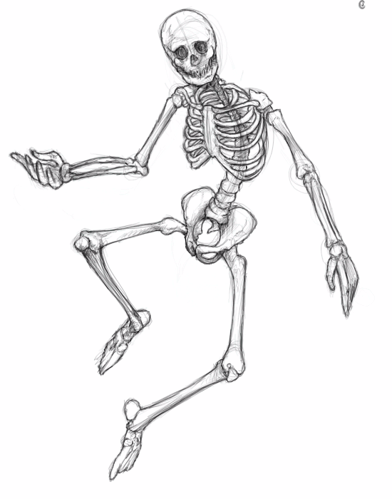
TheCrimsonKing
(Aug 22, 2005)
It's a skeleton.Lose some weight A-hole!
Gigandas (Aug 28, 2005)
Looks pretty good when you take a glance, but in detail (assuming you're practicing the real human skeleton) there could be some improvements. LisaAnne did cover the fingers which will need more joints and the hands themselves have tons of smaller details near the wrist (find a reference for accuracy/this also goes for the feet). The right hand angle looks funky along the pinky and the bottom of the hand too (might wanna mess with that to get it to look right). I also see that the right thigh bone (?) gets rather thin as it gets to the ball part of the bone near the pelvis, but on the left side, it doesn't making it look a bit deformed in comparison. There are more things but I'm kinda in a hurry at the moment so if you need another person's eye for some help again, I'll give you more things to look at. Good luck with that.
Caddris (Sep 1, 2005)
Wow, first of all, that's totally awesome. Okay now for the help with anatomy. It looks like you have the ribs articulated to the scapula (shoulder blade). The colar bone is the only bone besides the humorus that is attatched to the scapula. The scapula sort of floats over the rib cage and glides back and forth and up and down when the arms move. You're missing the last two false ribs but that's not really a big deal because they'd have to be seen through the rib cage. There should be some vertabral processes visible at this angle. The ball joint of the femur comes off at more of an angle. The right femur is pretty close to the right angle. And finally just make sure that there is a clear distinction between the tibia and fibula of the lower legs. But I absolutely love the rotation you put on the radius and ulna! That's perfect and just breath takingly gorgeous. I'm in anatomy class this year and I'm absolutely fascinated by the beauty and form of the vertabrate skeletal system. I've also noticed that the anatomybase has helped my drawing, always a plus. If you want a good reference book for antatomy for art I would suggest "Drawing Human Anatomy" by Giovanni Civardi. It's pretty in depth and leaves out all the really deep tissue organs and muscles that have absolutely no effect on the outward shape of the body.
sincity (Sep 18, 2005)
Awesome stuff. What could you possibly need help with on this? :}
kissimmeegurl (Feb 26, 2007)
HAHA i luv it!! lol <3 |
| ||||||||||||||||||||||
| Public Boards/Beginner | |||||||||||||||||||||||
|
TaCO
(Aug 21, 2005)
crap
hideyourface (Aug 21, 2005)
yay. you're good with colours.
TaCO (Aug 21, 2005)
Lot's of people tell me that.
hideyourface (Aug 21, 2005)
maybe its true o_o
KH44N (Aug 22, 2005)
This looks amazing! I love the different colours u use! Good job. |

| ||||||||||||||||||||||
| Public Boards/Intermediate | |||||||||||||||||||||||
|
Jakira
(Aug 21, 2005)
my first"realistic pic"YAAAYY!!!!!!!!!!!!!
hideyourface (edited Aug 23, 2005)
well.. the eyes are too far aparts, you shouldn't shade at the top of the nose, there should be more shading underneath the nose, lips, eyebrows, and neck, and the neck should be straight, not curved. But not bad..
nekodesu (Aug 21, 2005)
I suggest you use a reference until you can draw without looking at them. It'll take a while though. Just look up something on google or something. But this isn't a bad start :)
p3ndragon (Aug 23, 2005)
Like Nekodesu said, start by using a reference. The eyes are a little far apart and large. The nose is pretty good, but needs more shape. I don't think this should be in the intermediate board. |
| ||||||||||||||||||||||
|
lamamo
(Aug 18, 2005)
I tried my best but I can't get the top wing right, other than that i think it looks alright.
Anna (Aug 22, 2005)
Hey!! Good stuff. Love how you have it colored. Pretty!
Dagan (Aug 22, 2005)
My brother(not Derrick) killed a Dragonfly with his knife yesterday that looked just like that one. It was pretty awesome. Anyways... awesome pic. keep it up.
HunterKiller_ (Aug 22, 2005)
That's beautiful. Looks like a poetic book illustration.
Animegirl250 (Aug 22, 2005)
This should be in advanced. It's wonderful! |

| ||||||||||||||||||||||
| Public Boards/Beginner | |||||||||||||||||||||||
|
whitebunny1063
(Aug 20, 2005)
I had a nightmare that another original character of mine,Murdoc was getting killed by train! How I love playing with Murdoc
Animegirl250 (Aug 21, 2005)
Wish I had dreams with my original characters in them,...
KH44N (edited Aug 21, 2005)
This looks awesome! You did a fantastic job! I like the background, and i like the different colours u used. Keep up the good work! ^__^
BSOD (Aug 21, 2005)
I once had a dream with Pilot ( my character) in it... the one with the Zombies and Harry potter >__<
whitebunny1063 (Nov 17, 2005)
To tell you the truth,Murdoc is American and he's kind |

| ||||||||||||||||||||||
| Public Boards/Advanced | |||||||||||||||||||||||
|
davincipoppalag
(Aug 20, 2005)
Also known as the "Flowerpots"...extreme tide differences...
davincipoppalag (Aug 24, 2005)
Hey..Thear! LTNS..Thanks!
LisaAnne (Aug 24, 2005)
You're giving Mother Nature a run for her money! Beautiful...I love the little people as well.
~~PuFFeR~~ (Sep 4, 2005)
I noticed that a lot of your pictures involve some type of water scene, do you live by the ocean?
davincipoppalag (Sep 9, 2005)
More or less Libby.. I live on the coast in Connecticut. I love the water..(I'm a Pisces!) lol |

| ||||||||||||||||||||||
| Public Boards/Beginner | |||||||||||||||||||||||
|
plasma_ooganator
(Aug 21, 2005)
title is reason for ratingyay!
hideyourface (Aug 21, 2005)
correct me if Im wrong, but you can see the name despite the rating o0o.
plasma_ooganator (Aug 21, 2005)
lol oops
KH44N (Aug 21, 2005)
This is really cool. I like the creative idea, and nice work! ^__^ |
| ||||||||||||||||||||||
| Public Boards/Intermediate | |||||||||||||||||||||||
|
nekodesu
(Aug 20, 2005)
Singer from Dir en Grey. I printed a ref yesterday but I'm too lazy to find the link for it. Modified some things here and there but whatever. Copying is boring.
davincipoppalag (Aug 20, 2005)
This came out really good neko..I like how you did the hair and the shadows work really well too
Chimpeggs (Aug 21, 2005)
I commented on this on Deviant ^.^ I love how it came out...very great job!!!
Kenshin (Oct 9, 2005)
Yay Kyo XD*<3's Dir en grey*
Fire_Dragon (Dec 21, 2005)
hehehehe I <3 dir en grey there amazing (>^^)><(^^)><(^^<) |

| ||||||||||||||||||||||
|
littlepony
(Aug 20, 2005)
heh i was bored now im tired so good night
Juni_gatsu (Aug 21, 2005)
Cute picture, I really like the flamey look on it's mane and muzzle ^.^But even so, this is really not up to intermediate standards, the colouring is very flat, the lineart is harsh and then blurred in someplaces and there is a real lack of detail....You really need to practice more on the begginner boards even if you think the canvas sizes are too small.
littlepony (Aug 21, 2005)
hey if you wanna see some of my real work go here http://s13.invisionfree.com/The_dragons_cave/index.php?act=idxstop being so mean im not good on the computer ok
marcello (Aug 21, 2005)
they're being quite far from mean, they're giving you suggestions that will help you avoid getting this picture deleted.
nekodesu (Aug 21, 2005)
Zoom in if the 300x300 canvas is too small for you. That's pretty much the same thing as 500x500. |

| ||||||||||||||||||||||
| |||||||||||||||||||||||
| 2draw.net © 2002-2025 2draw.net team/Cellosoft - copyright details - 0.81sec (sql: 39q/0.40sec) |