| |||||||||||||||||||||||
| Public Boards/Intermediate | |||||||||||||||||||||||
|
somebody
(Aug 25, 2005)
Another attempt at lineart. I'm a glutton for punishment. Haha |

| ||||||||||||||||||||||
|
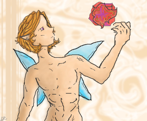
Renuar
(Aug 22, 2005)
...
Renuar (Sep 12, 2005)
wow, thank you all for the comments. Here's the trick, use the 'Pen' tool, set to minimum, and make good use of the 'soft' tool :]
p3ndragon (Sep 12, 2005)
I love you.I love this style even more.
absolutindigo (Sep 12, 2005)
Beautiful , it looks like a "Cirque du Soleil" poster
comd (edited Mar 19, 2006)
I second HunterKiller's remarks. This is gorgeous. |

| ||||||||||||||||||||||
|
solve
(Sep 7, 2005)
upon his throne of skulls.changed it to father severity.
friend (Sep 11, 2005)
This is wicked, seems wong, but really it's quit right.
nekodesu (Sep 11, 2005)
At first, I wasn't sure what I was looking at but this looks really nice.
LisaAnne (Sep 12, 2005)
Aww I was really into the anatomy of the first picture, but the head of this is wonderful...I love the lines, and the motion it conveys. Nice work. |

| ||||||||||||||||||||||
|
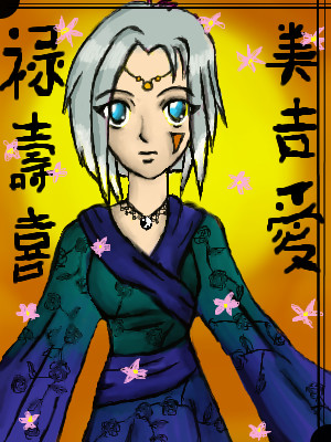
Phil
(Sep 8, 2005)
This Started as a attempt at anime. Havent done anime since i was 16 but these boards seems to have lots, So i was inspired to try one. the symbols in the backround are from this link if ne ones intrested~:http://chineseculture.about.com/library/picks/aatp_luckysymbols.htm playing about wiv colours
think i may be done:)
hideyourface (Sep 8, 2005)
It's pretty. But not advanced I think.
Phil (Sep 9, 2005)
yea i know i asked a mod to move it:) |
| ||||||||||||||||||||||
| Specialty Boards/Collaborations | |||||||||||||||||||||||
|
This was fun:)
28 comments
– latest 4:I'll finish It later, It'll look better when I'am done.
hideyourface (Aug 30, 2005)
ohh, great revision. I didn't know it was gonna look this good.
renire (Sep 14, 2005)
Ha ha ha, this is brilliant!!! I love this. :D |

| ||||||||||||||||||||||
|
7 comments
– latest 4: I started the coloring
Yeah I kinda... Lightened the hair. But that's all! :D Not that I didn't love the hair. I loved the hair. Seriously. <3<3<3 Frappa!
hideyourface (Sep 9, 2005)
well.. work on your anatomy, and that face looks a bit too feminine and simple for the body.
Truearashi (Sep 10, 2005)
I think it turned out just great.The neck is maybe a little too thin, but I like the slightly feminine face ^_^ |
| ||||||||||||||||||||||
| Public Boards/Intermediate | |||||||||||||||||||||||
|
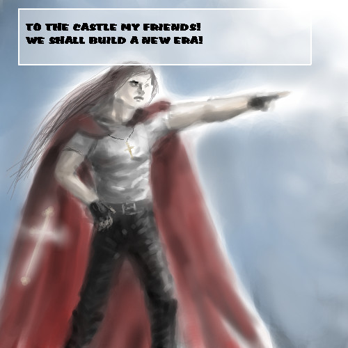
pencilhero
(Sep 7, 2005)
XD
hideyourface (Sep 7, 2005)
That's on well-dressed king.
SneakyWalter (Sep 7, 2005)
Heh, I noticed the crosses on his cape & Necklace. Actually, He be wear some purple, if he were a king. Looks good. |
| ||||||||||||||||||||||
| Public Boards/Beginner | |||||||||||||||||||||||
|
GreenEye
(Sep 7, 2005)
You know when you've just had one of those days, where at the end you just want it all to end? Yup, that was my day. What do you think of this? Okay, not okay? I dunno, you tell me! :)
thesolarwinds (Sep 7, 2005)
awww*hug* *hands cookies and cake* its good.. the proportions are good... the back leg is a little skinny, but it works... i love ur hooves.. they are very realistic looking.
hideyourface (Sep 7, 2005)
the neck is toooo long. And yeah, the upper part of the back leg could be fatter. You should also get rid of the colour going outside the lines of the horse.
DrsFan (Jan 1, 2006)
AWWWWWWWWWWWWWWWW,this looks like spirit in the movie!good job |

| ||||||||||||||||||||||
| Public Boards/Intermediate | |||||||||||||||||||||||
|
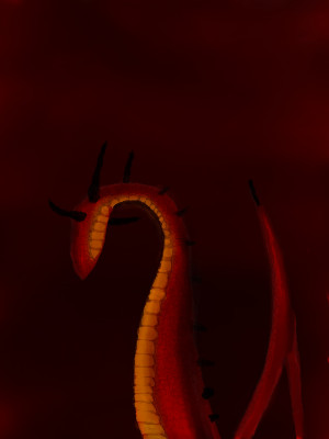
Phil
(Sep 6, 2005)
i dont know what to say.. Except Scales hurt my hand alot lol.
davincipoppalag (Sep 6, 2005)
Worth the pain..this is coming out well
hideyourface (Sep 6, 2005)
could use a more dynamic background. Nice details in the scales.
Phil (Sep 6, 2005)
wanted to add lightning but couldnt draw it.so added it on psp instead lol |
| ||||||||||||||||||||||
| Specialty Boards/Contest! | |||||||||||||||||||||||
|
Alex-Cooper
(Aug 30, 2005)
Contest entry. Thinking of adding color. I know a fast moving car will spell my end. As was predicted it in my dreams.
sincity (Sep 13, 2005)
Go Alex! Fucker. Ha! just joking. You deserve it. Great job bud. :}
Rosemary (Sep 13, 2005)
wonderful draw well done :)
TuffGhost (Jun 21, 2007)
I love the street lamp with the missing sign on it, great attention to detail and great color usage.
Alex-Cooper (Jun 26, 2007)
I like your name TuffGhost. Would you happen to be a strong dead man looking out for yourself? |

| ||||||||||||||||||||||
| |||||||||||||||||||||||
| 2draw.net © 2002-2025 2draw.net team/Cellosoft - copyright details - 1.90sec (sql: 46q/0.91sec) |
drawn in 3 hours 43 min