| |||||||||||||||||||||||
| Public Boards/Intermediate | |||||||||||||||||||||||
|
Turtlebuster
(May 31, 2003)
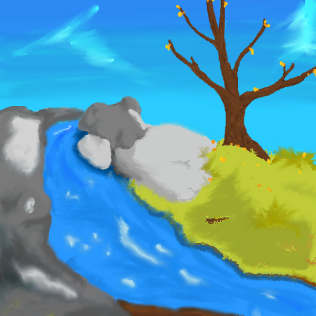
XD thanks to some good tips from some good people, i've worked on this and made it a little more to my likeing.1) cleaned up some 'too soft areas' so they look like rocks instead of marshmellows 2) made a brand new tree that doesn't quite look real, but i like much better. 3) worked a little on the sky for shading i couldn't seem to lighten the shading in the back anymore than this, so i will have to make sure i do that from the start from now on. refresh to see changes ^^ |
| ||||||||||||||||||||||
| Public Boards/Beginner | |||||||||||||||||||||||
|
taori
(May 31, 2003)
And just so she can remain single, Turkey Girl kills herself. Kill being the key word here. Dead. I mean, we're talking Thanksgiving dinner.
marcello (edited May 31, 2003)
Come on, this is getting stupid...
furyofroy (edited May 31, 2003)
*agrees* It's also annoying. Just let the damned thing die already. Let the fad die. The amusement has passed.
taori (edited May 31, 2003)
I know. That's why I'm continuously trying to kill her off. But every time I do, she "magically" comes back to life. Grrrr.
Xodiak (edited May 31, 2003)
hahaha she dies and she dies all the time... but it will incredibly hard for you to kill her Taori, even if you created her in the first place because there is already a member with the Turkey_Girl nickname! and Turkey Girl is so fun to draw that I doubt her death would stop me drawing her! I love her so much! >:D|XOD| |

| ||||||||||||||||||||||
| Public Boards/Intermediate | |||||||||||||||||||||||
|
furyofroy
(May 27, 2003)
It's alright, I guess. :/ It's better looking if you see the larger form.
digital-nut (edited May 31, 2003)
*sob sob* Am I the only person who has never played final fantasy? Ok, I'll take that as a yes. I've seen the film, but..... yeh.....
furyofroy (edited May 31, 2003)
YOU'VE NEVER PLAYED??? That's it. Get off the computer and go get a copy of Final Fantasy 7. And if you don't have a Playstation, then buy one of them too. FF7 is the best in the series, in my opinion. Waste no time. I mean it.
digital-nut (edited May 31, 2003)
yeh, ff7 is on the ps1 right? *plz dont kill me*
GEM (edited Jul 4, 2003)
"Humongousword" that's what i'll call it |

| ||||||||||||||||||||||
|
kamidake26
(May 26, 2003)
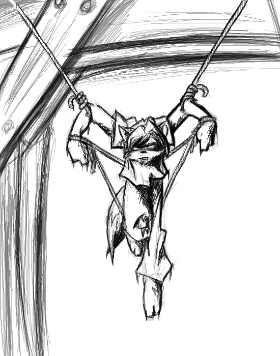
said the convict to the council.~EDIT1~~ not yet done, didnt realize how much extra strain the larger canvas is putting on my computer, memory leak, or just too many pixels? anyhow, saving before a crash. ~~EDIT 2~~ and I think I'm done.. I just wanted to adust the ropes a bit, it would've been easy for him to get away the way it was.. and I didnt want it to look like he was doing this for asthetic reasons :P hehe
furyofroy (edited May 27, 2003)
aarg...I'm jealous. :)
Ari (edited May 30, 2003)
Wow. Cool! Love the eyes! This is an awesome drawing (as always).
safescene (Oct 3, 2003)
gah, I love this...a lot...that's all I have to say
bumpinthenight (May 26, 2004)
kool stuff.... needs to be colored!!! |
| ||||||||||||||||||||||
|
Sererena
(May 26, 2003)
It looks like a badly-executed watercolor! Believe it or not, this is what my watercolors actually look like... blurry, blotchy, scratchy and sketchy! Blah, oh well.
NOVEMBER93 (Jun 30, 2006)
this looks very nice. congradulations on the showcase
beth92093 (Oct 17, 2006)
wow this is realy good great job!!!!!!!!!!!!
ErikaEnvy (Aug 8, 2008)
wow! this is amazing!
clockwork-fairy (Sep 8, 2025)
pretty!!! the textures are amazing and she kinda looks like my girlfriend, which is a plus. |

| ||||||||||||||||||||||
| Main Forums/2draw.net | |||||||||||||||||||||||
 |
digital-nut (edited May 26, 2003)
I was just wonderin, coz i luv Ruby Gloom, and can I ask what people think of the opening page of my website??
2 comments
|
||||||||||||||||||||||
| Public Boards/Intermediate | |||||||||||||||||||||||
|
Turtlebuster
(May 25, 2003)
Now i think i'm done with it.
marcello (edited May 26, 2003)
furyofroy never uses oekakibbs-that explains
furyofroy (edited May 26, 2003)
no--I used it in the early days.
concannon (edited May 26, 2003)
Love the background; the dragon's neck could stand to ge a little thicker.
Turtlebuster (edited May 26, 2003)
ya.. i know what you mean, Vamp. i don't think it needs to be thicker, but the red scales should cover the yellow chest/front neck area more, and make it look a little more round... |

| ||||||||||||||||||||||
| Public Boards/Beginner | |||||||||||||||||||||||
|
Marienkind
(May 25, 2003)
oh, dolly mon capitan-kun, it isn't nice to spam. =(edit: yes, "capitan" is supposed to be spelled like that. =P
OneWingedMoo9se (edited May 25, 2003)
Aww what a cute dead dolly and a pretty red head.
furyofroy (edited May 25, 2003)
who's been spamming? what? o.O Cute pic!
Turtlebuster (edited May 25, 2003)
has kun been spammin? or captain-kun? who is that? (erm i mean 'capitan!')
Ameraq (edited May 26, 2003)
He looks like Aya...only with green eyes...and a smile....very nice! ^.^ |

| ||||||||||||||||||||||
| Public Boards/Intermediate | |||||||||||||||||||||||
|
Turtlebuster
(May 25, 2003)
run for the hills and head for the caves! just stay away from this one!
furyofroy (edited May 25, 2003)
You seem to have veered away from your usual style on this one. It's good, but it seems like...it lacks "depth", you know? It seems flat. I think it needs more shading. Line art's great, tho.
concannon (edited May 26, 2003)
...I originally thought the skulls were a mass of unidentifiable flesh. -_- I like the dragon. You may wanna try some more shading. (see above comment.) |

| ||||||||||||||||||||||
| Public Boards/Beginner | |||||||||||||||||||||||
|
crazygirl
(May 25, 2003)
what do you think? |
| ||||||||||||||||||||||
| |||||||||||||||||||||||
| 2draw.net © 2002-2026 2draw.net team/Cellosoft - copyright details - 1.86sec (sql: 33q/0.86sec) |
One general problem with this piece is while you have good local shading, you need to focus on the overall shading of the piece, from end to end. In order to give your piece more perspective, you should consider the gradual lighting from back to front, in addition to local shading.
In the case of the tree, I think you have the general idea down, and the leaves don't look terrible. Perhaps more concentration on the structure of the tree. For example, how big do you imagine the entire tree? What type of tree are you trying to draw? The shape of the base and branches will be governed by the answers to these questions.
For shading the tree, for one, I would not use smudge on the bark, it totally ruined the beginning of what could have been good shading in your animation. Again, of course, it depends on the type of tree, birch for example has quite different bark than most trees. But for a stereotypical tree (lol), I would use a combination of diffused brush, vertical strokes of good contrast, and then an overall shading from edge to edge over that.
For leaves, well, what you have isn't terrible, perhaps a little more differentiation...
Anyway, it's not really a bad piece, and the animation didn't corrupt so you could edit it further. :-)