| |||||||||||||||||||||||
| Public Boards/Intermediate | |||||||||||||||||||||||
|
.
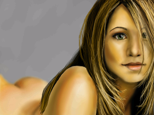
Opium
(Apr 4, 2006)
.
Deino (Apr 5, 2006)
Jenifer is a really gorgeous woman, yes. I knew it was her before I sae thew title: Very good job!
Opium (Apr 6, 2006)
Thanks Deino :)
Roytje (Apr 6, 2006)
I love her eye! Great drawing.
Opium (Apr 6, 2006)
Thanks Roytje :) |
| ||||||||||||||||||||||
|
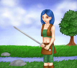
patienceisoverrated
(Mar 29, 2006)
refIt occured to me I haven't drawn any men on 2draw... which is funny, 'cause when I'm traditional drawing, I usually do about even numbers of both men and women. Sooo... yeah. I sorta wish lascaux had a flip tool like shi-painter does, 'cause whenever I use shi, I always flip the picture around to see what's wrong with it, but in lascaux.... you can't. I tried holding a mirror up to the screen, but it really doesn't work.
comd (Apr 2, 2006)
I love the halftone patterns that are emerging in these latter versions! I think they give the painting a more natural look (which is kind of odd since I generally think halftones are very artificial looking, but here it looks very natural to me).
patienceisoverrated (Apr 2, 2006)
Thanks... you're all too sweet :)I was kinda experimenting with halftones in this one, I've never really used them before... it's good to know something works.
Gigge (Apr 3, 2006)
Nice work. The colors in dark skin seem so nice for portraits to me.
LisaAnne (Apr 6, 2006)
Skin rocks. |

| ||||||||||||||||||||||
| Public Boards/Beginner | |||||||||||||||||||||||
|
chan2005
(Apr 4, 2006)
iLiKELiNES
chan2005 (Apr 4, 2006)
hehe, ah it was vaguely copied from a magazine. guesstimating is the name of the game tho :)
Zack (Apr 4, 2006)
Really cool work, with good use of line weights. It looks so clean. I also like the background choice and how faint some things are.
xiang (Apr 4, 2006)
I hate you in the jealous way. D:I loves how it's all lines and its simpleness.
LisaAnne (Apr 6, 2006)
I like lines too... the gradation in the background is a nice touch. You have a good grasp on perspective. I struggle with it sometimes (in my real work -stuff not on here) I dig it. I also like how you have little details in a lighter shade. |

| ||||||||||||||||||||||
| Public Boards/Advanced | |||||||||||||||||||||||
|
zep
(Mar 21, 2006)
comment whore?
Miss_DJ (Mar 31, 2006)
I always know it's a 'zep' without even looking at the name. Wonderful 'zeptacular' work.
staci (Apr 1, 2006)
but what does it all mean!?
davincipoppalag (Apr 1, 2006)
He's playing the Spanish version of "Deal or No Deal" Staci
Mal (Apr 6, 2006)
I really like this one , theres always great use of colour in your pieces. |

| ||||||||||||||||||||||
|
Opium
(Apr 1, 2006)
.
patienceisoverrated (Apr 4, 2006)
I like the skin texture you added. I like his wrinkles, too.... people with wrinkles are intresting to draw. It's like, all their life experiences and feelings and whatever are written on their faces.
Sweetcell (Apr 4, 2006)
I think you can be a believer of both, and I am. Being Roman Catholic myself I learned about His creation and evolution, and it's funny it seemed easy for me to blend the two, meld it if you will. I believe He exists and created the Earth and everything around us, but I also believe in the Big Bang and evolution... hmmmm maybe that makes me a bit by-polar. That would explain things.You can have Creation and Evolution, I believe it. Maybe someone just needs to find the middle where both fits. Awesome piece Opium, love that hair. He does look tired.....
gerbear (Apr 5, 2006)
Excellent portrait! Very impressed with it.
Opium (Apr 5, 2006)
Thanks Marcello, patience, sweetcell, and gerbear! :) |

| ||||||||||||||||||||||
| Public Boards/Intermediate | |||||||||||||||||||||||
|
Deino
(Apr 4, 2006)
"Pancronic face, emerging from the deepness of forgotten times"
Sweetcell (Apr 4, 2006)
Oh this is beautiful, awesome stunning. Bravo Deino. It's very Giegeresque, one of my fave artists.
davincipoppalag (Apr 4, 2006)
Put me in the fan column, too Deino. The first impression was of one of those grotesque deep-see dwellers. Really really good.
HunterKiller_ (Apr 4, 2006)
Fantastic fish/face. Nice description, too.
comd (Apr 5, 2006)
That's awesome. I would love to be able to create creatures like this. |

| ||||||||||||||||||||||
| Public Boards/Beginner | |||||||||||||||||||||||
|
comd
(Mar 12, 2006)
Just scribbled over the original image since I didn't like it.
DeadlyBlondeArcher (Mar 29, 2006)
I can sincerely say that I like both of them. The second version you say you "scribbled" over... I think it looks a bit more like Monet impressionist strokes insted of scribbles. They are both really interesting and pleasing to look at.
davincipoppalag (Mar 29, 2006)
I like them both, too. This latest one sort of looks like a combination of Anthony Hopkins, and Charles Laughton.
patienceisoverrated (Mar 30, 2006)
Anthony Hopkins and Charles Laughton.... on a stick!!! ...I'm sorry. I like this thing you do where you add colour/value with little short lines. Looks cool, very different from other stuff seen here.
comd (edited Apr 4, 2006)
Thanks everyone, but yes, I was really wondering what was up with the comments. Did everyone else realize this is a head impaled on a stick with blood coming out of the eyes and the eye on the right being pushed out of the eye socket? I think it's really ugly and nasty: a terrible thing to look at. I was in a terrible mood when I doodled this, and it was really frustrating to me that I couldn't delete that original version which wasn't even marked as finished. Now I wish once again that I could delete, as this is a thing of nightmares.The short little strokes and scribbles are really just me being lazy. I want to not be so painterly and blend things in, but I had a hard time doing this in lascaux. In painter, I tend to paint this scribbly way at first, but then I use the blend tools to quickly smudge them into these nice smooth regions of color. I can't really do that so easily in lascaux. :( |
This is hidden because it is rated Extreme. Edit your privacy settings to make it visible.
| ||||||||||||||||||||||
|
7 comments
– latest 4:
Shoebox (Apr 4, 2006)
Thanks guys.I really need to work on drawing without the lines, so, yeah. Really nice of all of you, I appreciate it :)
DoOp (Apr 4, 2006)
awwwww that's pretty ^_^ great job on it =3 i like the tree mostest =D
SanzoGirl (Apr 4, 2006)
Wow! O_OOkay, this is on the wrong board. This is Intermidiate/Advanced quality.
Shoebox (Apr 4, 2006)
Yeah, that tree is the first that actually looks like a tree and not a blob of green on a lump of brownAnd thank you too Sanzo. Usually though I don't use the intermediate board unless I use the extra space. Which may never happen since the beginner board got more pixels to play with. |
| ||||||||||||||||||||||
|
~unwritten_law_girl~
(Apr 4, 2006)
blah. |

| ||||||||||||||||||||||
|
tandrew971
(Mar 1, 2006)
2nd attempt
davincipoppalag (Mar 1, 2006)
It looks like things are where they should be, but it's awfully blurred. Sharpen up some things and it will be much better. This might help, too http://cellosoft.com/2draw/wiki/index.php/Lascaux_Sketch
tandrew971 (edited Jan 20, 2008)
.
comd (edited Apr 4, 2006)
Very nice, but perhaps it could benefit from just a few hard edges like davincipoppalag suggested? When all the edges are uniformly blurry and obscure, it sort of draws the eyes away from the picture since nothing's in focus, and so there's nothing to really draw the eye into the canvas. It's like there's no foreground subject in the picture. It could just be a few selective places like the upper edges of the eye lid or the corners of the mouth or the cast shadow of the nose: just something to pop things out a bit and pull the eyes inward. The thumbnail doesn't suffer from that so much since, at the scale, it looks like there are actual hard edges in the picture, but up close it looks more obscure than the thumbnail which is generally the reverse of what one might expect. Perhaps if the pictures are meant to be obscure up close, it could be done with some sort of texture or some painterly brush strokes. That makes it so there are new things to discover up close where the overall picture sort of dissolves into this interesting array of shapes and patterns and textures, but a digital blur/soft effect on an entire picture can destroy the clarity of it. Anyway, I hope you don't mind our suggestion: I wouldn't bother if I didn't already like the picture. |

| ||||||||||||||||||||||
| |||||||||||||||||||||||
| 2draw.net © 2002-2026 2draw.net team/Cellosoft - copyright details - 1.01sec (sql: 34q/0.30sec) |