|
| |||||||||||||||||||||
| Public Boards/Beginner | |||||||||||||||||||||
|
Jimbob
(Jul 12, 2004)
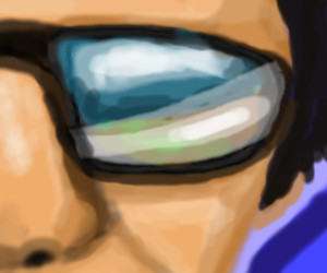
Playing with the blur, opacity, and layer properties :P |
| ||||||||||||||||||||
| Main Forums/2draw.net | |||||||||||||||||||||
 |
cherikit-chan (edited Jul 11, 2004)
Hope this doesn't sound too stupid but can you only buy tablets online? Or are there places or stores you can actually buy them from. I've been looking around but haven't really found any...
6 comments
|
||||||||||||||||||||
| Public Boards/Advanced | |||||||||||||||||||||
|
The_Chosen
(Jul 6, 2004)
I thought I might have needed more space than on intermediate that’s y I posted here if any mods c this & think it’s crap feel free to move it...not much else to say...my hand hurts...*yawn* Edit: Ur right mazi light & shadow can make or break a pic. I went back & shaded the face a bit more. I think this came out pretty good considering that I’m self taught ^^. Thnx 4 the comments people XD
mazi (Jul 11, 2004)
you could have posted on intermediate and asked for more space there. as it stands this is pretty good. my only complaint would be his face. it lacks definition. seems there should be more shadows and highlights according to the bg. reminds me of this drawing by estrigious.com's mel.i think you have great potential and could do a lot with a little more study on light/shadow. lighting effects can really make or break a pic.
Urei-sama (Jul 12, 2004)
mmm sexy. tatterd wings make big points with me... i like it
cherikit-chan (Jul 12, 2004)
OMG!!! I love his wings!!! And the title is awesome and so is the way you drew him!touch up... the timer`s off
|

| ||||||||||||||||||||
| Public Boards/Intermediate | |||||||||||||||||||||
|
ChibiNay
(Jul 7, 2004)
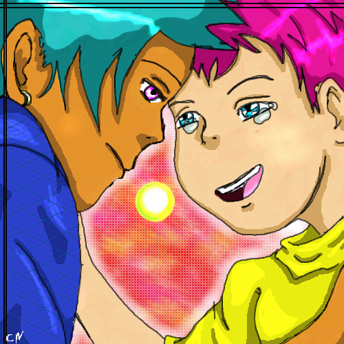
I just drew whatever was in my head at the time.
ILoveKenshin (Jul 7, 2004)
I think that the lineart should be a little less sketchy and wiggly, and the shading needs some work. Are they supposed to be anime characters? If so, then the chin, and nose should be a little more pointy, and the eyes should be... bigger and POINTIER! xD-Hana-chan
cherikit-chan (edited Jul 7, 2004)
I like the way you colored and shade. Yeah the guy's eyes are a bit uneven but I love the way they shine! ^^
Kitsu_Sakuma (Jul 11, 2004)
... You used a Spirited Away pic. X3 I like this, except the girl's eyes are.. off.. But other than that ish pretty good. ^^ Good movie... *walks off* |
| ||||||||||||||||||||
|
staci
(Jul 7, 2004)
bg soon
laurael (Jul 8, 2004)
Just that eye alone makes ya stop to comment...great pic!
debem (Jul 10, 2004)
A feminist, Mark Ryden-inspired piece...I love it! Menstrual power!
Aubrey (Jul 10, 2004)
Hmm looks like she just kicked ass in the girl's bathroom? lol Very cool picture Staci yet again.
staci (Jul 10, 2004)
teehoo..thank you all for the love..its much appreciated. |

| ||||||||||||||||||||
|
Anna
(Jul 8, 2004)
I need lots of practice on drawing people. Those of you who do portraits... can you please give me some advice. I'd appreciate all the help I can get. Thanks bunches. (Her chin annoys me.. I know it's off.. but I couldn't fix it right)
davincipoppalag (Jul 9, 2004)
Not bad Miss anna..way better than I can do.. for the chin..start about 1/4 inch up from the bottom on the left and curve so the lowest part of the chin is in line with the bottom of the nose and then bring the right curve up from there so it's symmetrical (almost) with the left side.. I like the shading and skin tones!
cherikit-chan (Jul 9, 2004)
I love how you did her hair! I also like her eyes their pretty. Nice drawing!
K-Dizzle (Jul 9, 2004)
so when are you gonna stop getting so much better, and teach me some stuff for a minute? lol...i already told you what i think about this picture...and i have no knowledge of how it could be better so HI, GREAT JOB AS ALWAYS : D
Aubrey (Jul 10, 2004)
It's very smooth looking Anna, all the lines in it are flowing and nice, practice makes perfect :) |

| ||||||||||||||||||||
| Public Boards/Beginner | |||||||||||||||||||||
|
mukumuku
(Jul 7, 2004)
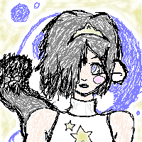
wouold anyone mind if i kinda...well...left? at least for a while? im not very good, and i dont get many comments..but i'm gonna try my hand at another board for a while...i dont know if im gonna keep this account running for much longer...but i'll see what i can do. so yeah.....*mo-fafa* (reference used...hope spunkee doesnt mind ><;;;)
angelbate (Jul 10, 2004)
*sniff* sorry to see you leave. maybe you can drop in once in a while. very cute drawing, i like the hair and the tiara, and how her eye is glancing to one side. nice work.
mukumuku (Jul 10, 2004)
i'll drop in every once in a while but not nearly as much as i used to...glad you like the drawing tho*mo-fafa* -btw, if you have any last requests, i could try and do summit for ya- i g2g, ill finish later, if you want a last request, do it now!
alright, im gonna call that finished...the bg sucks, but hey. any body have a request or anything before i go?
*mo-fafa* |
| ||||||||||||||||||||
| Public Boards/Advanced | |||||||||||||||||||||
|
Fin_beast
(Jul 5, 2004)
I saw the other kitty by Gigandas and thought I'd do one. :)I used a reference and I will probably post it when I'm done. Soon... he will be finished.
davincipoppalag (Jul 7, 2004)
I like the eyes but I think the mustache and beard are too neat
laurael (Jul 8, 2004)
The eyes are wonderfu, and so is what you've done with the fur, so far...finish soon, please... :)
Bumble_Beez (Jul 10, 2004)
Very good! I agree, the eyes are nice!blah
|

| ||||||||||||||||||||
| Public Boards/Beginner | |||||||||||||||||||||
|
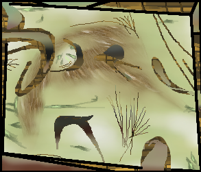
LovelyLori
(Jul 9, 2004)
dude, it's that thing! it's the thing! no look it's that thing!
Knockoff (Jul 9, 2004)
Your right, It is that thing!!! Run from the thing !!!! aahhh.!This is really nice, and great colors ;)
Zack (edited Jul 9, 2004)
you've been making some nice abstract work lately, Lori. i like this one the best so far. :] some of the figures and colors make me think of the Lascaux cave paintings (for which Lascaux Sketch was named).although this may seem random, every part of it was put there for a reason, be it in terms of composition, figure, color, mental associations, or what have you. sometimes we're not sure of the reason, but that doesn't mean there isn't one.
davincipoppalag (Jul 9, 2004)
I agree with zackie..this is very nice mizz lori!
Gigge (Jul 9, 2004)
I like this one too. Looks a bit like a tortoise shell framed picture of a bird pecking at something in a dirt road. |
| ||||||||||||||||||||
| Misc. Boards/Sprites | |||||||||||||||||||||
|
Rosemary
(Jul 9, 2004)
just playin' with pixels lol
Gigge (Jul 9, 2004)
hehe, I think it was grafitticorners that was just saying he thought he had made the narrowist picture. I think you've got a 2 pixel difference.
cherikit-chan (Jul 9, 2004)
Wow! Even from here it still looks nice(kinda looks realistic like an old black and white picture!)
Zack (Jul 9, 2004)
nice work. kinda makes me think of that che guavera (sp?) high-contrast photo people have on shirts and stuff.
laurael (Jul 9, 2004)
Nice playing! Looks great from here... :) |

| ||||||||||||||||||||
| |||||||||||||||||||||
| 2draw.net © 2002-2026 2draw.net team/Cellosoft - copyright details - 2.13sec (sql: 42q/0.88sec) |


I like the use of layers in this one, you can actually tell you used them.