| |||||||||||||||||||||||
| Public Boards/Beginner | |||||||||||||||||||||||
|
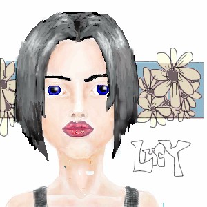
lucy_430
(Nov 24, 2003)
Umm...I guess this is finished now. The skin turned out kinda blotchy looking and the hair looks stiff. Please comment and critique. :) |
| ||||||||||||||||||||||
| Public Boards/Intermediate | |||||||||||||||||||||||
|
elana
(Nov 23, 2003)
I'll finish this later, its my sleepy time.
RabidMalikFanGirl (Nov 24, 2003)
Sweet. I can tell this is gonna turn out pretty nice...
mikhail (Nov 24, 2003)
its an undead hippieany ideas for a background?
I'm near the end of this one. I need to do some more shading...
|

| ||||||||||||||||||||||
| Main Forums/Drawing Discussion | |||||||||||||||||||||||
 |
Harmanye (edited Nov 24, 2003)
Hmmhmm*nod* I wanna collab, waaah!.... But really, I do want to. Umm, you can have a browse through my Userboard, you know, decide if you can put up with me. Just so you know, I turn off my computer at 12:00 PM, it turns on anywhere from 6:00 to 10:00 AM, so a reply and/or picture before then? I like to colour, and I don't push my suggestions if you don't like them. In fact I can go with the flow anyway it runs, just please don't ask me what to do; I don't know, which is why I'm out of id...
4 comments
|
||||||||||||||||||||||
| Public Boards/Intermediate | |||||||||||||||||||||||
|
kaT
(Nov 22, 2003)
eh I'm back, kinda, jsut checkin what's new, see if anyone here will check out my site...
mikhail (Nov 23, 2003)
this pic really sucks a lot of balls
Harmanye (Nov 24, 2003)
Ooo, constructive Mr. Mikhail... Anyway, it could be better, this is for sure (What couldn't?), I would suggest giving him a mouth, perhaps. And the 'hair covering one eye' trick is kinda old, and unnatural looking in this picture. The specs might need lenses, his skin wants a bit more shading, and the lineart could stand some cleaning up as well, unless you like it messy, some people do. On the good side, and there is one, he does look surprised, which I expect was the look you were going for, the specs are cool, and his hair is wonderful, as is the sky. Ooh, perhaps you shouldn't give him a nose either? Just let the specs suggest the nose. But those are all suggestions; you needn't listen to me if you don't want do. After all, you're older than me; I can't tell you what to do. Navaer, Happy drawing, and all that.
kaT (Nov 24, 2003)
hey, I always welcome sugestions, for he who belives that he knows everything never will.And although I belive that everyone has the right to have their own opinions, I have a few "other" opinions about Mikhail over there... uppdated a bit on some suggestions, and I think it does look better. I'm still just not used to doing pics all digitally. I perfer to color scans.
|

| ||||||||||||||||||||||
|
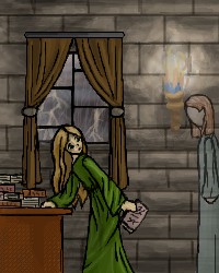
Harmanye
(Nov 22, 2003)
Book Ghost. Teehee.Oh, anyway. Comments please? (I know, I sound pitiful, but really, I'd like to have something, I mean. Uh. I'm blank right now) BTW, I had this open for 22 hrs, but that's not how long it took. Three hours at most; I like to mess around a lot, and I didn't feel like saving it unfinished anything.
mikhail (edited Nov 24, 2003)
yes it does look better, the drawing is well composed, however there is much free space above so i would suggest putting in a chandaleer with candles if u know what im talking about... and maybe you could make the ghost glow
Harmanye (Nov 24, 2003)
Glow. Hmm, I don't think glow would work, too much light from the fire to have more glowing stuff, wouldn't look right methinks.There is a lot of free space, this I know and worry about. When I start I don't usually know what I'm drawing beyond a rough idea, so my canvas size isn't always right. Bubmp, bubmp, a chandalier, I don't know if that would work, they're rather Victorian, them chandeliers... At least the ones I've seen are. Maybe I can work it out, bubmp Thank you Mr. Mikhail.
elana (Nov 24, 2003)
I like the lighting from the torch and the sconce! Are those trees outside or lightning?It's lighting, Ghosts always turn up when it's storming outside, remember?
|
| ||||||||||||||||||||||
|
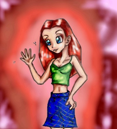
SuzieSuze
(Sep 25, 2003)
Just trying a diffrent style.. don't like it muchok well I don't think I am ever going to get to fixing this up.. so I guess this is it.
Fin_beast (Sep 26, 2003)
ehhh.........did you just flip my drawing?It's good but it would have looked better if you didnt use the smudge tool as much as you did.
Harmanye (Nov 24, 2003)
LOL Fin_beast, not every picture of someone waving is a copy off of you ^_^Anyway, less blur would be good, but it's one can't undo it now, just like one can't unring a bell. I like her hair, and her face. Your hands are awesome, so hand-like, not just flesh coloured blobs. I love her skirt, blue is good. ^_^ Navaer.
elana (Nov 24, 2003)
Her collarbone should be smaller and a shorter space should be between the depression of the bone. :D I like the pic though! |
| ||||||||||||||||||||||
| Main Forums/2draw.net | |||||||||||||||||||||||
 |
taori (Nov 22, 2003)
A question... I have this picture idea, but it involves putting text in the picture, and the text needs to be a certain font. It's a basic font (I can't remember the name of it right now, but it's one of those fonts that just comes with a computer) and should be in there if there's a way to change the font. However, every time I've ever put text in a picture, I can only get one generic font. Am I doing something wrong or is there only one font? No biggie if there's only one, I'll live with it. J...
4 comments
|
||||||||||||||||||||||
| Public Boards/Beginner | |||||||||||||||||||||||
|
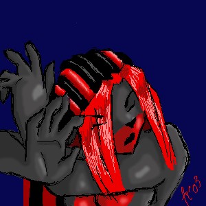
Charuba
(Nov 17, 2003)
The little scribblies are just random designs... I will finish this tomorrow.
margotfaye (Nov 18, 2003)
oh thats beautiful! :sigh: Compression is my enemy. Red is too good for such a cruel fate.
nyao (Nov 22, 2003)
OMG! I think that's totally awesome! The concept and colourz.... |

| ||||||||||||||||||||||
|
IDontLookTooGoodInPink
(Nov 20, 2003)
eh..this was fun.. i saw something simalar to this and thought it would be fun to draw.. enjoy.. =)
Harmanye (Nov 21, 2003)
Wonderful, I don't understand why no one has commented on this!I love her hair, and the hands... goshdarnit you are good at hands! -_- Well anyway, her face is also terrific, I tip my hat to you... If I had a hat that is. ^_^ The only odd the is the hair in the background, it needs shadows; it's stuck in midtones. Great job though! ^_^
mazi (Nov 22, 2003)
very good, but her hairs kinda defying gravity. o_o |
| ||||||||||||||||||||||
| Public Boards/Intermediate | |||||||||||||||||||||||
|
Edward
(Nov 17, 2003)
MWHAHA no one can guess until i finishe TOM. but right now i need sleep XD |

| ||||||||||||||||||||||
| |||||||||||||||||||||||
| 2draw.net © 2002-2026 2draw.net team/Cellosoft - copyright details - 0.90sec (sql: 42q/0.30sec) |
drawn in 16 min
It also looks like you got some foreign objects in your layers while you were drawing (A common incident with Shi-painter).
Her hair could be wanting a few antialiased... Gosh darnit, whadd'ya use? A pen, thats right, You might Pen some stray strands of hair on her face and at the tips, make it a bit more jagged-like.
I would recommend the Soft Eraser (Eraser2) around the top to get rid of those hard angles and such.
To get rid of those most unaesthetic blotchy things on the neck and face, some skin-coloured patching with the Watercolour (Water) brush and a tiny bit of Blur (Grad)... Ooh, and blur the lips up a bit, it loks like you used a Sharpen brush on them too many times.
Don't uver use the blur tool though, it makes it baadd.
That's all just friendly advice, it's not required that you do anything I said, this is still great. ^_^
I also love those straps on her shoulders; they really look ribbed.