| |||||||||||||||||||||||
| Public Boards/Intermediate | |||||||||||||||||||||||
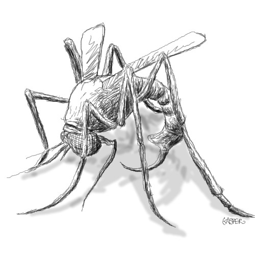
|
HunterKiller_
(Jan 17, 2005)
Not finished. |
| ||||||||||||||||||||||
| Public Boards/Beginner | |||||||||||||||||||||||
|
Hakkai
(May 19, 2005)
Lazy do0dle.
loverboy101 (May 19, 2005)
def!
Gigandas (May 19, 2005)
Hah, it looks like this guy is being put onto a full-scale radar, to be shot for carrying an iPod. I also think you chose the right colors here to give off that feeling of "being against."
SanzoGirl (May 27, 2005)
I have an iPod.__.
Ceido (May 27, 2005)
I have a Hi-MD player. It's really cool. 1gb disks and you can also use it as portable memory. ipods suck ass.I like your delicate drawing of a USB flash drive. :) |

| ||||||||||||||||||||||
| Public Boards/Intermediate | |||||||||||||||||||||||
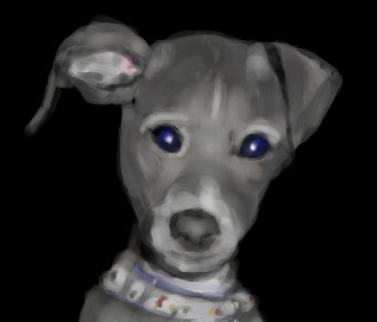
|
featherstone
(May 25, 2005)
I don't feel like doin' the background.
featherstone (May 25, 2005)
ya.. the eyes... well, hell.. that's what the photo looks like anyway
Gigandas (May 27, 2005)
Whoa, this is like one of those pictures you stand back and look at. Looks like a photo in the thumbnail :). I like his "whatcha lookin' at???" look :).
laurael (May 27, 2005)
Adorable! You are knocking these out, girly!
Xodiak (May 27, 2005)
Hehehehehe, very cute doggy! >:D|XOD| |
| ||||||||||||||||||||||
| Public Boards/Beginner | |||||||||||||||||||||||
|
RoHcky
(Apr 22, 2005)
My first attempt on 2draw and with lascaux. Used optical mouse at work. I'm too used to drawing with a pen and tablet, my fingers are hurting.
davincipoppalag (Apr 22, 2005)
This is nice work.. this may help http://cellosoft.com/2draw/wiki/index.php/Lascaux_Sketch
HunterKiller_ (May 27, 2005)
Nice stuff. Looks like you do this quite often.
Gigandas (May 27, 2005)
Finally, someone who actually put effort into getting the shape of an eye :). Okay, onto c & c!The tear duct could be more shimmery to make it look more natural as opposed to a stiff-plastic duct (remember, just because it's not in a reference, doesn't mean you can't use the artist's touch). Don't be afaid to define more of the creases below the eyes, but pay attention to how thick they are, and their exact placement. Another thing you might look at is the ends of the iris as you will see they are rather dark as opposed to the middle region of the iris. Also, add more variations in value in the iris; that might help with the crispness in the details there so it's not all smudged up together without definition. Well, hopefully these tips will help you more in the future :). Of course, you're already doing pretty well, so I'm sure you will get even better with time. |

| ||||||||||||||||||||||
| Public Boards/Intermediate | |||||||||||||||||||||||
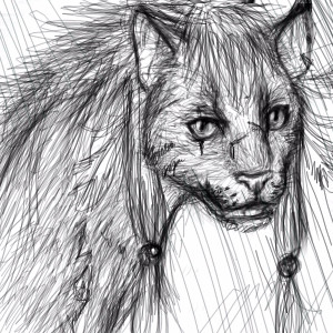
|
Maiko
(Apr 8, 2005)
It was a puma at first, and it turned into RED XIII! :O gaspanyway, yeah, the timer is wrong, I had to pretend I was drawing half the time so my dad would let me stay online plus I was busy hitting on Zer >:] lolol yeah, enjoy
kuusenkoriste (Apr 12, 2005)
i love moomins too.. :) at least someone even nows what moomins are.. XD you are really good drawer. :D (sorry if my english isn't very good.) XDD
Maiko (Apr 12, 2005)
No worries ^_^ Your english is plenty good :3My favourite characters are Snufkin and Sniff <:3
Xodiak (Apr 13, 2005)
Beautiful drawing! And the Moomins cartoon series was very nice, I loved the moomin girl most, hehehe! >;D|XOD|
Heiros (May 26, 2005)
I thought it looked like red XII but more catish. It looks cool! |
| ||||||||||||||||||||||
| Public Boards/Beginner | |||||||||||||||||||||||
|
thebest
(May 12, 2005)
best band ever =]
friend (May 15, 2005)
ya...they shoulda made red grenades during WWII.
juggalo666 (May 15, 2005)
naw man i disagree hed (pe) is the best band!
krazy_kitsune (May 16, 2005)
green day is awsome... no one can deny that
Punky (May 25, 2005)
um krazy kitsune... people just denied. read the comments before yours. boulavard of broken dreams is annoying. :P i like Dookie. and i agree with zack on the misspelling idiot thing. :) |

| ||||||||||||||||||||||
|
9 comments
– latest 4:
Xodiak (May 25, 2005)
It reminds me of Red Skull. Hehehe, Xod loves your gory and scary drawings! This is marvelous. >:P|XOD|
Zack (May 25, 2005)
Nice hand, man.
K-Dizzle (May 25, 2005)
lol..I was thinking the same thing, Xod.This is badass..nice job
davincipoppalag (May 25, 2005)
Lol...another great Joe character... keep em comin' |

| ||||||||||||||||||||||
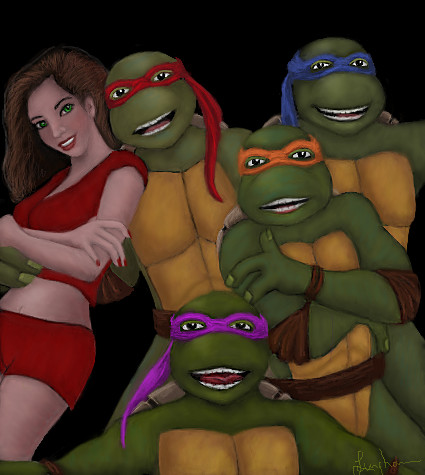
| Public Boards/Intermediate | |||||||||||||||||||||||
|
laurael
(May 23, 2005)
Some day, I 'will' get these guys to look real...:P
Gigandas (May 25, 2005)
lol, I thought he was just posing to look "cool," but I guess that works too ;).
emmamommalag (May 25, 2005)
Yay, laurael's drawing turtle pics again. And this one's gorgeous. (((laurael)))
sincity (May 25, 2005)
What do you mean, some day, I think you nailed them! Looks great! :}
Xodiak (May 25, 2005)
Haha! Such a nice group of people! I like the sexy and beautiful girl most. The ninja turtles look very great too! Awesome picture, your drawing and colouring style is deliciously great. <:)|XOD| |
| ||||||||||||||||||||||
| Public Boards/Beginner | |||||||||||||||||||||||
|
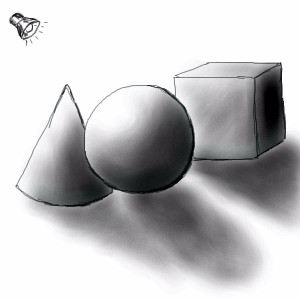
HunterKiller_
(May 24, 2005)
Ok, a little art history on myself. I grew up drawing, never took any professional art classes/courses, etc. Thus, i've never studied the basics in depth, like this stuff (which might be why i sux0rs so much =) ). So i was told to do more of this stuff and life drawings. Crits please. I know the shadow of the sphere's off.
davincipoppalag (May 24, 2005)
Kudos on not using the line and circle tools HK...
HunterKiller_ (May 25, 2005)
lol thanks poppa, well that would certainly defeat the purpose of this excersise. More comments would sure have helped though...
Gigandas (edited May 25, 2005)
Well, if you're open to any critique, then I'd say here are a couple things to look at: First off, you might wanna smooth the lines out more just so it looks more professionally executed, second, you may want the outline (if you're gonna have an outline at all) to have gradation as the shadows come to light. Example: take a look at the top of that ball there, and make the outline that goes around there, baaaaarely visible/very light color (again, assuming you even want an outline. realism has no outlines.). Third, define a core shadow, the darkest dark area on the object (example: the bottom right region of the ball). Fourth, you want to define the reflective light (the light reflecting off the surface the object is on and back onto the object itself). It's a very thin light color line that goes outside and around the core shadow. Those pointers should help assuming I explained in a way it can be understood.Here, look at this example: http://www.anticz.com/drawing1.htm |
| ||||||||||||||||||||||
| Specialty Boards/Collaborations | |||||||||||||||||||||||
|
WEEEEEEEEEE!
16 comments
– latest 4:
Alex-Cooper (May 25, 2005)
Thanks Kasha. That was way more fun than it should have been. I can't seem to wipe this stupid grin off my face, even though you totally kicked my ass.
Xodiak (May 25, 2005)
Brilliant! <:D|XOD| |

| ||||||||||||||||||||||
| |||||||||||||||||||||||
| 2draw.net © 2002-2025 2draw.net team/Cellosoft - copyright details - 1.34sec (sql: 37q/1.04sec) |
lol @ Mike, i KNEW somebody would say that, though i was thinking someone by the name of Xod haha.