| |||||||||||||||
| Public Boards/Beginner | |||||||||||||||
|
Well, It Isn't A :Black: Hole...
Excel_Ichigo
(Feb 12, 2005)
Boweth down to the rainbow. Err....raincircle?
Excel_Ichigo (Feb 12, 2005)
Thank you!
mkkmypet (Feb 12, 2005)
Very nice blending... each color turns into the next so smoothly. I like the stone-ish/cloudy sky background, too.
Excel_Ichigo (Feb 13, 2005)
Thank you, again!
NOVEMBER93 (Apr 8, 2006)
i agree with mkkmypet.....this is a lovely picture |

| ||||||||||||||
| Public Boards/Intermediate | |||||||||||||||
|
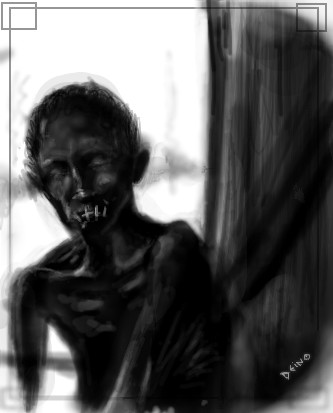
Deino
(Apr 6, 2006)
Inspired by one of 2draw's greatest artist: Axil. Intolerance is the worst thing humans can express.
alichanotaku (Apr 6, 2006)
I like it. I really feel the emotions in this picture, since I'm jewish. Good job.
Excel_Ichigo (Apr 7, 2006)
I'm reading Schindler's List right now, actually.This is very well done. |
| ||||||||||||||
| Public Boards/Beginner | |||||||||||||||
|
~unwritten_law_girl~
(Apr 6, 2006)
blah
Excel_Ichigo (Apr 6, 2006)
Je suis un pirate. This be cute. Yarr!
Ferret_Boy (Apr 7, 2006)
MAird |

| ||||||||||||||
|
Golgoroth
(Mar 20, 2006)
Woah... can't believe I did this good for once! First thing posted on intermediate board...Please comment!
solve (Mar 20, 2006)
hey jesus... OMG... i thought it was really him talking to me through another vision on 2draw. i really gotta watch my self, j man is a top notch prankster.
comd (edited Mar 23, 2006)
I hope you don't mind me suggesting something, but consider not using very soft brushes until later. Soft gradations are very attractive, but the fact that your pictures lack any hard edges make me feel like they're destroying the clarity of your vision. Your pictures come out as a digital blur to me, but it looks like there is something nice behind the blur if only we could see it with clarity. There is a striking composition in this picture, but it's weakened by the fact that the foreground is drawn in a way that's almost equally obscure as the background. The only thing that makes the foreground stand out somewhat is the contrast between the hair and the skin.
Natsuna (Mar 23, 2006)
He's my homie :D Fer Real son'
mx (Mar 30, 2006)
I agree that this is not intermediate quality....however...i do see some potential. I have seen work of a spanish artist that reminds me of this. There is some innocence with it, which works with the subject matter. i do thing if you want to distort, you need to know how things should be drawn in order to distort well. There are certian things that must still refer to actual anatomy, even when distorting. I think you can consider adding stark, solid bright & flat colors in some places which could work agains the soft feel of the painting. mx |

| ||||||||||||||
| Public Boards/Intermediate | |||||||||||||||
|
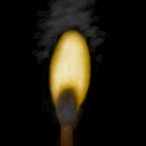
Excel_Ichigo
(Mar 24, 2006)
(: It's cold here.
davincipoppalag (Mar 24, 2006)
Really nice job on that flame..
Excel_Ichigo (Mar 24, 2006)
I hope. I kept fiddling with it.Very, very tiny change.
|
| ||||||||||||||
| Public Boards/Beginner | |||||||||||||||
|
Childlike_Vampire
(Feb 20, 2006)
Whoo.
Robinman2 (Feb 20, 2006)
i HATE VAMPIRES THEY BIIIIIIIIIIIIIITTTTTTEEEEEEEEEEEEEEEEE
Excel_Ichigo (edited Feb 20, 2006)
The sky is very nicely done, but I believe another tower or two would make the castle look more realistic. Not that /you/ need any help. :P
Axil62 (Feb 22, 2006)
this needs more 2draw attention. The liquid sky is marvy!
Childlike_Vampire (Feb 22, 2006)
*hugs Axil* |

| ||||||||||||||
|
Excel_Ichigo
(Dec 22, 2005)
Advice please?
darkshadow (Dec 22, 2005)
not really enough here to give advice on looks like a pole with water. slime or vines on it what do you want advice on?
Excel_Ichigo (edited Dec 22, 2005)
xPIt's going to be a pole with water. Any advice you care to share on the water so far?
darkshadow (Dec 22, 2005)
keep going i would look through the show case and basters board and look for water pics and ask that person most of the who are on those boards are willing to help if you ask them hope that helps I wanted to do more but my compy is messing up. ):
|

| ||||||||||||||
|
Excel_Ichigo
(Dec 8, 2005)
Practicing coloring.
TOL-CREW (Dec 8, 2005)
your best owrk nice clean fresh good job
narutofan (Dec 8, 2005)
way cool
Excel_Ichigo (Dec 9, 2005)
Bring it up to 400% and it should be about the same size as an actual CD. |

| ||||||||||||||
| Main Forums/Drawing Discussion | |||||||||||||||
 |
kawaii_otaku323 (Jun 28, 2005)
Any suggestions on how to make hair highlights? How does one know what colors to use? I think I understand for blondes but...I'd just think some suggestions for all hair would be tres bien. or some examples you think i could learn by. ^_~U
8 comments
|
||||||||||||||
| Public Boards/Intermediate | |||||||||||||||
|
ironoxide_red
(Jun 23, 2005)
Really useful when you're out in the desert and you don't have water... ok, that was a stupid joke.
Excel_Ichigo (edited Jun 24, 2005)
xD This is very funny.Now this is what happens when you attempt perspective drawing without planning - you end up spending way too much time on a silly cartoon. Let's call this finished, ok?
-> darkshadow: I live in Sweden so I've unfortunately never seen that show (I've seen SNL, though). I guess "the thought of water" would be the next logical step but I'm not sure you could make it profitable... or draw-able!
kawaii_otaku323 (Jul 2, 2005)
witty ^_~ but...i wish there was ramen in it... ^^ mmmm...i'm hungry i guess, lmao, great pic. ^_-
nekodesu (Jul 2, 2005)
Water creates water...genius XD I like the picture of the water pouring into the cup. And the lettering is awesome! |

| ||||||||||||||
| |||||||||||||||
| 2draw.net © 2002-2024 2draw.net team/Cellosoft - copyright details - 1.46sec (sql: 35q/0.39sec) |