| |||||||||||||||||||||
| Public Boards/Beginner | |||||||||||||||||||||
|
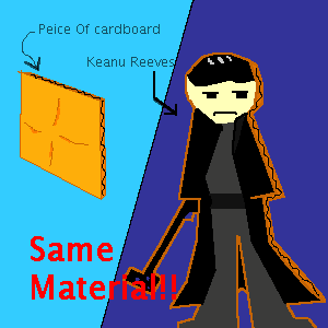
frozendevil
(Sep 2, 2003)
I think I captured the ONE expression he has pretty well=D |
| ||||||||||||||||||||
| Public Boards/Intermediate | |||||||||||||||||||||
|
mazi
(Sep 2, 2003)
new user icon pour moi. j00 shall ph34r me. |

| ||||||||||||||||||||
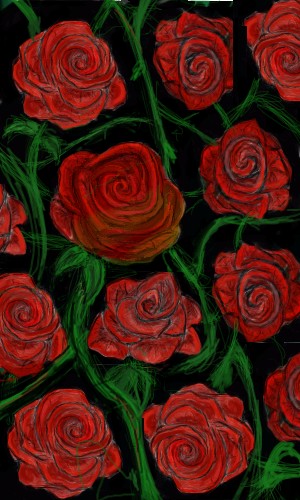
|
4 comments
– latest 4:
Einz (edited Sep 2, 2003)
yup its a rose ;-pi will add some more flowers like dafodills and orchids later i drew this from the head ,without any refs so it probably is not anatomicaly correct but flowers are extremely complex objects 2draw and make good practise just look at a flower and see how the surfaces flow ,its perfection i will finish when i have a couple hours of spare time hooray for Boobies.. uhm flowers
Eliafin (Sep 2, 2003)
Awww, that's perdy. I like it ^_^ there were some cool ideas you deleted (I watched the animation) I liked the one with it floating on the leaf on the water.`not done yet
- ah well i reached the limit so i guess ill set it to finished -edit- Marcello: is there a way i can finish this pic ,maybe moving it to the advanced board?
Sixelab (Sep 14, 2003)
lovely, i would love to nap in them....minus the thorns of course. They look very lifelike, i love the colours you chose. |
| ||||||||||||||||||||
| Public Boards/Beginner | |||||||||||||||||||||
|
Harmanye
(Sep 2, 2003)
eeepp, pixel shading, pixel work, every inch.I wouldn't let it alone, I tried to do everything I could without making the picture look too messy, maybe I'll tackle something bigger next time I do pixel art. The floor is marble, in case you coulnd't tell. ^^;; -- Thanks Eliafin, seeing as how I don't have a life, and nothing better to do anyway, It's easy for me to find the time :) Marcello: Okay, I'll do that, thank you :) -- Okay... I think it's fixed now... C-and/or-C?
Eliafin (edited Sep 2, 2003)
Wow, that's good!! I wouldn't have the patience to do something like this!! I love the colors.Edit: Oh the marble looks much better now. ^_^
marcello (Sep 2, 2003)
It looks good overall, but I'd suggest lowering the contrast on the stones considerably, they stand out too much. |

| ||||||||||||||||||||
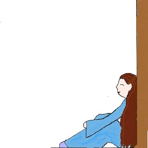
|
xXKaylaXx
(Sep 2, 2003)
not finished yet, I'll come back to it later, all suggestions and ideas welcome and appreciated! |
| ||||||||||||||||||||
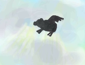
|
xXKaylaXx
(Sep 2, 2003)
i did the background and decided it need something in the foreground so its a flying pig! (its unfinished incase i decide it needs something else later) |
| ||||||||||||||||||||
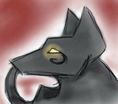
|
concannon
(Sep 1, 2003)
Damn I love drawing random Anubis heads. They show up EVERYWHERE in my assignment books.Really.
Harmanye (Sep 1, 2003)
Doggy! ooo... o_OLoving the eye. I like the sharpness of the angles on this, very nice indeed, and the sketch-likeness ^_^
Merulotte (Sep 1, 2003)
*still has a bit of trouble with finding the Add Comment link*I remember going to a PaintChat where we all drew Anubises. (Anubii?) Jackal heads can be easy or hard, depending on how you draw them. The lines are nice, and just sketchy enough. The way it was colored is also nice; as you never blurred it, giving it a more textured look. ^_^
Harmanye (Sep 1, 2003)
Doggy! ooo... o_OLoving the eye. I like the sharpness of the angles on this, very nice indeed, and the sketch-likeness ^_^
Eliafin (Sep 2, 2003)
Awww! *pets it* so cute!!!! The ears are cool and the fully little symbol below the eye! I like the gloweeness of the eye too. The texture on the coloring/shading looks really good. ^_^ *thumbs up* Awsome job! |
| ||||||||||||||||||||
|
taori
(Sep 1, 2003)
Nyah. |

| ||||||||||||||||||||
|
frozendevil
(Sep 1, 2003)
Uh, yeah... its kinda hard to think now o.o
taori (Sep 1, 2003)
That's extremely cool. I like the whole idea, I couldn't have thought of that. O.O
strangeoid (Sep 1, 2003)
That's crazy... O_o
Merulotte (Sep 1, 2003)
It appears to show us many angles of a house (or houses) and parts of the road/backyard. I like how this appeals to you, it makes you think. ^_^
Eliafin (edited Sep 2, 2003)
It sorta looks like two or three pictures cut up and fitted together. It looks cool! Nice ideaEdit: oh, and I love the tital!!! very fiting ^_^ |

| ||||||||||||||||||||
|
nyao
(Sep 1, 2003)
justm another normal weird doodle from me.... i like little eye... lots of colourz. ^^
Merulotte (Sep 1, 2003)
What nice pastelly colors you've chosen. ^_^ I like the expression quite a lot.
Eliafin (Sep 2, 2003)
Cute! I love the colors and the eye is amazing!!
boblaff (Dec 25, 2003)
Nice use of light! I also like the arrangement of your composition, it has a quality that creates interest. The dark right hand corner is very dramatic. |

| ||||||||||||||||||||
| |||||||||||||||||||||
| 2draw.net © 2002-2026 2draw.net team/Cellosoft - copyright details - 1.07sec (sql: 36q/0.31sec) |
I like how he's just a big ol' piece of tree by-product. The expression is quite familiar, I must say. ^_^