| |||||||||||||||||||||||
|
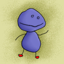
Lloyd
Nightmare
(Jan 2, 2005)
Lloyd is a stuffed plushie that lives under the toy shelves.
inatyrb (Jan 2, 2005)
That's really cute! He looks tough! Lol! |

| ||||||||||||||||||||||
|
7 comments
– latest 4:
pandabarrie (Jan 2, 2005)
what ever you guys...blue is hot and thats final...(i also think that the bluse helps give the picture a nice divercity of colores, neh?)
bakuraiscool (Jan 2, 2005)
I still disagree...but oh well.
K-Dizzle (Jan 3, 2005)
I think we should let my Bic lighter decide... *flick* ...The verdict is in.The base of the flame is blue (as if we didn't already know :P) , as seen in exhibit A (the dragon picture above). Case closed.
pandabarrie (Jan 3, 2005)
THANK YOU!*gives k-dizzle a cookie* |

| ||||||||||||||||||||||
|
bakuraiscool
(Jan 2, 2005)
I know, it sucks.EDIT: No seriously, can someone comment of how they feel about this picture? Or atleast just comment something!!!
pug106 (Jan 2, 2005)
i'm going to comment because you sound a little desperate,:-) i think it isn't too bad, only thing i would say is, the eye brow is a little close to the eye, other than that, not too bad, happy?:-)
bakuraiscool (Jan 2, 2005)
Yes...okay, I'll try to make it better...
taori (Jan 2, 2005)
There's a lot of things I really like about this picture. For one, you didn't leave the eye all one color- bravo! I'm always making that mistake. You'll probably want to work on eyelashes and eyebrows some more-- just look at some reference pictures to help you (I'm no good at them, or I'd give you some pointers). It seems like you went a little crazy with the blur tool in the colored part of the eye (iris? pupil? I don't know). Don't be afraid to define those little lines around the black part more. Again, reference pictures are fantastic. You're improving a lot, keep it up!Uh...I think I screwed it up.
EDIT: Time to do more eyes...*sigh* |

| ||||||||||||||||||||||
|
taori
(Jan 2, 2005)
cuz no one mourns the wicked.(I'll probably tweak the background later, it's bothering me.)
bobernater (Jan 2, 2005)
why does it have only 1 wing
Nyuusen (Jan 2, 2005)
the title is unnecesarily long and bothersome but other wise its okay, sketchy and a bit splotchy in some areas where the black and green meet but okay.
bobernater (Jan 6, 2005)
the title is so nesacary
friend (Jun 26, 2005)
omg a bat monkey... Ive only meet one in a dream! THIS IS SO COOL! |

| ||||||||||||||||||||||
|
mazi
(Jan 2, 2005)
.
Hakkai (Jan 2, 2005)
This really pwns.. you know why? Because Mazi is a secksay beast. XD
Sutafani (Jan 2, 2005)
I like the realism... I'm fixaded on the hair also..0_0
Childlike_Vampire (Jan 2, 2005)
Wow, this is really pretty Mazi! The hair is so super spiffy. Very nice realism and self portrait! I like the b n w thing, too. Great drawing. :D
mukumuku (Jan 2, 2005)
this is great! the chading and the grey scale is really good |

| ||||||||||||||||||||||
|
Serchul
(Jan 2, 2005)
Hello Finny!
Knockoff (Jan 2, 2005)
Nice to see both of you aroud here at 2draw. ;)Sexy shoes.
davincipoppalag (Jan 2, 2005)
I love how these little Serchul Characters just appear from time to time. Cute.
taori (Jan 2, 2005)
Why Serchul! I've missed you. Or else I'm just blind and you haven't been gone. Or maybe I've been gone. Or whatever. Anyway, I love these dear little non-sequiters of yours. This makes my day.
LisaAnne (Aug 30, 2005)
I like your characters...they make me smile. Simple, but works. |
| ||||||||||||||||||||||
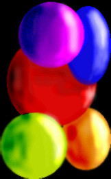
|
pug106
(Jan 2, 2005)
Don't really know what it is, just a bit of fun!!
davincipoppalag (Jan 2, 2005)
It looks like pretty party balloons. Very colorful and fun.
Pantera (Jan 2, 2005)
Looks like it could be m&m's also, I like it :)
Rhiwithil (Jan 2, 2005)
I love the purple balloon! It's pretty. |
| ||||||||||||||||||||||
|
bakuraiscool
(Jan 2, 2005)
This is for cyclops week...if it's too late, then I'm sorry.(rated 13+ for blood)
davincipoppalag (Jan 2, 2005)
Lol Pokeclops heheee
bobernater (Jan 2, 2005)
i thought you like pokemon>???
bakuraiscool (Jan 2, 2005)
I do...but Pikachu looks cool like this! And this for cyclops week anyways... |

| ||||||||||||||||||||||
|
natsuki
(Jan 2, 2005)
It actually didn't take 45 min. to do this.... I watched TV for lke half the time.... well anyways I was doing this pic for bordom. I was just messing around so it's not great or anything...
squee (Jan 2, 2005)
Its blurry as hell X__X otherwise I love the lineart
Reich (Jan 2, 2005)
lol this is cool...real good line art, but alittle blurry but besides that it good ^^
mukumuku (Jan 2, 2005)
pretty colors i like how you colored this
silver_maiden (Jan 2, 2005)
nicely done |

| ||||||||||||||||||||||
|
sal
(Jan 2, 2005)
...
Anna (Jan 2, 2005)
lol! I think this is one of my favorites from yours, sal! :-D Very cool and interesting twist!
davincipoppalag (Jan 2, 2005)
Sal strikes again. Where do you and zep get all your ideas.
taori (Jan 2, 2005)
it's undead one-eyed towelie! this is groovy. i like the layers of color in the background.
Cordelia_Pink (Jan 2, 2005)
This is a plan out for a halloween episode in spongebob squarepants. He's either dressed up as frankenstein or cyclops. *eviiiil laugh* anyhow, good job. nice water and bubbles effect. lol |

| ||||||||||||||||||||||
| |||||||||||||||||||||||
| 2draw.net © 2002-2025 2draw.net team/Cellosoft - copyright details - 5.45sec (sql: 34q/5.41sec) |