| |||||||||||||||||||||||
|
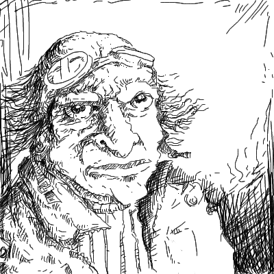
Captain Intuos
DinoFlorist
(Aug 21, 2005)
I got a new tablet as a gift, so I am trying it out! This is an intuos 3 tablet; I like it very much!
GOODBYE (Aug 21, 2005)
nice drawing, luckyyy. I wish I bought that tablet instead but god is it expensive.
davincipoppalag (Aug 21, 2005)
Ohhh big bucks tab@!! Nice to see a pic from you mr ben! And a good one too..it looks like it would be an illustration in some kind of novel.
Urei-sama (Aug 21, 2005)
... can i have your old one? |
| ||||||||||||||||||||||
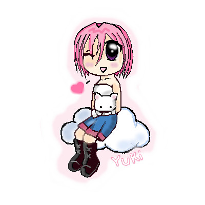
|
yukitora
(Aug 21, 2005)
:]
Animegirl250 (Aug 21, 2005)
aww looks like thr kiki kitty plushie from Gaia
renire (Aug 21, 2005)
Thats what i thought :D cute pic ^_^
KH44N (Aug 21, 2005)
This looks very pretty. Maybe a background would make it look prettier. But those can sometimes be annoying. Other than that, great pic! ^__^ |
| ||||||||||||||||||||||
|
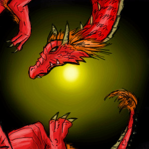
Animegirl250
(Aug 20, 2005)
Dont ask why the dragon is...kinda spiraling...It just ended that way.
KH44N (Aug 21, 2005)
This is awesome! The light look gorgeous, the spikes and the teeth look just great. Excellent work! ^__^
davincipoppalag (Aug 21, 2005)
It's a nice looking spiraling dragon..
PurpleLlamasRcoming (Aug 23, 2005)
thats SO good! i wish i could draw like that! |
| ||||||||||||||||||||||
|
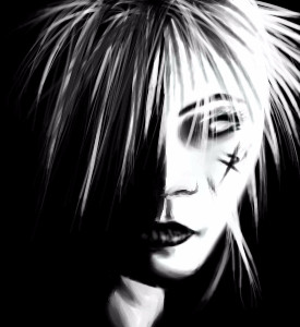
nekodesu
(Aug 20, 2005)
Singer from Dir en Grey. I printed a ref yesterday but I'm too lazy to find the link for it. Modified some things here and there but whatever. Copying is boring.
davincipoppalag (Aug 20, 2005)
This came out really good neko..I like how you did the hair and the shadows work really well too
Chimpeggs (Aug 21, 2005)
I commented on this on Deviant ^.^ I love how it came out...very great job!!!
Kenshin (Oct 9, 2005)
Yay Kyo XD*<3's Dir en grey*
Fire_Dragon (Dec 21, 2005)
hehehehe I <3 dir en grey there amazing (>^^)><(^^)><(^^<) |
| ||||||||||||||||||||||
|
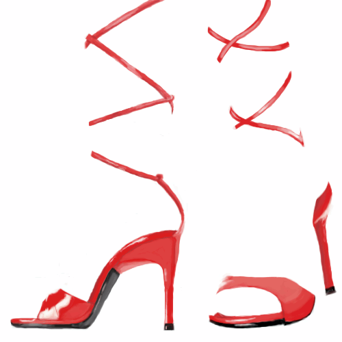
xswirvex
(Aug 20, 2005)
shiny red heels
HunterKiller_ (Aug 21, 2005)
Stylish indeed. Good work.
lycene (Aug 21, 2005)
Ooh, very cool. I agree with everyone that this is incredibly stylish. The shine is awesome.
Qwerty_Wittle_Fawah (Aug 22, 2005)
Thats hot ~ as PAris hilton would say....I love it...it blows my mind cuz my brain put like the lines where it should be to show her legs and stuff but that is awesome kudos to you Brilliant and creative who woulda thought? okay im talking too much but i really do think that is awesome
xiau (Oct 5, 2005)
I can't help but wonder: Why is this not in showcase? This is amazing, I love the shine on the shoes. Very realistic, and I like it alot better without legs. |
| ||||||||||||||||||||||
|
littlepony
(Aug 20, 2005)
heh i was bored now im tired so good night
Juni_gatsu (Aug 21, 2005)
Cute picture, I really like the flamey look on it's mane and muzzle ^.^But even so, this is really not up to intermediate standards, the colouring is very flat, the lineart is harsh and then blurred in someplaces and there is a real lack of detail....You really need to practice more on the begginner boards even if you think the canvas sizes are too small.
littlepony (Aug 21, 2005)
hey if you wanna see some of my real work go here http://s13.invisionfree.com/The_dragons_cave/index.php?act=idxstop being so mean im not good on the computer ok
marcello (Aug 21, 2005)
they're being quite far from mean, they're giving you suggestions that will help you avoid getting this picture deleted.
nekodesu (Aug 21, 2005)
Zoom in if the 300x300 canvas is too small for you. That's pretty much the same thing as 500x500. |

| ||||||||||||||||||||||
|
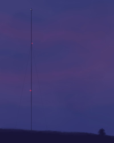
DireOnion
(Aug 20, 2005)
That's it for now.
davincipoppalag (edited Aug 20, 2005)
I like these little forays into realism Dire...this is quite well done..the fine lines for the guy wires look perfect..the subtle colors in the sky are beautiful
HunterKiller_ (Aug 21, 2005)
I like this very much. So simple, yet it seems to hold so much.
Urei-sama (Aug 21, 2005)
thats wild. I thought it was missing something too but the more i look at it, the better it looks
Animegirl250 (Aug 22, 2005)
Hey it's that flashy pole thingy! |
| ||||||||||||||||||||||
|
Animegirl250
(Jul 31, 2005)
What anime pics on 2draw SHOULD be like. Yes! More yaoi! Oh I'm bad with perspective but I think It's okay...for now...I guess....
Animegirl250 (Aug 20, 2005)
Damn straight again. Boys being the only horny ones is completely stereotyped. SHEESH
nekodesu (Aug 20, 2005)
Hotness XD Awesome yaoi drawing
voodoobunny (Sep 6, 2005)
O.O yaaoiiiihhh! <3 rawr...they are so sexayh =3
101_Torchic_101 (Sep 25, 2005)
XD so gay..although for some reason i think it's hot when male anime characters are gay..0_o..It's Cute!! (and hot) |

| ||||||||||||||||||||||
|
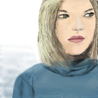
Mal
(Aug 20, 2005)
I'm sitting down here but hey, you can't see meKinda invisible, you don't sense my stay Not really hiding, not like a shadow Just thought I would join you for one day
KH44N (Aug 20, 2005)
Wow! Everything looks awesome. This is very nicely drawn. Good job and keep it up.
davincipoppalag (Aug 20, 2005)
I did'nt know you did people, too mal! Nice job! |
| ||||||||||||||||||||||
|
triple_six_mafia
(Aug 20, 2005)
gas
Minty_hippo (Aug 20, 2005)
Nice 1 [GAS]koolies name hehe I like thart ^^ I love the greeen bacground, green is my favourite colour ^^
sephiroth54321 (Aug 20, 2005)
Nice...
KH44N (Aug 20, 2005)
This looks really cool. The green background is nice, and the design reminds me of sort of chinese design. ^_^ |

| ||||||||||||||||||||||
| |||||||||||||||||||||||
| 2draw.net © 2002-2026 2draw.net team/Cellosoft - copyright details - 6.60sec (sql: 33q/6.43sec) |