| |||||||||||||||||||||||
|
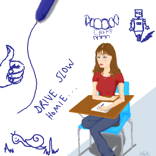
LisaAnne
(Sep 24, 2005)
Crappy doodle, but its good for stress relief. |
| ||||||||||||||||||||||
|
Luka
(Sep 26, 2005)
...and with this i go to the intermediate level! Yey, for the progress! :D
xiau (Sep 27, 2005)
I love the shine on her lips :DThe soft colors are amazing! You should have come to this board sooner!
Juni_gatsu (Sep 28, 2005)
Very nice, I like the softness and the texture of the fabric of her jacket ^.^ The cool glowy background is nice as well. But her lips seem very sharp in contrast to the rest of the picture...maybe if her nose was a bit more defined it would match better ^.^''
Gigge (Oct 1, 2005)
The soft glow is very pretty. It definitely conveys a whisper. |

| ||||||||||||||||||||||
|
DeadlyBlondeArcher
(Sep 27, 2005)
not made for walkin'
JK-Arts (edited Sep 28, 2005)
I wish i had leggs like that........Yea rapped around my waist. Some body give me a Dollar or a ping-pong ball :P . This picture is hot makes me think bad bad things but in a good good way know what i mean.
featherstone (Sep 29, 2005)
well vavavooom... nice work, Cindy
Miss_DJ (edited Sep 29, 2005)
I love it! Great reflection!!...she'll be a little more comfortable on carpet, though...trust me....lolololol HOT DRAW!
SYTHE (Dec 11, 2005)
Some times less really is more. This is an acceptional work of erotic art. Always leave them wanting more! |

| ||||||||||||||||||||||
|
kristine
(Sep 27, 2005)
Never Sell you soul to the devil.....(I'M A DRAWING MACHINE!!!!! lol = P)
kristine (Oct 3, 2005)
no one has any comments on this? ok then...
davincipoppalag (Oct 3, 2005)
I didn't see it! You did great on the violet eyes
kristine (Oct 3, 2005)
i was about to say no one loves me! lol j/k...thanks for commenting
davincipoppalag (Oct 3, 2005)
Lol I think sometimes it has more to do with when you post. Often there are many pictures posted about the same time, and some get lost. Not everyone scrolls through evertyhing. |

| ||||||||||||||||||||||
|
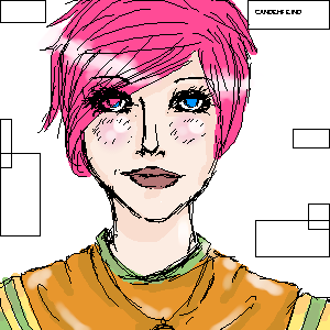
anarie
(Sep 27, 2005)
Reference from a Gravitation screenie. It just so happened that the uke that I was drawing had pink hair as well. XDOh and yeah. This is shonen-ai. Get over it. XD These are two of my own characters. They're actually made for an RP about a webcomic I love: Pandect. I've only decided on the uke's animal right now, and neither have names. >>;; So yeah. ^_^ Just seeing if I actually have any anime drawing talent... at all... and I seem to have very little. XD
Mafuyu (Sep 27, 2005)
ZOMG <3You have clean solid lines and shading, nice job.
anarie (Sep 27, 2005)
<3 Thank j00. ^_^
Pakasutemanshikuka (Oct 12, 2005)
aww cute :3 I love Gravitation.this is very nice.. I like the pink hair much ^_^<3
whitebunny1063 (Dec 24, 2005)
They look so sweet together. :) |

| ||||||||||||||||||||||
|
kristine
(Sep 26, 2005)
I had to do this with my mouse...my dang brand new tablet is already actin up... i gotta take it back...so all my drawings for a couple of days will look like pooooooooop. what do you all think? could this possible be advanced quality?.......NAAAAAAAAA! no way.
hideyourface (Sep 27, 2005)
well it depends what you're drawing with a mouse. If it's just lines like in this picture a tablet would probably be better, but with Aubrey's car and a ton of other very detailed pictures, theres not many long precise strokes required. Anyway, this picture is really nice and simple, but I think her head is too far to the right if you think about where her neck would be compared to her shoulder
darkshadow (Sep 27, 2005)
i keep comming back to this i ;ike it a lot and dont know why i mean i can normaly tell you what i like and what i dont amd i dont have eather one for ya good picture
kiketsu (Sep 27, 2005)
OMFG!!!!! YOU DID THAT WITH YOUR MOUSE?!!!? I'M ALMOST AFRAID TO SEE WHAT YOUR DRAWINGS WITH A TABLET LOOKS LIKE! you're so wonderful....
DieChan (Oct 7, 2005)
This is a very unpoop-like drawing. :O~~~You draw so well! >< Marry me? <:D |

| ||||||||||||||||||||||
|
Phil
(Sep 26, 2005)
heh heh heh fanced a change from boobs
jord (Sep 27, 2005)
whow, a very small angel
hideyourface (Sep 27, 2005)
his nipple looks like it's on fire.
Caddris (Sep 27, 2005)
And I laways thought angels were androgynous . . .
Boichi (Sep 27, 2005)
Why's he sitting on an elephant? 0.o?? |
This is hidden because it is rated Extreme. Edit your privacy settings to make it visible.
| ||||||||||||||||||||||
|
pandabarrie
(Sep 26, 2005)
yes i know the title is from a movie (Jonny Depp is in it) but i thought it fit nicely. dont you?anyway...im avoiding doing HW at the moment. i have to get back to it now. tootles
kuramaandhiei (Sep 26, 2005)
UR GOOD
KH44N (edited Sep 28, 2005)
HOLY CRAP!!! This looks flippin amazing!just touched up the sky a wee bit
|

| ||||||||||||||||||||||
|
1 comment
– latest 1:
p3ndragon (Sep 26, 2005)
I like it. The lineart could probably be cleaned up a bit, while still maintaining it's grittiness. The nose looks good, too, but I think that since it's shaded like that you need to define the left side of the nose... above the nostril thing... I think. Argh >_<Keep it up, I like your other stuff too. |
| ||||||||||||||||||||||
|
yxky
(Sep 26, 2005)
...
starmarked (Sep 27, 2005)
Ooo very nice, I really like how you drew the hair. Welcome to 2draw :]
lycene (Sep 27, 2005)
I really like the lighting on this; it adds a lot to the motion of the picture. Very pretty.
darkshadow (Sep 27, 2005)
really like this great job
JK-Arts (Sep 28, 2005)
ery nicelighting and shading it looks glorious. |

| ||||||||||||||||||||||
| |||||||||||||||||||||||
| 2draw.net © 2002-2026 2draw.net team/Cellosoft - copyright details - 8.35sec (sql: 34q/8.18sec) |
drawn in 28 min