| |||||||||||||||||||||||
|
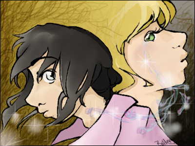
Urei-sama
(Aug 21, 2005)
oikitsumaru inspired me to draw somthing... |
| ||||||||||||||||||||||
|
triple_six_mafia
(Aug 21, 2005)
that nigga jungle! |

| ||||||||||||||||||||||
|
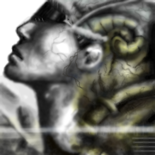
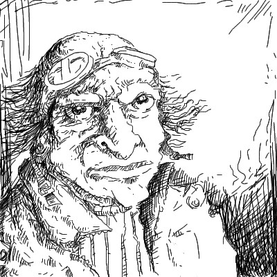
Tezzy
(Jul 28, 2005)
Safety save
Gigge (Aug 5, 2005)
This picture makes me look for stuff that isn't there. I like it.
Gigandas (Aug 5, 2005)
I see some Giger in this one too, although it's not quite as sharp or creepy. I love all the weird details that Giger uses in his paintings as well as how he can mold realistic people into whatever his mind can come up with. He's probably my biggest influence as well and I'm glad to see others like his work too :).
Xodiak (Aug 5, 2005)
Xod likes the organic and metallic feel of the drawing. I also like the texture with the veins. Quake 2 comes into my mind when looking at this drawing. Amazing artwork! <:D|XOD|
Imp (Aug 21, 2005)
Omg terry! You have talent! - Simon!! |
| ||||||||||||||||||||||
|
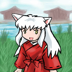
Animegirl250
(Aug 21, 2005)
Inuyasha when he was tiny ^_^ His necklace isn't there for a reason for all you hawk-eyes. |
| ||||||||||||||||||||||
|
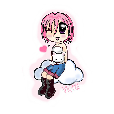
yukitora
(Aug 21, 2005)
:]
Animegirl250 (Aug 21, 2005)
aww looks like thr kiki kitty plushie from Gaia
renire (Aug 21, 2005)
Thats what i thought :D cute pic ^_^
KH44N (Aug 21, 2005)
This looks very pretty. Maybe a background would make it look prettier. But those can sometimes be annoying. Other than that, great pic! ^__^ |
| ||||||||||||||||||||||
|
voodoobunny
(Aug 21, 2005)
I love spagettiiih!
voodoobunny (Aug 21, 2005)
Awww....Thanks.
renire (Aug 21, 2005)
Reminds me of Teranee off of W.I.T.C.H, cool pic, love the hair and the way you have positioned the face ^_^
voodoobunny (Aug 21, 2005)
teeheehee, I don't have blue/violet hair. but the hairstyle kinda reminds her's.
KH44N (Aug 21, 2005)
Nice pic. I like the highlights on the hair, and the background looks cool. |

| ||||||||||||||||||||||
|
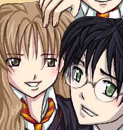
oikitsumaru
(Aug 12, 2005)
10 hours later.. *dies* harry potter. ugly. but whatever
fleeting_memory (Aug 14, 2005)
very cute-too bad they are going to have to replace the actors soon if they are to keep doing the movies-they are going to get too old for thir parts :)
Pakasutemanshikuka (Aug 15, 2005)
i loooove this =D ilovelovelove ! ='D i'm a big potter-fan.. damn >XD
xiau (Aug 15, 2005)
I have a strong dislike for Harry Potter, but I loves this picture... I can't help it. The cell-shading on the hair and face is amazing. I love the soft eyes and the light reddish-pink you used on the cheeks.
Urei-sama (Aug 21, 2005)
bah! hes not ugly here. You did an exelent job |
| ||||||||||||||||||||||
|
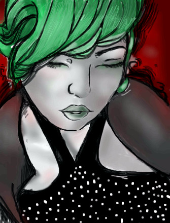
Orkdoop
(Aug 19, 2005)
UMM, I guess I like this. Its not GREAT or anything...
Shoebox (edited Aug 19, 2005)
Ooh, pretty, I like the hair.. green is such a fantastic colour, hehe... I think the lips could use more shading but.. I"m not really an authority, y'know, so you just do what you think needs to be done to it XD I like the expression, and the nose (I have so much trouble doing noses, it's not even funny...) I dont know. Its alright.
KH44N (Aug 20, 2005)
This looks very cool. I like the different colours u used.
Urei-sama (Aug 21, 2005)
i like this. its very plush looking and yea, the colors are great |
| ||||||||||||||||||||||
|
DinoFlorist
(Aug 21, 2005)
I got a new tablet as a gift, so I am trying it out! This is an intuos 3 tablet; I like it very much!
GOODBYE (Aug 21, 2005)
nice drawing, luckyyy. I wish I bought that tablet instead but god is it expensive.
davincipoppalag (Aug 21, 2005)
Ohhh big bucks tab@!! Nice to see a pic from you mr ben! And a good one too..it looks like it would be an illustration in some kind of novel.
Urei-sama (Aug 21, 2005)
... can i have your old one? |
| ||||||||||||||||||||||
|
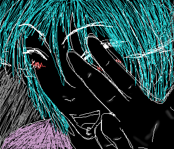
voodoobunny
(Aug 21, 2005)
omg. |
| ||||||||||||||||||||||
| |||||||||||||||||||||||
| 2draw.net © 2002-2026 2draw.net team/Cellosoft - copyright details - 3.44sec (sql: 35q/3.39sec) |
|XOD|
>_< ::fury::