| |||||||||||||||||||||||
|
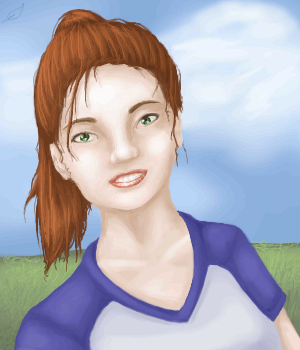
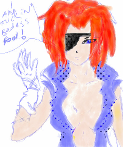
Sporty
Shoebox
(Aug 15, 2005)
No reference.. and it shows <.<Ah well...
KH44N (Aug 16, 2005)
Wow. This looks really very nice. I love the background. Everything looks perfect!
Shoebox (Aug 16, 2005)
Thank'ee ^^ ... I've been lazy with the backgrounds on my other realistic pictures, so I wanted to at least spend some effort on this one...
darkshadow (Aug 17, 2005)
very cute nice pic. is it you o_O
Shoebox (Aug 17, 2005)
nono, not at all XD I'm blonde for starters... it's just.. someone. |
| ||||||||||||||||||||||
|
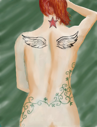
diver2026
(Aug 15, 2005)
some ideas for how I want my back tattooed one day... just messing around feel free to move it to a different board just realized this is posted on advanced - i thought I clicked intermediate.. oops. Anyways I figured I probably should put a bit of effort in. I'd appreciate any tips on how to make the tattoos look like part of the skin. I think they're a little better but still not right.
fleeting_memory (Aug 16, 2005)
that's alright-you can just ask someone to move it if you want. Interesting ideas for tatoos
hideyourface (Aug 17, 2005)
you should see the tattoos Davey Havok has. He's got a set of wings covering his entire back.just touching up the edges and adding a little more shading
|
| ||||||||||||||||||||||
|
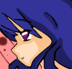
laurael
(Jan 29, 2004)
Sais are a girls' best friend...
laurael (edited Apr 24, 2004)
D.K....Um...'Raph'...hence the name...laur'ael'...get it?
TheCrimsonKing (Apr 29, 2004)
Noice detail! Like the eyes and lips. Nice "Total Size" as well..
Gigandas (Aug 17, 2005)
Hey, this one gives me an idea :). Since there's a bumper sticker for "Silly boys, trucks are for girls," there should be a "Silly boys, sais are for girls" hehe :P. You should put one of those on your car :).
KH44N (Aug 17, 2005)
HOLY CRAP!!! This is flippin amazing! The colours are amazing and the highlights are just perfect! Excellent job! |

| ||||||||||||||||||||||
|
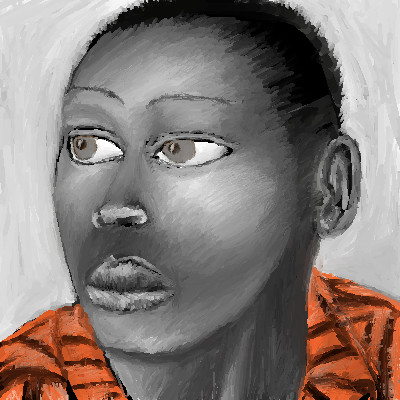
PS
(Jul 28, 2005)
trying
Xodiak (edited Jul 28, 2005)
He looks so eerie with empty eyes... Fantastic drawing! <:D|XOD|
hideyourface (Aug 13, 2005)
well, unless this is supposed to be abstract, the eyes are a bit big and close together, and the nose could be bigger. Also, the jawline should come to more of a point near the ear. But I think it is supposed to be abstract..I really like how you used orange on the greyscale, and how you coloured it with all the lines heading in one direction.
Xodiak (Aug 17, 2005)
I like how this particular drawing is not strictly photorealistic. It has alot of style. I like the eyes very much. I had my mouse pointer under his eye and for a moment I thought he was crying, hehe. This is great. |:)|XOD| |
| ||||||||||||||||||||||
|
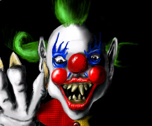
lamamo
(Aug 16, 2005)
ooh scary
medievalist- (Aug 17, 2005)
Thats kickass, gunna give me nightmares though.
davincipoppalag (Aug 17, 2005)
Lol very evil.. sometime..take a look in DMV's gallery....
emmamommalag (Aug 17, 2005)
Shades of DMV! Great job, lana.. love those wicked looking eyes and teeth.
lamamo (Aug 17, 2005)
I see what you mean about DMV. |
| ||||||||||||||||||||||
|
Kokain
(Aug 17, 2005)
Mekee'. <3 Secksi bitch. |
| ||||||||||||||||||||||
|
Kokain
(Jan 17, 2004)
Chibi Vegeta, with that stupid but cute smirk. ^^ Obviously in the rain. I need to finish off the shading on his top an hair. =.=; |

| ||||||||||||||||||||||
|
kagomelove
(Aug 12, 2005)
thinking quietly |
| ||||||||||||||||||||||
|
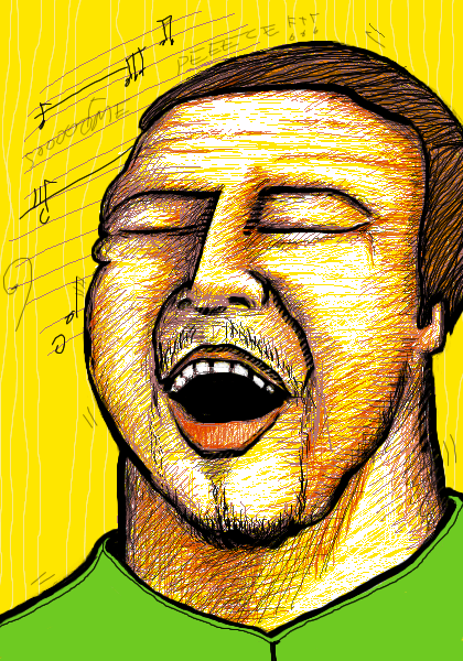
sagenev
(Aug 12, 2005)
version XXX.69 dedicate to author book
zep (Aug 14, 2005)
sacate un cuello...jejeje, tan buenas las rayitas amigo y el gesto, oye cukiboy bacan es mas como cool que col :)
sagenev (Aug 14, 2005)
yes men... sometimes don't press the letters... or forget it. i think is because i don't have bird's foodforget another letter, but the world forget much more
KH44N (Aug 16, 2005)
Nice... I like it. :) |
| ||||||||||||||||||||||
|
nekodesu
(Aug 15, 2005)
...The bg really does not look like it belongs with the picture but I couldn't think of other backgrounds and I'm too lazy to fix the shading....So yeah, whatever.
renire (Aug 16, 2005)
what KH44N said <:D
KH44N (edited Aug 16, 2005)
WOW! As i said before, this looks amazing!
inatyrb (Aug 16, 2005)
I really like this. The only thing that bothers me is the tongue. it just doesn't look right. very nice picture though. Sexy blood!
p3ndragon (Aug 16, 2005)
I like the softness of your drawings, but a few things: I think that, judging by the angle of the nose, the viewer's left side of the face shouldn't slant that far away. However, I'm pretty sure it's just the nose that's throwing me off because you drew the neck in the middle of face. The face looks great actually, but I think the nose was drawn at the wrong angle. Also, the ear is a bit too small. But, in summary, good drawing. But yeah, Background lolz. |

| ||||||||||||||||||||||
| |||||||||||||||||||||||
| 2draw.net © 2002-2026 2draw.net team/Cellosoft - copyright details - 5.53sec (sql: 36q/5.47sec) |