| |||||||||||||||||||||||
|
ChiFriend
(Aug 25, 2005)
er |

| ||||||||||||||||||||||
|
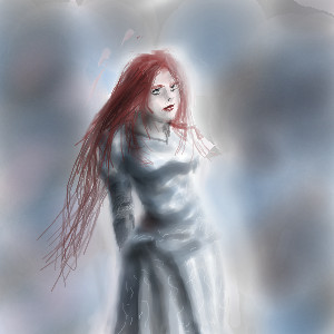
Namori
(Aug 14, 2005)
mermaid under the sunlight...
~unwritten_law_girl~ (Aug 15, 2005)
its pretty!
hideyourface (Aug 15, 2005)
i think the front of her should be shaded since the light is coming from behind. If not that, then it should at least have some more darker shading. Also, her hairline is a but too high up and her left arm is a bit too long. That's all I see wrong with it. It's still very pretty.
fleeting_memory (Aug 16, 2005)
I like the gold on the tail and around her arms
Namori (Aug 26, 2005)
hmm...yeah, it does look kind of awkward since the light is coming from behind her and her front is still very light...thanks for pointing it out to me, hideyourface! :D I'll try to make sure not to make that mistake again. |

| ||||||||||||||||||||||
|
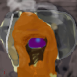
CrimsonKing
(Jun 28, 2003)
Uh i really don't know what this is, i think it's a Orc from the 80's with kung fu gear and knowledge. So yeah lol
zep (Aug 26, 2005)
i think you are talking about TheCrimsonKing. :)
Maiko (Aug 26, 2005)
but the name in the email is joe! :o
Gigandas (Aug 26, 2005)
Why does this guy's email address say "joeyjoejoesph@hotmail.com" though? Coincidence...?
Maiko (Aug 26, 2005)
HAHAHA >:3 |

| ||||||||||||||||||||||
|
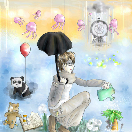
broken-lock14
(Aug 18, 2005)
.
lycene (Aug 25, 2005)
Well, I'm not Everybody, but I certainly love this scene. I especially like the coloring on the boy's clothes.
Urei-sama (Aug 25, 2005)
this is very cool. i like the imagination involved
broken-lock14 (Aug 25, 2005)
Spank you all very much so for the lovely comments (I accept friendly critiquing as well *hint hint*). =^n____n^=
Maiko (Aug 26, 2005)
ahh!! Fellyfisks X3 <3 <3 <3I love the fellyfisks <3 |
| ||||||||||||||||||||||
|
Sorciere
(Aug 25, 2005)
Sorry for the sketchiness. I might ink/colour this later.
whitebunny1063 (Aug 25, 2005)
How did you do her on PaintBBS?
darkshadow (Aug 25, 2005)
like the form of her but her hand looks a little big to me very well done on the face
lycene (Aug 25, 2005)
She is so cute! I like her eyes, especially. The only thing I would change about this is that her hand looks a bit stiff. I'd keep the size of it, though, I like it big.
Childlike_Vampire (Aug 26, 2005)
This is very awesome. I love her body, and the style of the hand, but most especially I love her hair and face. The rounded shapes and movement are super appealing. I definitely think you should finish this. *nodnod* |

| ||||||||||||||||||||||
|
Snoozy27
(May 7, 2005)
Exhilarating!
TRIP (May 8, 2005)
this rocks my world 100 times over. Awsome. <3
HunterKiller_ (May 8, 2005)
Ok, i don't know who you are but welcome back anyways ^.^ TeeheeThis is one funky picture. It makes me thirsty. *Gets off ass for a drink*
davincipoppalag (May 8, 2005)
He looks like he is having a really hot time! This is great. Very creative and well-done
15grifficorntears (Aug 26, 2005)
my math teacher MR. Lawrence lives on the sun, he is also a robot. |

| ||||||||||||||||||||||
|
IkariIreuL
(Aug 25, 2005)
? |
| ||||||||||||||||||||||
|
Mal
(Aug 25, 2005)
One day they will be wine :o)
darkshadow (Aug 25, 2005)
looks like a water color very nice
KH44N (Aug 25, 2005)
Damn... this is pretty good. I love everything about. Great work and keep it up!
davincipoppalag (Aug 25, 2005)
Lookit Mal drawin up a storm... good job! |

| ||||||||||||||||||||||
|
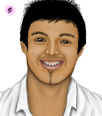
pencilhero
(Aug 25, 2005)
just a crappy doodle >__________> *looks the leechget window to see when the mmorpg client download will be finished*tsk wrong section it should go----------------->beginers board
deleted34235 (Aug 25, 2005)
I like it alot!!!!!!!!!!!! I dont think its crappy......maybe cuz its not!!!!!!!!! I cant even draw that!!!!!!!! anyway, nice job!!!!!
KH44N (Aug 25, 2005)
This is so nice. I love the different colours u used for the background. The hair looks pretty nice too. Great work. |
| ||||||||||||||||||||||
|
Gemmy619
(Aug 25, 2005)
The winner of Big Brother 2005YAY ive finished them all at last :D thank god lol
davincipoppalag (Aug 25, 2005)
Very nice series, too. |
| ||||||||||||||||||||||
| |||||||||||||||||||||||
| 2draw.net © 2002-2026 2draw.net team/Cellosoft - copyright details - 4.96sec (sql: 36q/4.92sec) |
drawn in 18 min
drawn in 6 min