| |||||||||||||||||||||||
|
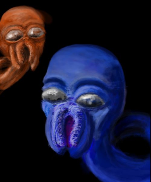
Rawkus.
Ceido
(Jul 8, 2005)
This is Barry.|| I know it's not up to advanced standard. If i mod could, please move it to intermediate. ||
~Wolf~ (Jan 21, 2006)
It remind me of something but I can't think of it.
AngelDragon (Jan 21, 2006)
Wolf: The squid-guy Zoidberg from Futurama, pehaps? And to the artist: This is very good! The eyes are very eerie ^^ It's like they're watching me.... O_o
HunterKiller_ (Jan 26, 2006)
Y-i-p, yip yip yip yip yipyipyipyipyipyipyipyipyipyipyip.
Kraisa (Feb 10, 2006)
LOL@hunterkiller I saw them on pbs yesterday with my son, I'm grown and they still make me laugh. Cool picture Ceido7! Could you imagine waking up to that one morning looking at you and makeing the yiiiip yipyipyip noise....? *shiver* |
| ||||||||||||||||||||||
|
Nightmare
(Feb 10, 2006)
He hurts things with his iron hands...he may also be blind, and might've lost his mind.
Pakasutemanshikuka (Feb 10, 2006)
Woah, I really do like the colouring and lineart. I wish I could do lineart too..I like your art here, just wanted you to know. Cool job!
HunterKiller_ (Feb 10, 2006)
Nice. I thought it was something from Alex-Cooper at first. |

| ||||||||||||||||||||||
|
Pseudonymous
(Feb 9, 2006)
My Nikerdood! :D
Pseudonymous (Feb 9, 2006)
Thanks! He's really a sweet thang. He took a nap with me today. :)
Pakasutemanshikuka (Feb 10, 2006)
so cute! brilliant job :O
WarHorse (Feb 10, 2006)
Thats really cute. Does it look like the real dog? Its really fluffy. Kind of reminds me of a furby.
Pseudonymous (Feb 10, 2006)
I love you, WarHorse. :) <3 |

| ||||||||||||||||||||||
|
thesolarwinds
(Feb 9, 2006)
blerg.http://i2.photobucket.com/albums/y16/thesolarwinds/photo_a_day_323.jpg
friend (Feb 9, 2006)
Woah this is really good! Emotionally Powerful!
terracotta (Feb 9, 2006)
Love the flower and the drawing. I want to hang this on my wall when you've finished with it, okay?
thesolarwinds (Feb 10, 2006)
lol... sure. |

| ||||||||||||||||||||||
|
Pseudonymous
(Jan 31, 2006)
It nourishes your sense of elegance.
Qwerty_Wittle_Fawah (Feb 1, 2006)
I really like what you are doing. There is something odd about the spoon though :-/ I can't place it, and I also can't wait to see this finishedMurr. I'm getting kinda sick of this. I don't think I'm gonna finish it.
Edit: Forget this. It's done.
Rosemary (Feb 10, 2006)
great shine :) |

| ||||||||||||||||||||||
|
staci
(Feb 9, 2006)
here is a picture.
DeadlyBlondeArcher (Feb 9, 2006)
yay! you made it move across the gallery!...Now I don't have to get offa my fat ass to see it from far away! :D
Pseudonymous (Feb 9, 2006)
Preeety :)
davincipoppalag (edited Feb 9, 2006)
Beautiful picture , such an interesting perspective
Rosemary (Feb 10, 2006)
i play the violin :) wonderful draw |

| ||||||||||||||||||||||
|
Alex-Cooper
(Dec 29, 2005)
and more importantly, where the hell are my friends?!
PolythenePam (Jan 16, 2006)
You listen to The Moldy Peaches?
Alex-Cooper (edited Jan 18, 2006)
YES!YOU?
PolythenePam (Feb 1, 2006)
YES!
Alex-Cooper (Feb 9, 2006)
WOAH! |

| ||||||||||||||||||||||
|
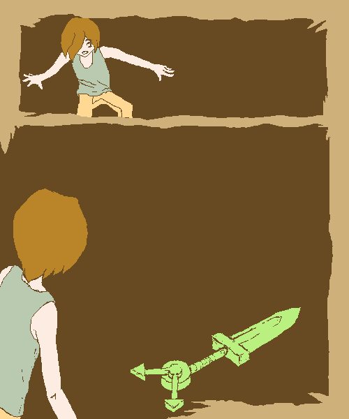
DreameRadial
(Feb 9, 2006)
Time is TickingZomg it's the dreaded text heavy page!!! Well... not that text heavy, but still. Sorry, words will be added later, I havta go. Will finish in an hour or two.
Rudeezy (Feb 9, 2006)
these manga pages of yours are turning out really neat. It makes me want to start one of my own. :D |
| ||||||||||||||||||||||
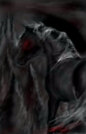
|
unicorn
(Jan 15, 2006)
the horse in lord of the rings:)
brujah (Feb 7, 2006)
ahah insan bi haber werir heha
asli607 (Feb 8, 2006)
melis i?te ..
davincipoppalag (Feb 8, 2006)
It's shaped very well and the light is good. I would have liked a bit more sharpness in details. This is good.
unicorn (Feb 9, 2006)
ne bilem pardon:Dbegenmiom ki o kadar haber werlcek kadar seetmiom..nese artk burda?z hepbilrkte and thank you!:) |

| ||||||||||||||||||||||
|
unicorn
(Jan 15, 2006)
...
blackmamba (Jan 20, 2006)
ya yine beginnera koydun sandim kizacaktim!
SpAwNofAllEvIL (Jan 20, 2006)
oooooo i luvv it do you go on deviantart.com? :U i have a profile there! you rok!! i drew the pic called WaNt To KnOw WhAt I ThInK? i drew that one yup :"D OKAY I DRINK TO MUCH COFFEE!! :X sweet pic
brujah (edited Feb 6, 2006)
melis harika oolmu? bay?ld?m edit:galerinde çok iyi
unicorn (Feb 9, 2006)
yes i have account at da and thankss!:) saol burcajh:D |
| ||||||||||||||||||||||
| |||||||||||||||||||||||
| 2draw.net © 2002-2026 2draw.net team/Cellosoft - copyright details - 4.87sec (sql: 33q/4.80sec) |